Wondering how your logo performs? 🧐
Get professional logo reviews in seconds and catch design issues in time.
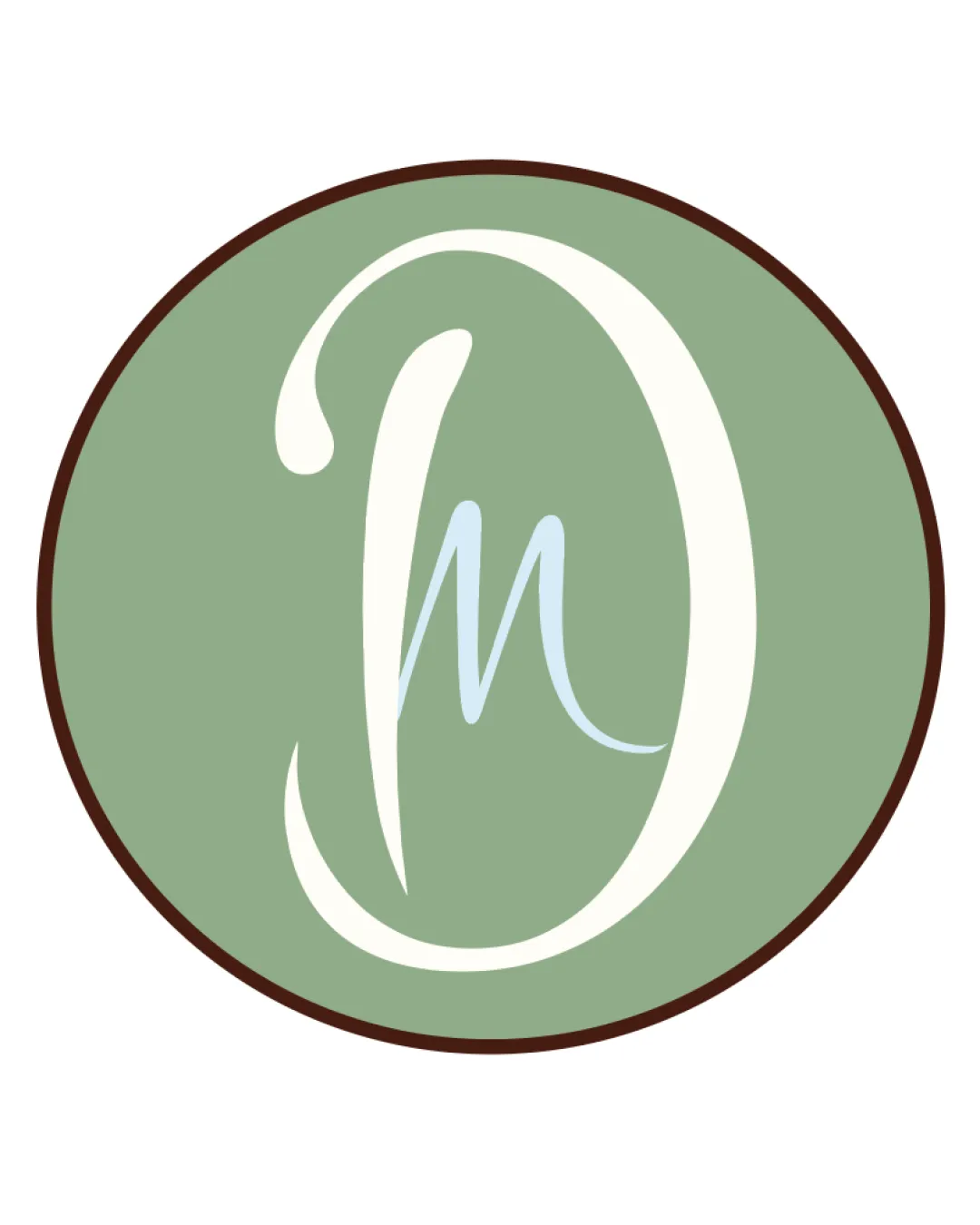
Try it Now!Logo review of D M
 Logo analysis by AI
Recognized style:
Logo type:
Detected symbol:
Detected text:
Business industry:
Review requested by Helene
**If AI can recognize or misinterpret it, so can people.
Structured logo review
Legibility
![]() The letters D and M are clear and identifiable.
The letters D and M are clear and identifiable.
![]() Some may find the style slightly decorative, affecting quick readability.
Some may find the style slightly decorative, affecting quick readability.
Scalability versatility
![]() The simple design is versatile for different sizes.
The simple design is versatile for different sizes.
![]() The thin lines may lose clarity on very small scales.
The thin lines may lose clarity on very small scales.
200x250 px
100×125 px
50×62 px
Balance alignment
![]() The elements are well-balanced within the oval shape.
The elements are well-balanced within the oval shape.

Originality
![]() The integration of the letters is unique and personalized.
The integration of the letters is unique and personalized.
![]() Monograms can sometimes feel generic.
Monograms can sometimes feel generic.
Aesthetic look
![]() The logo has an elegant and clean appearance.
The logo has an elegant and clean appearance.
![]() The color palette might seem subdued for some industries.
The color palette might seem subdued for some industries.
Cultural sensitivity dual meaning
![]() No cultural sensitivity issues detected.
No cultural sensitivity issues detected.
Color harmony
![]() The green and brown colors are harmonious and calming.
The green and brown colors are harmonious and calming.
![]() The colors might be too understated for a bold brand presence.
The colors might be too understated for a bold brand presence.


