Wondering how your logo performs? 🧐
Get professional logo reviews in seconds and catch design issues in time.
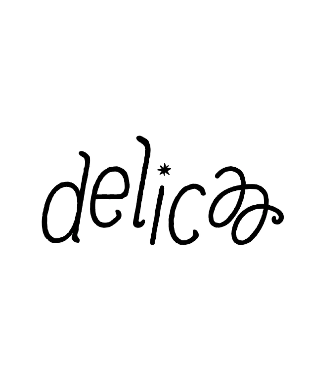
Try it Now!Logo review of delicaa
 Logo analysis by AI
Logo type:
Style:
Detected symbol:
Detected text:
Business industry:
Review requested by Malikalsyaa
**If AI can recognize or misinterpret it, so can people.
Structured logo review
Legibility
![]() Most of the letters are distinguishable.
Most of the letters are distinguishable.
![]() The double 'a' at the end is difficult to read and may cause confusion regarding the actual brand name.
The double 'a' at the end is difficult to read and may cause confusion regarding the actual brand name.![]() Overly playful letterforms in 'a' and uneven x-height reduce overall clarity.
Overly playful letterforms in 'a' and uneven x-height reduce overall clarity.![]() The asterisk as a dot over the 'i' may be misinterpreted or distract from legibility.
The asterisk as a dot over the 'i' may be misinterpreted or distract from legibility.
Scalability versatility
![]() Single-color, simple line design will reproduce well in large and small formats.
Single-color, simple line design will reproduce well in large and small formats.![]() No thin lines prone to loss at small sizes.
No thin lines prone to loss at small sizes.
![]() Exaggerated terminal strokes in 'a' might merge or lose clarity at very small sizes, such as on business cards or mobile icons.
Exaggerated terminal strokes in 'a' might merge or lose clarity at very small sizes, such as on business cards or mobile icons.![]() Hand-drawn eccentricity may not translate as well to embroidery or laser-engraved applications.
Hand-drawn eccentricity may not translate as well to embroidery or laser-engraved applications.
200x250 px
100×125 px
50×62 px
Balance alignment
![]() Consistent line weight throughout and all lowercase style lends some visual cohesion.
Consistent line weight throughout and all lowercase style lends some visual cohesion.
![]() Double 'a' at the end visually outweighs the rest of the word, creating imbalance.
Double 'a' at the end visually outweighs the rest of the word, creating imbalance.![]() Tall 'l' and floating asterisk add vertical tension, creating a top-heavy look, especially toward the right side.
Tall 'l' and floating asterisk add vertical tension, creating a top-heavy look, especially toward the right side.

Originality
![]() Custom hand-drawn type with unique looping 'a' ligatures, playful brand personality.
Custom hand-drawn type with unique looping 'a' ligatures, playful brand personality.
![]() The asterisk is a somewhat unoriginal embellishment, and the playful script trend is commonly used in some creative industries.
The asterisk is a somewhat unoriginal embellishment, and the playful script trend is commonly used in some creative industries.
Aesthetic look
![]() Playful, approachable, and friendly style can appeal strongly to the target.
Playful, approachable, and friendly style can appeal strongly to the target.![]() Monoline approach is aesthetically pleasing for certain casual food or lifestyle brands.
Monoline approach is aesthetically pleasing for certain casual food or lifestyle brands.
![]() Ending looped 'aa' is overdecorated and looks busy; the logo feels unfinished or experimental rather than refined.
Ending looped 'aa' is overdecorated and looks busy; the logo feels unfinished or experimental rather than refined.![]() The asterisk on the 'i' looks extraneous and distracts from the logo’s overall integration.
The asterisk on the 'i' looks extraneous and distracts from the logo’s overall integration.
Dual meaning and misinterpretations
![]() No overtly inappropriate or questionable symbolism.
No overtly inappropriate or questionable symbolism.
![]() The ending 'aa' could be misread as a stylized symbol, potentially leading to confusion about the brand spelling or intent.
The ending 'aa' could be misread as a stylized symbol, potentially leading to confusion about the brand spelling or intent.
Color harmony
![]() Single black on white palette is easy to reproduce and avoids color conflict.
Single black on white palette is easy to reproduce and avoids color conflict.
Black
#000000
White
#FFFFFF


