Concept & direction
The starburst symbol suggests innovation or a guiding light, supporting a modern tech identity. The typography is clean and assertive, with the star mark providing a distinctive visual anchor.
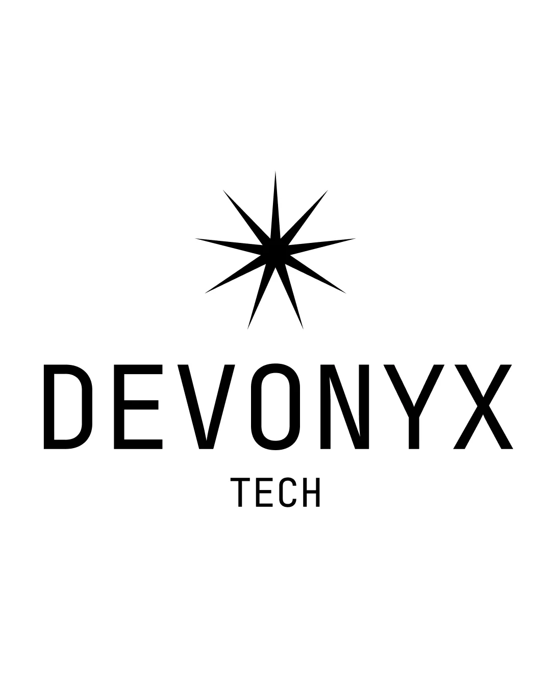
Strong, modern tech logo; clean, legible, and versatile but would benefit from minor mark refinements and increased distinctiveness.
Focus on the changes that matter. Keep what makes the logo work.
The starburst symbol suggests innovation or a guiding light, supporting a modern tech identity. The typography is clean and assertive, with the star mark providing a distinctive visual anchor.
Prevents detail loss and ensures strong brand presence across touchpoints.
Improves logo functionality at small applications without altering core design.
The star and bold type are suitable for a tech brand, projecting innovation and clarity.

Inspect spacing with the guide. Optical balance may differ from geometric centering.
Get a clear logo score, key risks, and priority fix ideas before your client or audience sees it.
More credits needed
Add credits to continue without losing your work.
Then $7/month. Cancel anytime.
Essential logo review with AI
Estimated progress