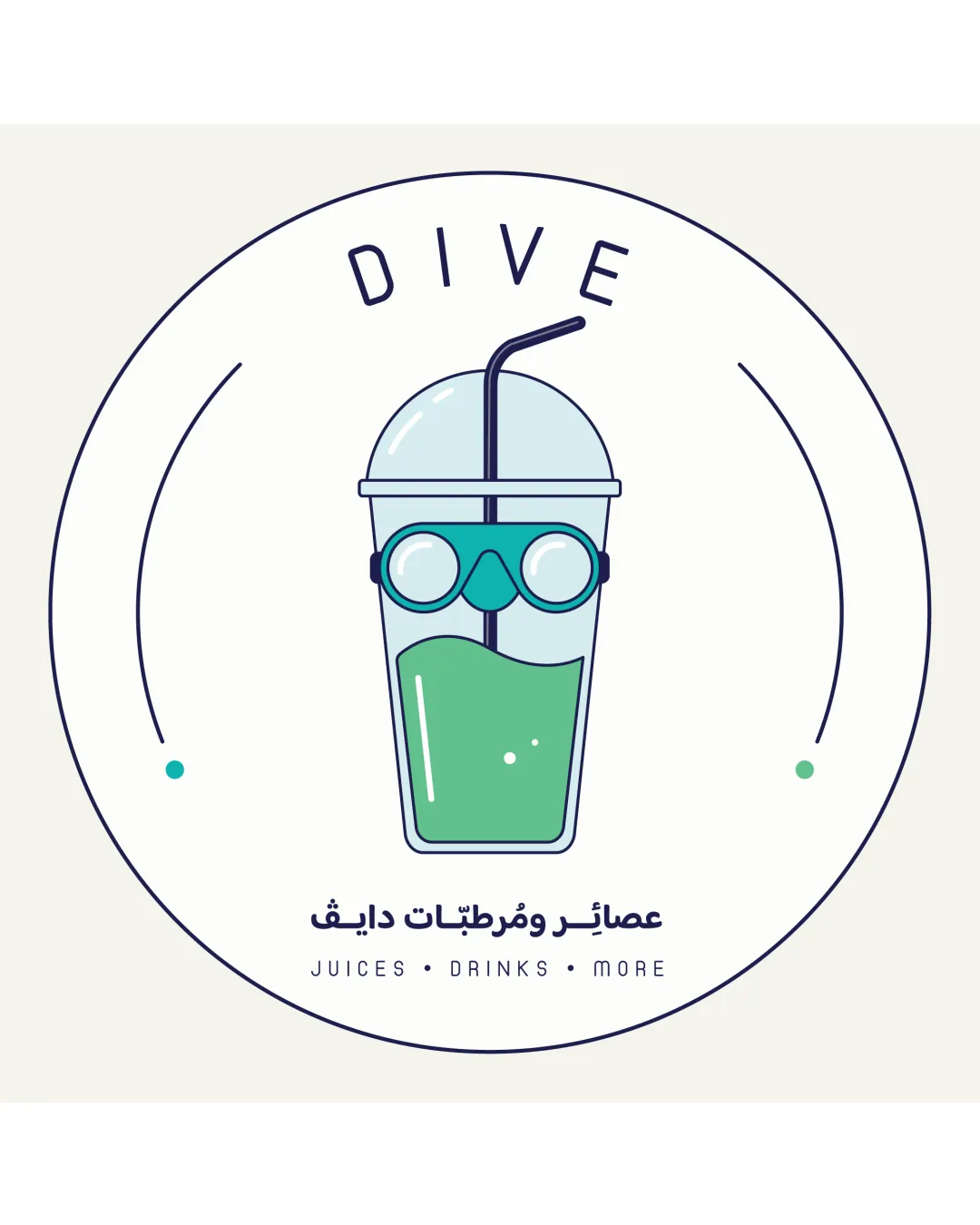
DIVE
JUICES • DRINKS • MORE logo review
4.5 / 5
Logo score
Logo review of

Dive Juices • Drinks • More

This is a distinctive, well-crafted logo with strong conceptual alignment for a juice and drinks brand, ready for professional use pending minor refinements.

Objective AI feedback. Your creative decision.

Combination Mark Modern Illustrated Minimalism Juices And Drinks
4.5/5
Legibility
4.5/5
Originality
5/5
Misread
4.5/5
Balance
4/5
Scale
Action plan

What to fix first

The most important fixes to handle before polishing the full presentation.

1

Increase tagline weight or develop a simplified mark-only version for very small-scale use.

Medium priority

Current tagline may become unreadable at reduced sizes.

Impact: Improves Legibility And Adaptability For All Applications. · Effort: Low

Detailed review

Logo performance breakdown

4.5/5

Legibility

Checkmark icon Main 'DIVE' wordmark is highly legible and spaced well.
Checkmark icon Tagline in English and Arabic is crisp and clear.

Warning icon Slight reduction in clarity for small sizes due to thin tagline type; minor only.

4.5/5

Originality

Checkmark icon Unique synthesis of diving and drink concepts.
Checkmark icon Illustration style is distinct and not generic.

Warning icon Visually playful, but the concept could be imitated.

4.5/5

Color harmony

Checkmark icon Fresh color palette fits beverage/juice industry; colors are cheerful and inviting.

Warning icon Color scheme could be more vibrant for maximum shelf standout.

Teal
#37928B

White
#FFFFFF

Navy
#22223B

Light Green
#90CBA2

Your palette is close. Refine the color roles and combinations before updating the logo.

Build brand colors
4.5/5

Balance alignment

Checkmark icon Centering is precise; icon is well positioned within the circular frame.
Checkmark icon Type, illustration, and white space are balanced.

Warning icon Minor tension between text and illustration spacing at the bottom.

logo 200x250 pixels scalability test alignment grid overlay
4/5

Scalability

Checkmark icon Bold lines and simple shapes maintain clarity at medium sizes.
Checkmark icon Icon is recognizable when scaled down.

Warning icon Thin tagline and some line details may diminish at small sizes.

logo 200x250 pixels scalability test

200x250 px

logo 100x125 pixels scalability test

100×125 px

logo 50x62 pixels scalability test

50×62 px

5/5

Misinterpretations

Checkmark icon No negative or confusing secondary interpretations.

5 / 5

Logo structure & brief match

Checkmark icon The integration is conceptually and visually seamless; mark and wordmark support each other.

Checkmark icon Brand Context: Juices And Drinks: Logo captures the energetic, refreshing theme of beverages with playfulness fitting for the category.

Try your own review

Wondering how your logo performs?

Get a clear logo score, key risks, and priority fix ideas before your client or audience sees it.

Review my logo