 View review
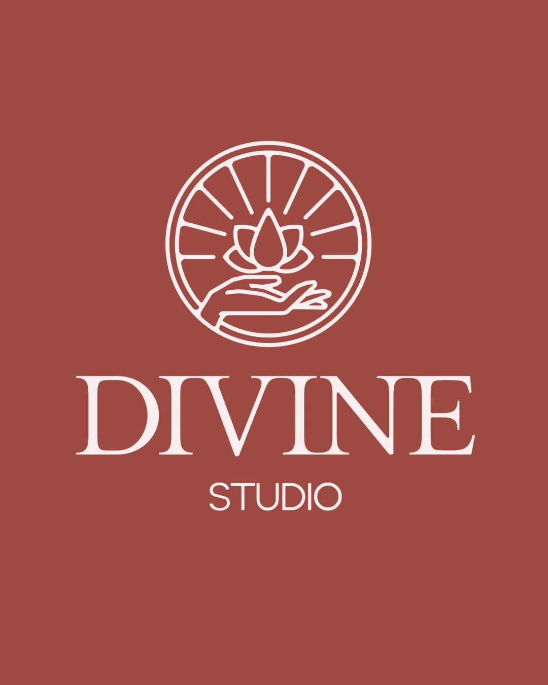
Logo score
Logo review of
Divine Studio
Review the detailed scores below to see what is working and what should be refined first.
Objective AI feedback. Your creative decision.
Legibility
Originality
Misread
Balance
Scale
Detailed review
Logo performance breakdown
Legibility
 Both 'DIVINE' and 'STUDIO' are highly legible with excellent font selection and spacing. Color contrast between text and background is strong, aiding readability.
Originality
Lotus and hand combination introduces some uniqueness relevant to the wellness sector. Radiating lines suggest energy or divinity, supporting the brand name.
 The lotus/hand motif is somewhat generic and common in the wellness/spa/therapy industry. No unexpected or standout visual twist that elevates the form.
Color harmony
Two-color palette is harmonious and sophisticated. Contrast ensures visibility and pleasant aesthetic.
Copper
#984C43
Seashell
#F6EAE4
Balance alignment
Overall layout is vertically centered, with balanced spacing between symbol and text. The symmetrical badge complements the centered text effectively.
The weight contrast between 'DIVINE' (serif, bold) and 'STUDIO' (sans-serif, light) introduces a minor visual imbalance.

Scalability
Minimalist line art style aids clarity in medium and large formats such as signage and print. Simple color palette ensures adaptability.
Delicate linework in the symbol may lose clarity or break apart in small-scale applications such as favicons, pens, or embroidery. Scaling down the text 'STUDIO' could render it unreadable.
200x250 px
100×125 px
50×62 px
Misinterpretations
No inappropriate or accidental imagery detected. Symbol supports the intended 'divine', healing, or nurturing message cleanly.
Symbol & text fit
Both symbol and text exude a calm, refined aesthetic suiting the brand.
Minor stylistic disparity between the more classical serif of 'DIVINE' and the modern sans-serif of 'STUDIO' as well as the pure line mark; the integration could be even more cohesive.
Try your own review
Review my logo
Wondering how your logo performs?
Get a clear logo score, key risks, and priority fix ideas before your client or audience sees it.
Keep exploring