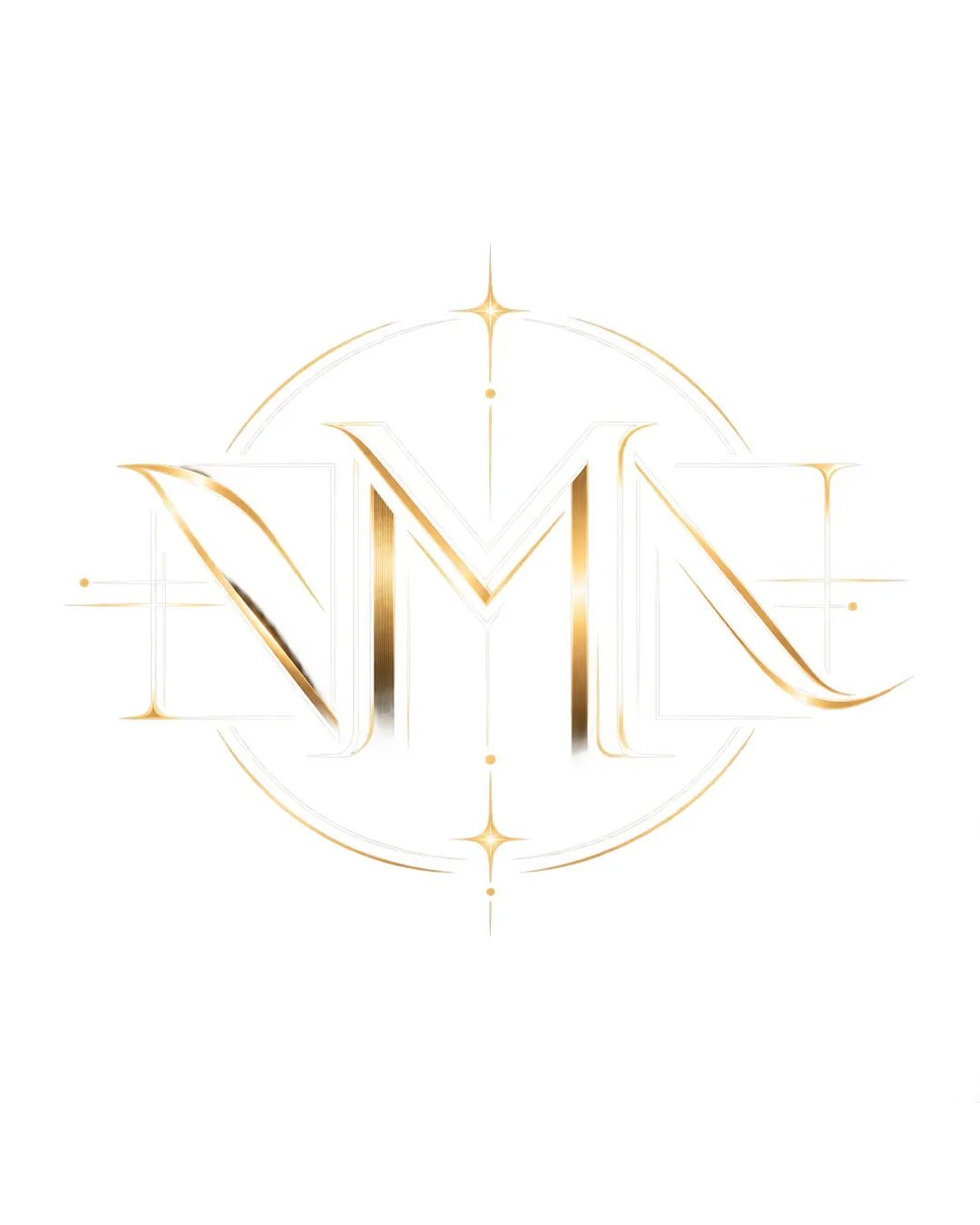
DMN logo review
3.6 / 5
Logo score
Logo review of

Dmn

A distinctive and elegant luxury monogram with strong balance, but requires minor contrast and detail adjustments for optimal versatility and clarity.

Objective AI feedback. Your creative decision.

Monogram Elegant, Modern, Metallic Luxury Goods
3/5
Legibility
4/5
Originality
4.5/5
Misread
4/5
Balance
2.5/5
Scale
Action plan

What to fix first

The most important fixes to handle before polishing the full presentation.

1

Increase contrast in the monogram's gold gradient or add a subtle outline for clarity on light backgrounds.

High priority

Faint strokes and gradients can become unreadable in print or small digital use.

Impact: Improves Legibility And Adaptability Across Media. · Effort: Medium

2

Simplify or reinforce starburst and thin accent details.

Medium priority

Fine elements risk disappearing or blurring at smaller scales.

Impact: Reduces Risk Of Detail Loss At Small Sizes And Enhances Logo's Versatility. · Effort: Low

Detailed review

Logo performance breakdown

3/5

Legibility

Checkmark icon Distinctive letter shapes, especially the 'M'.

Warning icon The overlapping forms and faint gold gradients reduce clarity, especially for the 'D' and 'N'.

4/5

Originality

Checkmark icon Distinct monogram integration with luxury cues.
Checkmark icon Gold gradients and stars add uniqueness.

Warning icon Monogram format is common in luxury but well executed here.

4/5

Color harmony

Checkmark icon Gold gradient conveys luxury and elegance.

Warning icon Some loss of contrast on white background.

Gold
#FFD700

White
#FFFFFF

Your palette is close. Refine the color roles and combinations before updating the logo.

Build brand colors
4/5

Balance alignment

Checkmark icon Well-balanced symmetrical layout.
Checkmark icon Circular guides and star accents center the composition.

Warning icon Letter spacing merges symbols, slightly affecting clean separation.

logo 200x250 pixels scalability test alignment grid overlay
2.5/5

Scalability

Checkmark icon Simple, continuous structure.

Warning icon Thin lines, gradients, and fine details will likely be lost or unreadable at small sizes.

logo 200x250 pixels scalability test

200x250 px

logo 100x125 pixels scalability test

100×125 px

logo 50x62 pixels scalability test

50×62 px

4.5/5

Misinterpretations

Checkmark icon No obvious misinterpretations or problematic forms visible.

Brief match

Checkmark icon Aesthetic: Elegant, high-end, and appropriate for luxury-oriented applications.

Try your own review

Wondering how your logo performs?

Get a clear logo score, key risks, and priority fix ideas before your client or audience sees it.

Review my logo