View review
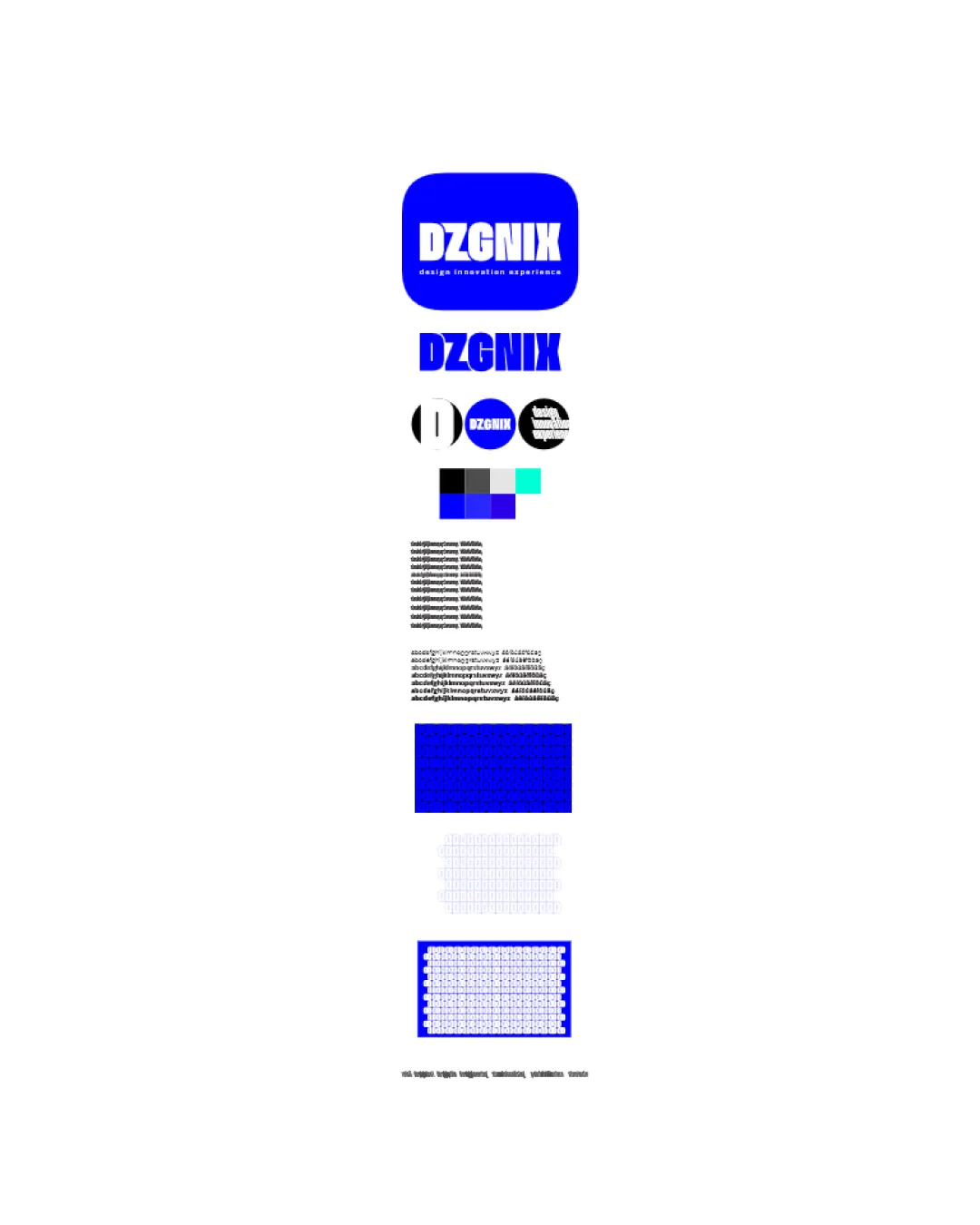
Dzgnix
An effective, legible corporate identity that would benefit from increased visual distinctiveness and consideration for small-scale clarity.
Objective AI feedback. Your creative decision.
What to fix first
The most important fixes to handle before polishing the full presentation.
Increase visual differentiation within the wordmark (e.g., subtle custom letterforms or unique negative space).
High priorityCurrent design is functional but visually generic in the design/innovation category.
Impact: Will Boost Originality And Reduce Generic Feel, Improving Memorability. · Effort: Medium
Test and refine minimum size usability, particularly for the tight condensed variants and rounded-square version.
Medium prioritySmall text and tightly set forms could become unreadable at reduced sizes.
Impact: Ensures Logo Clarity In All Applications. · Effort: Low
Logo performance breakdown
Legibility
Wordmark is bold and highly readable at most sizes
Condensed type and tight spacing may impact small-size readability
Originality
Modern look with boldness gives a distinctive impression
Wordmark and thick sans-serif style are somewhat generic without a unique twist
Color harmony
Consistent use of blue with black/white contrast is recognizable and strong
Palette is conventional for tech/design and lacks distinctiveness
Blue
#0037FF
White
#FFFFFF
Black
#000000
Cyan
#36E6E7
Light Gray
#CCCCCC
Your palette is close. Refine the color roles and combinations before updating the logo.
Build brand colorsBalance alignment
Lockups are visually centered with consistent margins
Variation in stroke thickness across applications could create inconsistencies
Scalability
Simple forms work in most sizes; flat style is versatile
Condensed typography may become less clear at tiny sizes; roundel variant could lose legibility when scaled down
200x250 px
100×125 px
50×62 px
Misinterpretations
No problematic ambiguity or misreadings detected
Logo structure & brief match
Lockup between mark and wordmark is orderly
Rounded square symbol is generic and doesn't add strong conceptual value to the wordmark
Design, Innovation, Experience: Font weight and clarity fit 'innovation'; visual simplicity matches 'design'; lacks overt reference to 'experience'.
Wondering how your logo performs?
Get a clear logo score, key risks, and priority fix ideas before your client or audience sees it.