 View review
Logo score
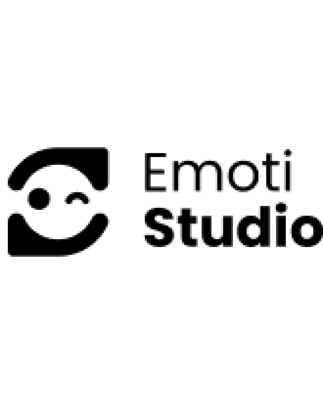
Logo review ofEmoti Studio
Review the detailed scores below to see what is working and what should be refined first.
Legibility
Originality
Misread
Balance
Scale
Detailed review
Logo performance breakdown
Legibility
![]() Text is clear and easy to read.
Text is clear and easy to read.![]() Good contrast between the text and the background.
Good contrast between the text and the background.
Originality
![]() Clever use of shapes to convey emotion in a unique, geometric way.
Clever use of shapes to convey emotion in a unique, geometric way.![]() Fresh approach to the emoji/smile theme without feeling generic.
Fresh approach to the emoji/smile theme without feeling generic.
![]() Use of a smiling face is very common, reducing some distinctiveness.
Use of a smiling face is very common, reducing some distinctiveness.
Color harmony
![]() Simple black-and-white palette ensures high versatility.
Simple black-and-white palette ensures high versatility.![]() No clashing or overwhelming colors.
No clashing or overwhelming colors.
Black
#000000
White
#FFFFFF
Balance alignment
![]() Overall balanced composition between logomark and wordmark.
Overall balanced composition between logomark and wordmark.![]() Good alignment gives a professional look.
Good alignment gives a professional look.
![]() The spacing between the symbol and text may feel slightly too loose, creating a subtle separation.
The spacing between the symbol and text may feel slightly too loose, creating a subtle separation.

Scalability
![]() Simple, bold shapes maintain clarity at small sizes.
Simple, bold shapes maintain clarity at small sizes.![]() Suitable for social media icons, business cards, and large signage.
Suitable for social media icons, business cards, and large signage.
![]() Very fine spacing between symbol elements could blur at extremely small sizes (such as tiny favicons or embroidery).
Very fine spacing between symbol elements could blur at extremely small sizes (such as tiny favicons or embroidery).
200x250 px
100×125 px
50×62 px
Misinterpretations
![]() No inappropriate or confusing shapes detected.
No inappropriate or confusing shapes detected.
Symbol & text fit
![]() Font weight and logomark share a modern, approachable style.
Font weight and logomark share a modern, approachable style.
![]() Text does not overpower or underwhelm the symbol.
Text does not overpower or underwhelm the symbol.
Try your own review
Review my logo
Wondering how your logo performs?
Get a clear logo score, key risks, and priority fix ideas before your client or audience sees it.
Keep exploring


