Wondering how your logo performs? 🧐
Get professional logo reviews in seconds and catch design issues in time.
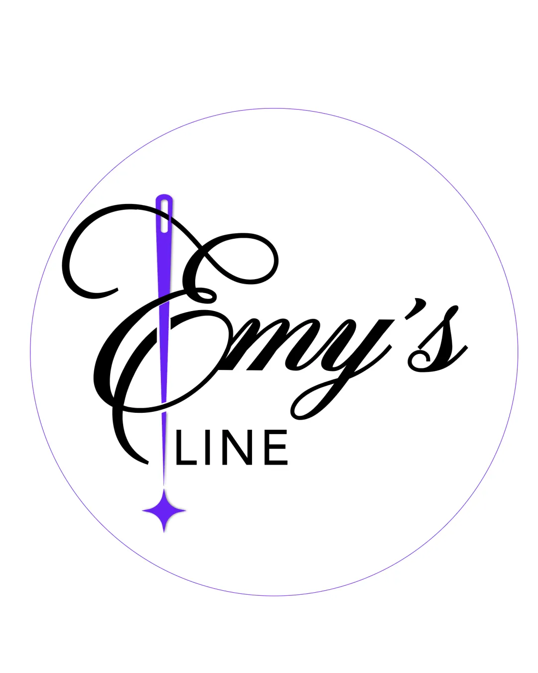
Try it Now!Logo review of Emy's LINE
 Logo analysis by AI
Logo type:
Style:
Detected symbol:
Detected text:
Business industry:
Review requested by Emine
**If AI can recognize or misinterpret it, so can people.
Structured logo review
Legibility
![]() The word 'LINE' is very clear and uses a straightforward sans-serif font.
The word 'LINE' is very clear and uses a straightforward sans-serif font.![]() The script font choice for 'Emy’s' gives a premium and elegant feel suitable for fashion.
The script font choice for 'Emy’s' gives a premium and elegant feel suitable for fashion.
![]() The elaborate flourishes of the 'E' can make it hard to read, especially at smaller sizes.
The elaborate flourishes of the 'E' can make it hard to read, especially at smaller sizes.![]() Contrast between the needle and script overlaps, making the 'E' busy and less legible in compact spaces.
Contrast between the needle and script overlaps, making the 'E' busy and less legible in compact spaces.
Scalability versatility
![]() Logo would stand out on large signage and fashion tags.
Logo would stand out on large signage and fashion tags.
![]() The thin details in the needle and intricate script are likely to be lost on small applications like business cards, embroidery, or small labels.
The thin details in the needle and intricate script are likely to be lost on small applications like business cards, embroidery, or small labels.![]() The star embellishment and overlapping elements reduce clarity at reduced scale.
The star embellishment and overlapping elements reduce clarity at reduced scale.
200x250 px
100×125 px
50×62 px
Balance alignment
![]() Center alignment of main elements conveys intentional design and structure.
Center alignment of main elements conveys intentional design and structure.
![]() The needle as part of the ‘E’ creates a heavy left side, unbalancing the visual weight with the right-leaning 'my’s.'
The needle as part of the ‘E’ creates a heavy left side, unbalancing the visual weight with the right-leaning 'my’s.'![]() The baseline difference between ‘Emy’s’ and ‘LINE’ may look disconnected.
The baseline difference between ‘Emy’s’ and ‘LINE’ may look disconnected.

Originality
![]() Creative integration of a sewing needle into the letter ‘E’ is relevant and unique in the fashion/handcraft industry.
Creative integration of a sewing needle into the letter ‘E’ is relevant and unique in the fashion/handcraft industry.![]() The star-shaped shine enhances the theme.
The star-shaped shine enhances the theme.
![]() Script usage is common in fashion, slightly reducing overall originality.
Script usage is common in fashion, slightly reducing overall originality.
Logomark wordmark fit
![]() Needle and script work harmoniously to showcase tailoring or sewing elements.
Needle and script work harmoniously to showcase tailoring or sewing elements.![]() Wordmark and symbol have an intertwined concept, which is a strong integration.
Wordmark and symbol have an intertwined concept, which is a strong integration.
![]() Discrete font styles (script vs. geometric sans-serif) break cohesion somewhat.
Discrete font styles (script vs. geometric sans-serif) break cohesion somewhat.
Aesthetic look
![]() Sophisticated, feminine, and visually engaging.
Sophisticated, feminine, and visually engaging.![]() Color palette is tasteful and uncluttered.
Color palette is tasteful and uncluttered.
![]() Ornamental details are close to excess, verging on crowded in the main logomark.
Ornamental details are close to excess, verging on crowded in the main logomark.
Dual meaning and misinterpretations
![]() No obvious inappropriate interpretations or ambiguous shapes detected. Clear tailoring/fashion metaphor.
No obvious inappropriate interpretations or ambiguous shapes detected. Clear tailoring/fashion metaphor.
Color harmony
![]() Good use of limited palette; the purple accent draws attention without overwhelming the design.
Good use of limited palette; the purple accent draws attention without overwhelming the design.![]() Black and purple combination delivers sophistication.
Black and purple combination delivers sophistication.
Purple
#3C2270
Black
#000000
White
#FFFFFF


