View review
Logo score
Logo review of
Essence
Review the detailed scores below to see what is working and what should be refined first.
Objective AI feedback. Your creative decision.
Legibility
Originality
Misread
Balance
Scale
Detailed review
Logo performance breakdown
Legibility
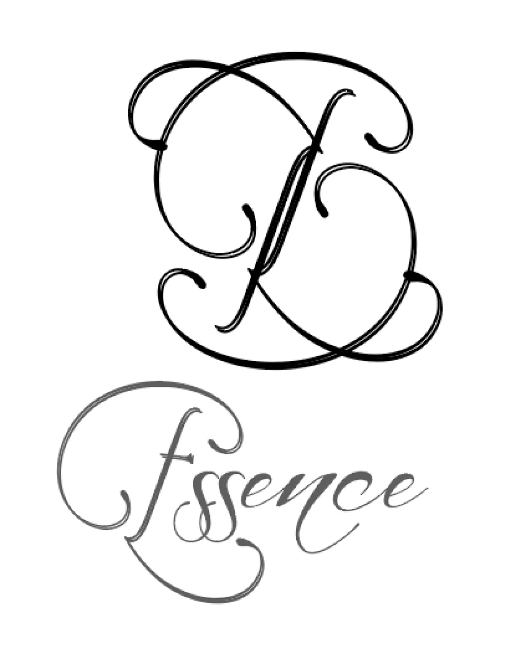
 The text 'Essence' uses elegant letterforms that could be attractive in a luxury context.
 Legibility is severely compromised due to excessive flourishes and decorative strokes. The uppercase E and the f overlap and blend into each other, making the initial read confusing. At smaller scales, the script becomes hard to decipher and visually messy.
Originality
The monogram is custom and has a distinctive ornamental flair. Calligraphic approach sets it apart from generic sans-serif wordmarks.
Script-based, flourish-heavy logos are very common in beauty and luxury industries, making the core idea less unique. No innovative use of negative space or creative dual-meaning is present.
Color harmony
Use of black and gray is tasteful, timeless, and does not overwhelm the senses. Monochrome palette helps evoke sophistication.
Subtle gray can cause legibility issues against light backgrounds in some use cases.
Black
#000000
Gray
#757575
White
#FFFFFF
Your palette is close. Refine the color roles and combinations before updating the logo.
Build brand colorsBalance alignment
The monogram and wordmark are both highly stylized, creating some visual consistency.
The heavy flourishes cause visual imbalance as the top monogram feels heavier and more dominant than the lighter wordmark below. The connection between the capital F/E and the rest of the word isn't harmonious, making the composition feel disjointed. The alignment between the monogram and the wordmark is not clearly defined.

Scalability
Ornate script could stand out on large print materials such as wedding invitations or high-end packaging.
Thin, intricate lines will disappear at small sizes, making the logo unusable on business cards, favicons, or embroidery. Level of detail is too high for practical, multi-format application. Poor contrast between the thin elements and the background in grayscale presentations.
200x250 px
100×125 px
50×62 px
Misinterpretations
No inappropriate or unintended visual meanings detected.
Symbol & text fit
Both the logomark and the wordmark follow a similar script style.
The logomark is more densely decorated than the wordmark, creating a jarring difference in visual weight.
There is little integration or interplay between the two elements; they feel like separate pieces rather than a cohesive whole.
Try your own review
Review my logo
Wondering how your logo performs?
Get a clear logo score, key risks, and priority fix ideas before your client or audience sees it.
Keep exploring