Legibility
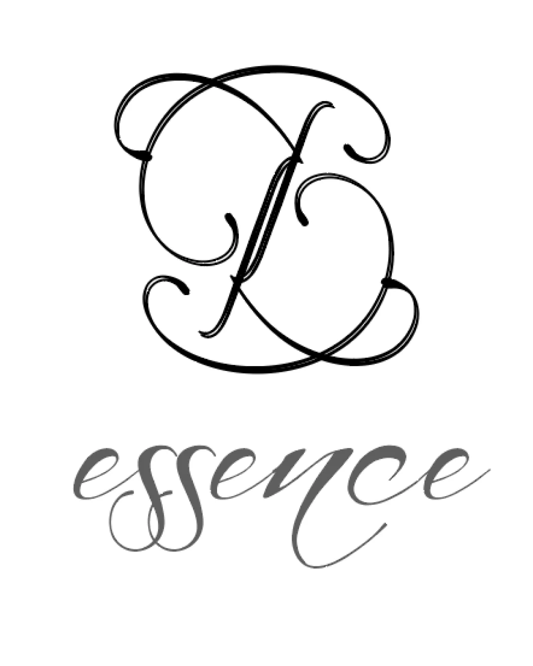
- Lower wordmark 'essence' is mostly readable despite elaborate script.
- Monogram is excessively ornate, making identification of the 'F' and 'E' challenging.
- The monogram’s flourishes overlap and obscure letterforms.
- Script font for 'essence' presents minor legibility issues with closely spaced and overlapping letters.