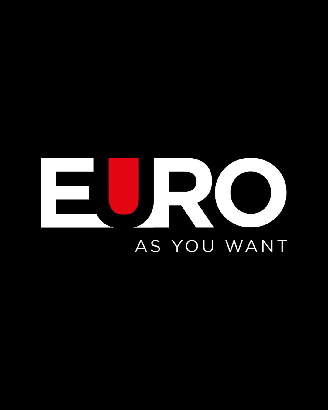
EURO AS YOU WANT logo review
4/5
Logo score
Logo review of

Euro As You Want

A visually strong, modern wordmark elevated by its bold use of color; minor spacing tweaks and stronger conceptual linkage would further enhance it.

Wordmark Modern Minimal Sans-serif Industry
5/5
Legibility
4/5
Originality
5/5
Misread
3/5
Balance
4/5
Scale
Your next steps

What to fix first

Focus on the changes that matter. Keep what makes the logo work.

1

wordmark spacing (upper horizontal band)

Adjust kerning between 'U' and 'R' to ensure smoother transitions.

Optional refinement Medium priority Low effort
Area to inspectApproximate location

Kerning between some letters (notably the transition from the red 'U' to 'R') feels slightly uneven, which can disrupt visual flow.

How to check

Review the wordmark at various sizes for uniform spacing impression.

See the category review
2

red 'U' in 'EURO' (upper horizontal band)

Explore a subtle visual element or tweak to root the red 'U' in the industry context.

Optional refinement Medium priority Medium effort
Area to inspectApproximate location

The bold red 'U' enhances distinctiveness but may not have an apparent conceptual link to 'industry.'

How to check

Ask target users if the red 'U' communicates anything related to the intended industry purpose.

See the category review
Detailed review

Logo performance breakdown

4/5

Brief & logo match

Based on an inferred industry
Compared with

industry

The design communicates modern industry professionalism, but the red 'U' accent does not clearly signal a specific field.

  • Modern Look

    Bold sans-serif font and red accent create a fresh, current impression.

  • Visibility And Impact

    Large, high-contrast typography stands out well against the black background.

5/5

Legibility

  • Clear, bold letterforms for both wordmark and tagline.
  • High contrast ensures readability at many sizes.
4/5

Originality

  • The colored 'U' is a smart, memorable twist.
  • Distinct separation from a generic sans-serif wordmark.
  • The bold red 'U' enhances distinctiveness but may not have an apparent conceptual link to 'industry.'

    Optional refinement red 'U' in 'EURO' (upper horizontal band)

    Try: Explore a subtle visual element or tweak to root the red 'U' in the industry context.

    Check: Ask target users if the red 'U' communicates anything related to the intended industry purpose.

    Area to inspectApproximate location
4/5

Color harmony

  • Red accent energizes the palette.
  • Black and white provide solid contrast.
  • Red draws focus but appears abruptly in an otherwise monochrome palette; this may hint at an inconsistent color strategy for brand materials.

    Optional refinement red 'U' color usage (upper horizontal band)

    Try: Consider supporting the red accent with minor secondary uses or rationalizing it as the only accent color.

    Check: Preview the primary and secondary brand applications for a consistent use of the red accent.

White#FFFFFF
Red#FF0000
Black#000000

Estimated colors. Use the original design file for exact values.

Create a full color palette using these colors

Create new palette
3/5

Balance alignment

  • Strong central layout.
  • Attention-grabbing composition.
  • Kerning between some letters (notably the transition from the red 'U' to 'R') feels slightly uneven, which can disrupt visual flow.

    Optional refinement wordmark spacing (upper horizontal band)

    Try: Adjust kerning between 'U' and 'R' to ensure smoother transitions.

    Check: Review the wordmark at various sizes for uniform spacing impression.

    Area to inspectApproximate location
Uploaded logoAlignment guide overlay

Inspect spacing with the guide. Optical balance may differ from geometric centering.

4/5

Scalability

  • Clean lines and limited detail scale well.
  • Single-color adaptability is likely with small tweaks.
Uploaded logo at 200 pixels wide
200 × 250 px
Uploaded logo at 100 pixels wide
100 × 125 px
Uploaded logo at 50 pixels wide
50 × 63 px

Compare the detail at different sizes. Labels show the full image dimensions.

5/5

Misinterpretations

  • No unintended or distracting secondary readings detected.

Black & white

Does the shape still work without color?

These tests are available only for logos uploaded in vector (SVG) format.

Background contrast

Find the surfaces where your logo stays clear.

These tests are available only for logos uploaded in vector (SVG) format.

Blur & silhouette

A 3px blur softens fine details so you can check whether the overall shape stays recognizable. If key gaps close or elements merge, the logo may rely too heavily on detail.

These tests are available only for logos uploaded in vector (SVG) format.

Try your own review

Wondering how your logo performs?

Get a clear logo score, key risks, and priority fix ideas before your client or audience sees it.

Review my logo