Europium63 logo review
4/5
Logo score
Logo review of

Europium63

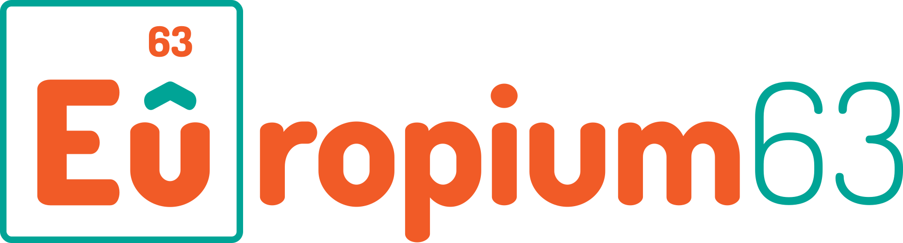
Inventive and distinctive identity with strong visual and conceptual connection to creativity and precision, needing only minor refinement for scalability.

Combination Mark Playful Geometric Wordmark With Scientific Motif Creative/design
4/5
Legibility
4/5
Originality
5/5
Misread
4/5
Balance
3/5
Scale
Your next steps

What to fix first

Focus on the changes that matter. Keep what makes the logo work.

1

periodic table 'Eu' square and accent mark

Test logo reduction at smaller sizes to ensure all elements remain legible.

Worth testing High priority Low effort
Area to inspectApproximate location

Small text '63' and thin accent above 'u' may be hard to reproduce at small sizes.

How to check

Print or display logo at badge/business card size and inspect clarity of '63' and the accent mark.

See the category review
2

full artwork

Consider testing a refinement for color hierarchy or accent optimization for improved clarity and harmony.

Optional refinement Medium priority Low effort

Orange and teal deliver strong contrast and energy but may appear visually busy against the dark background.

How to check

Show variants with adjusted color prominence and gather feedback on viewer focus and visual comfort.

See the category review
Detailed review

Logo performance breakdown

5/5

Brief & logo match

Based on your brief
Compared with

Graphic design agency

Logo cleverly aligns with the agency's creative profile and delivers a memorable, sophisticated, and relevant brand icon.

  • Creative/Scientific Theme

    Periodic table mark supports a smart, design-savvy identity for an agency.

  • Memorability

    Distinctive scientific motif stands out among typical agency brands.

4/5

Legibility

  • Bold, clear wordmark
  • Readable text with creative flair
4/5

Originality

  • Inventive use of periodic table concept
4/5

Color harmony

  • Energetic color usage
  • Contrast enhances differentiation
  • Orange and teal deliver strong contrast and energy but may appear visually busy against the dark background.

    Optional refinement full artwork

    Try: Consider testing a refinement for color hierarchy or accent optimization for improved clarity and harmony.

    Check: Show variants with adjusted color prominence and gather feedback on viewer focus and visual comfort.

Orange#F15A27
Teal#00B3A6
White#FFFFFF
Charcoal#232124

Estimated colors. Use the original design file for exact values.

Create a full color palette using these colors

Create new palette
4/5

Balance alignment

  • Cohesive modular structure
  • Good alignment between mark and type
Uploaded logoAlignment guide overlay

Inspect spacing with the guide. Optical balance may differ from geometric centering.

3/5

Scalability

  • Main text scales well
  • Small text '63' and thin accent above 'u' may be hard to reproduce at small sizes.

    Worth testing periodic table 'Eu' square and accent mark

    Try: Test logo reduction at smaller sizes to ensure all elements remain legible.

    Check: Print or display logo at badge/business card size and inspect clarity of '63' and the accent mark.

    Area to inspectApproximate location
Uploaded logo at 200 pixels wide
200 × 250 px
Uploaded logo at 100 pixels wide
100 × 125 px
Uploaded logo at 50 pixels wide
50 × 63 px

Compare the detail at different sizes. Labels show the full image dimensions.

5/5

Misinterpretations

  • Clear scientific reference with no visual ambiguities
5/5

Symbol & text fit

  • Seamlessly integrates mark with wordmark

Black & white

Does the shape still work without color?

Preparing artwork...

Background contrast

Find the surfaces where your logo stays clear.

Compare the mark and lettering on each surface.

Blur & silhouette

A 3px blur softens fine details so you can check whether the overall shape stays recognizable. If key gaps close or elements merge, the logo may rely too heavily on detail.

Original
3px blur

Look for clear separation between shapes and a distinctive outline.

Try your own review

Wondering how your logo performs?

Get a clear logo score, key risks, and priority fix ideas before your client or audience sees it.

Review my logo