 View review
Logo score
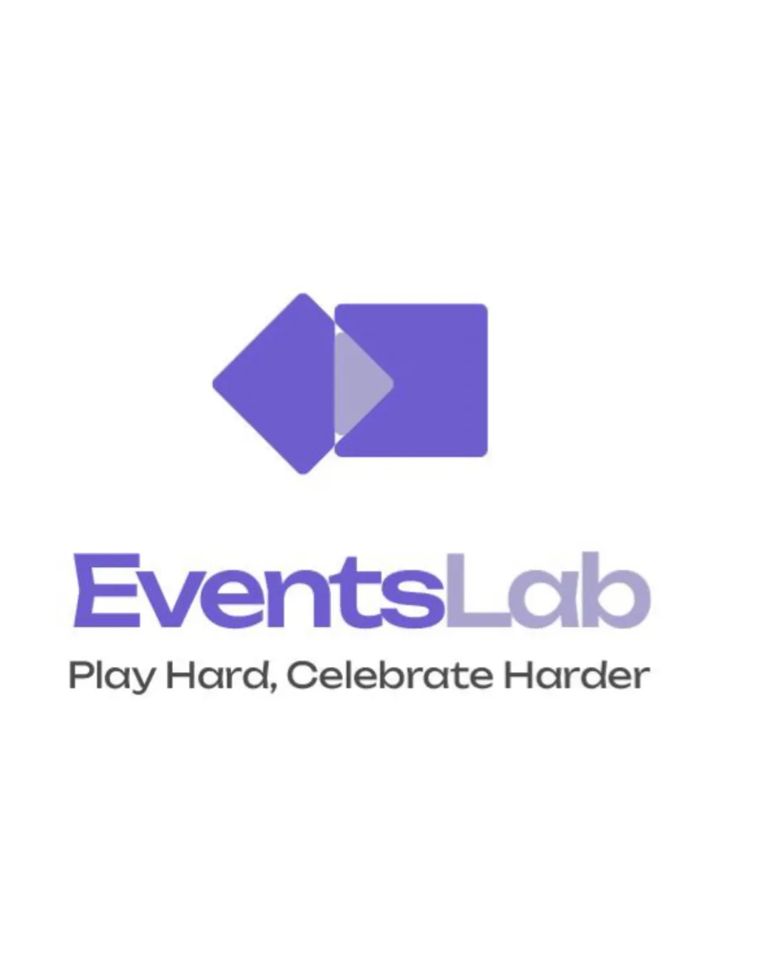
Logo review ofEventslab
Review the detailed scores below to see what is working and what should be refined first.
Legibility
Originality
Balance
Scale
Detailed review
Logo performance breakdown
Legibility
![]() I assume the business name is EventsLab, with the tagline Play Hard, Celebrate Harder.
I assume the business name is EventsLab, with the tagline Play Hard, Celebrate Harder.
![]() Thin lines in the tagline may reduce legibility at smaller sizes.
Thin lines in the tagline may reduce legibility at smaller sizes.
Originality
![]() The overlapping shapes add some uniqueness.
The overlapping shapes add some uniqueness.
![]() The geometric shapes are quite common in logos.
The geometric shapes are quite common in logos.
Color harmony
![]() The purple shades are cohesive and pleasing.
The purple shades are cohesive and pleasing.
Balance alignment
![]() The logomark and wordmark are well balanced and aligned.
The logomark and wordmark are well balanced and aligned.

Scalability
![]() The geometric logomark adapts well to various sizes.
The geometric logomark adapts well to various sizes.
![]() Fine details in the tagline could be lost at smaller scales.
Fine details in the tagline could be lost at smaller scales.
200x250 px
100×125 px
50×62 px
Symbol & text fit
![]() The text and symbol complement each other well.
The text and symbol complement each other well.
Try your own review
Review my logo
Wondering how your logo performs?
Get a clear logo score, key risks, and priority fix ideas before your client or audience sees it.
Keep exploring


