 View review
Logo score
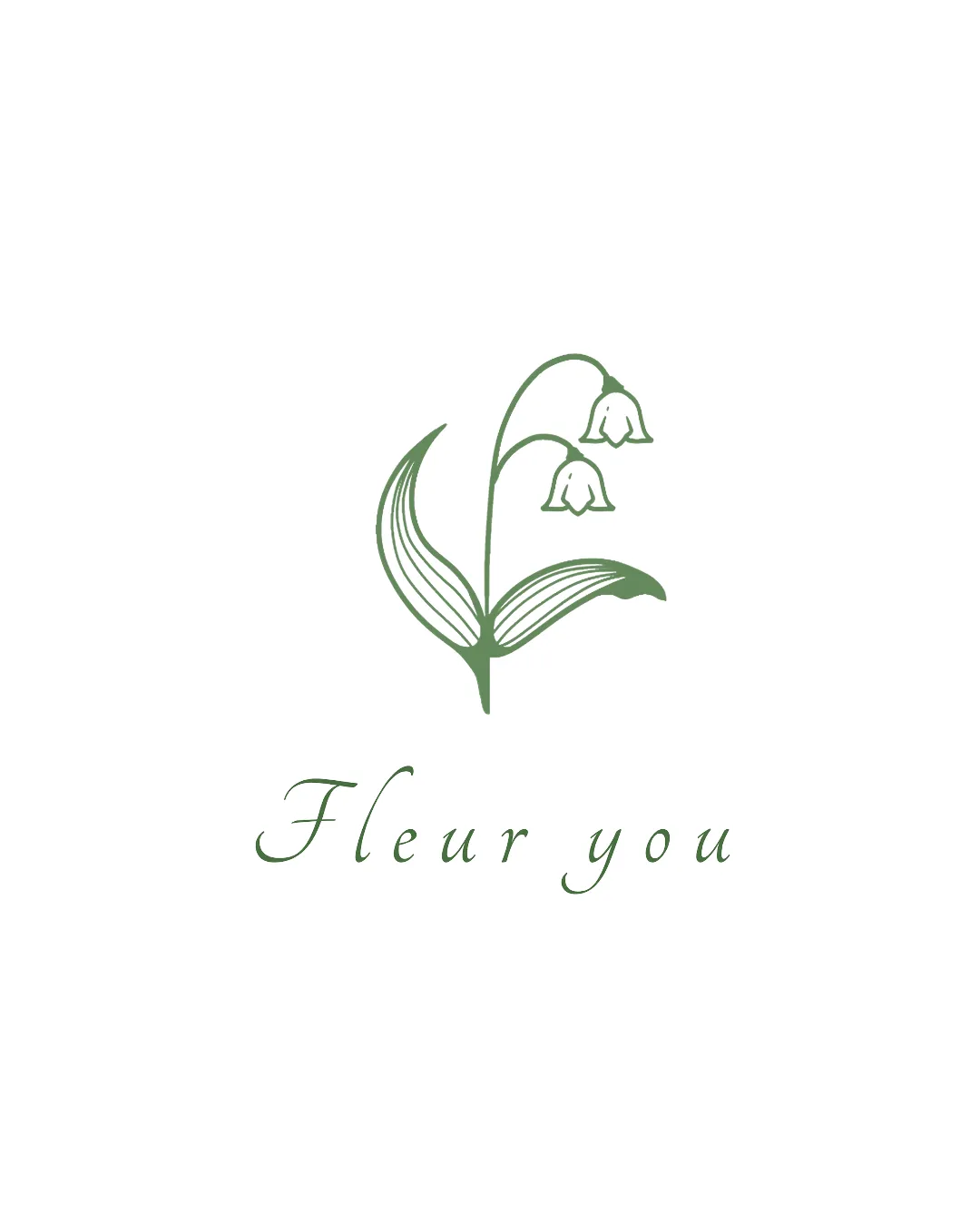
Logo review ofFleur You
Review the detailed scores below to see what is working and what should be refined first.
Legibility
Originality
Misread
Balance
Scale
Detailed review
Logo performance breakdown
Legibility
![]() Text is generally easy to read despite the cursive style.
Text is generally easy to read despite the cursive style.![]() Adequate spacing between letters avoids crowding.
Adequate spacing between letters avoids crowding.
![]() Cursive font may reduce legibility at very small scales.
Cursive font may reduce legibility at very small scales.![]() Lower contrast between the thin strokes and white background may cause issues when reduced further.
Lower contrast between the thin strokes and white background may cause issues when reduced further.
Originality
![]() Floral illustration is delicate and slightly stylized, giving a touch of uniqueness.
Floral illustration is delicate and slightly stylized, giving a touch of uniqueness.![]() Hand-drawn feel distinguishes it from some generic vector floral icons.
Hand-drawn feel distinguishes it from some generic vector floral icons.
![]() Floral imagery is widely used within the industry, so the concept lacks strong distinctiveness.
Floral imagery is widely used within the industry, so the concept lacks strong distinctiveness.![]() Name and floral tie-in feels somewhat literal and typical for this sector.
Name and floral tie-in feels somewhat literal and typical for this sector.
Color harmony
![]() Restrained two-tone palette is sophisticated and pleasing.
Restrained two-tone palette is sophisticated and pleasing.![]() Sufficient contrast between the green and white maintains clarity.
Sufficient contrast between the green and white maintains clarity.
Genoa
#70876c
White
#FFFFFF
Balance alignment
![]() Visual balance between the floral symbol and the wordmark.
Visual balance between the floral symbol and the wordmark.![]() Vertical alignment is consistent; design feels cohesive and well-centered.
Vertical alignment is consistent; design feels cohesive and well-centered.

Scalability
![]() Minimal line art style is adaptable for larger formats such as signage or packaging.
Minimal line art style is adaptable for larger formats such as signage or packaging.![]() Simple color palette allows for flexible use on light and dark backgrounds.
Simple color palette allows for flexible use on light and dark backgrounds.
![]() Thin lines in the floral illustration could lose detail or appear faint at small sizes, such as favicons or embroidery.
Thin lines in the floral illustration could lose detail or appear faint at small sizes, such as favicons or embroidery.![]() Script typeface may become illegible on business cards or very small applications.
Script typeface may become illegible on business cards or very small applications.
200x250 px
100×125 px
50×62 px
Misinterpretations
![]() No inappropriate or accidental imagery detected.
No inappropriate or accidental imagery detected.![]() Clear depiction of floral subject matter.
Clear depiction of floral subject matter.
Symbol & text fit
![]() Floral mark style is harmoniously matched with the elegance of the script typeface.
Floral mark style is harmoniously matched with the elegance of the script typeface.
![]() Proportions between symbol and wordmark are well-balanced.
Proportions between symbol and wordmark are well-balanced.
Try your own review
Review my logo
Wondering how your logo performs?
Get a clear logo score, key risks, and priority fix ideas before your client or audience sees it.
Keep exploring


