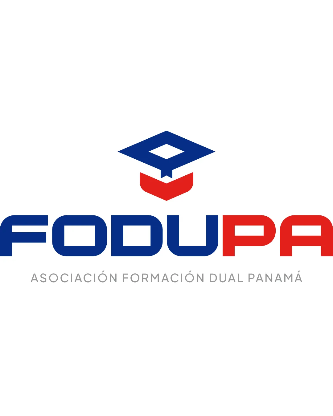
FODUPA ASOCIACIÓN FORMACIÓN DUAL PANAMÁ logo review
4.2 / 5
Logo score

Logo review ofFodupa Asociación Formación Dual Panamá

Solid and functional, but would benefit from refined mark-wordmark integration and a more distinctive visual approach.

Combination Mark Modern Educational Education
5/5
Legibility
3/5
Originality
5/5
Misread
4/5
Balance
4/5
Scale
Review next
Action plan

What to fix first

The most important fixes to handle before polishing the full presentation.

1

Strengthen the visual connection between the graduation cap symbol and the wordmark for more unity.

Medium priority

Currently, the separation between mark and text can make them feel like individual components.

Impact: Creates A More Cohesive Logo And Brand Impression. · Effort: Medium

2

Consider a unique twist or element within the graduation cap to enhance originality.

Medium priority

The mark risks blending in due to the generic symbol choice.

Impact: Improves Logo Distinction In A Crowded Educational Sector. · Effort: Medium

Detailed review

Logo performance breakdown

5/5

Legibility

Checkmark icon Main wordmark is bold and readable.
Checkmark icon Subtext is clear with adequate spacing.

3/5

Originality

Checkmark icon Stylized graduation cap is a relevant metaphor.

Warning icon Graduation cap is a highly common symbol in education logos.

5/5

Color harmony

Checkmark icon Patriotic colors suit the regional focus.
Checkmark icon Good contrast between blue, red, and supporting gray.

Dark Blue
#153A73

Red
#E21B1B

Gray
#A9A9A9

4/5

Balance alignment

Checkmark icon Well-centered symbol above wordmark.
Checkmark icon Good horizontal balance between blue and red.

Warning icon Graduation cap symbol is slightly detached visually from the main wordmark.

logo 200x250 pixels scalability test alignment grid overlay
4/5

Scalability

Checkmark icon Simple geometric forms scale well.
Checkmark icon Limited detail maintains clarity at smaller sizes.

Warning icon Thin strokes in subtext may lose visibility when reduced significantly.

logo 200x250 pixels scalability test

200x250 px

logo 100x125 pixels scalability test

100×125 px

logo 50x62 pixels scalability test

50×62 px

5/5

Misinterpretations

Checkmark icon No inappropriate or confusing visual misreadings.

4 / 5

Logo structure & brief match

Checkmark icon Symbol and wordmark both communicate education focus.

Warning icon Connection between symbol and text could be more visually integrated.

Checkmark icon Education/dual Training: The use of a graduation cap and institution-like typography aligns well with an educational association. The color palette and strong type feel suitable for formal and organizational use.

Try your own review

Wondering how your logo performs?

Get a clear logo score, key risks, and priority fix ideas before your client or audience sees it.

Review my logo