Wondering how your logo performs? 🧐
Get professional logo reviews in seconds and catch design issues in time.
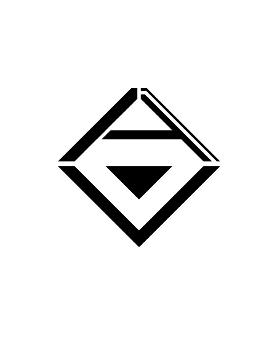
Try it Now!Logo review of G, A
 Logo analysis by AI
Logo type:
Style:
Detected symbol:
Negative space:
Detected text:
Business industry:
Review requested by Ryzen
**If AI can recognize or misinterpret it, so can people.
Structured logo review
Scalability versatility
![]() Bold geometric lines ensure good reproduction at multiple sizes.
Bold geometric lines ensure good reproduction at multiple sizes.![]() Simple color palette works well for monochrome applications and digital formats.
Simple color palette works well for monochrome applications and digital formats.
![]() Fine diagonal notch at the top right could lose detail at very small sizes, such as favicons or embroidery.
Fine diagonal notch at the top right could lose detail at very small sizes, such as favicons or embroidery.![]() Nested lines in tight spaces might blur when reduced.
Nested lines in tight spaces might blur when reduced.
200x250 px
100×125 px
50×62 px
Balance alignment
![]() Centralized diamond shape maintains strong visual symmetry.
Centralized diamond shape maintains strong visual symmetry.![]() Lines and spacing provide a sense of structure and balance.
Lines and spacing provide a sense of structure and balance.

Originality
![]() Integrates letterforms (G, A) in a clever angular composition.
Integrates letterforms (G, A) in a clever angular composition.![]() Minimalist geometric approach differentiates it from generic logomarks.
Minimalist geometric approach differentiates it from generic logomarks.
![]() Diamond monograms are somewhat common in real estate and luxury sectors, which makes the shape familiar, but the letter integration adds originality.
Diamond monograms are somewhat common in real estate and luxury sectors, which makes the shape familiar, but the letter integration adds originality.
Aesthetic look
![]() Modern, minimal, and elegantly structured.
Modern, minimal, and elegantly structured.![]() Avoids unnecessary decoration and clutter.
Avoids unnecessary decoration and clutter.
Dual meaning and misinterpretations
![]() No inappropriate or unclear secondary imagery identified.
No inappropriate or unclear secondary imagery identified.
Color harmony
![]() Monochrome palette is universally versatile and professional.
Monochrome palette is universally versatile and professional.![]() High contrast ensures legibility and impact.
High contrast ensures legibility and impact.
Black
#000000
White
#FFFFFF


