Wondering how your logo performs? 🧐
Get professional logo reviews in seconds and catch design issues in time.
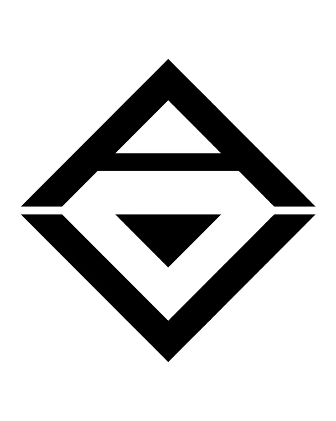
Try it Now!Logo review of G letter
 Logo analysis by AI
Logo type:
Style:
Detected symbol:
Negative space:
Detected text:
Business industry:
Review requested by Ryzen
**If AI can recognize or misinterpret it, so can people.
Structured logo review
Scalability versatility
![]() Bold, simple lines ensure good reproduction at most sizes.
Bold, simple lines ensure good reproduction at most sizes.![]() Logo would work well on billboards, packaging, app icons, and favicon due to clear geometric structure.
Logo would work well on billboards, packaging, app icons, and favicon due to clear geometric structure.
![]() Very thin negative space on fine print or embroidery might blur together, losing clarity at extremely small sizes.
Very thin negative space on fine print or embroidery might blur together, losing clarity at extremely small sizes.
200x250 px
100×125 px
50×62 px
Balance alignment
![]() Shape is perfectly symmetrical and visually centered.
Shape is perfectly symmetrical and visually centered.![]() Strong geometric consistency throughout.
Strong geometric consistency throughout.

Originality
![]() Monogram integrates the G in a geometric, diamond-shaped enclosure.
Monogram integrates the G in a geometric, diamond-shaped enclosure.![]() Use of negative space for an arrow is a subtle, smart touch.
Use of negative space for an arrow is a subtle, smart touch.
![]() Diamond/monogram approach is somewhat overused in technology sectors.
Diamond/monogram approach is somewhat overused in technology sectors.![]() G letterform isn't extremely unique in its execution, bordering on generic geometric.
G letterform isn't extremely unique in its execution, bordering on generic geometric.
Aesthetic look
![]() Minimalist and strong aesthetic, crisp lines.
Minimalist and strong aesthetic, crisp lines.![]() High contrast between black and white enhances visual appeal.
High contrast between black and white enhances visual appeal.
![]() May appear too stark or rigid to some audiences and lacks warmth/personality.
May appear too stark or rigid to some audiences and lacks warmth/personality.
Dual meaning and misinterpretations
![]() No inappropriate or confusing symbols detected.
No inappropriate or confusing symbols detected.![]() Arrow in negative space is clear and unobjectionable.
Arrow in negative space is clear and unobjectionable.
Color harmony
![]() Single color palette is timeless and versatile.
Single color palette is timeless and versatile.![]() Black and white provide maximum contrast and flexibility.
Black and white provide maximum contrast and flexibility.
Black
#000000
White
#FFFFFF


