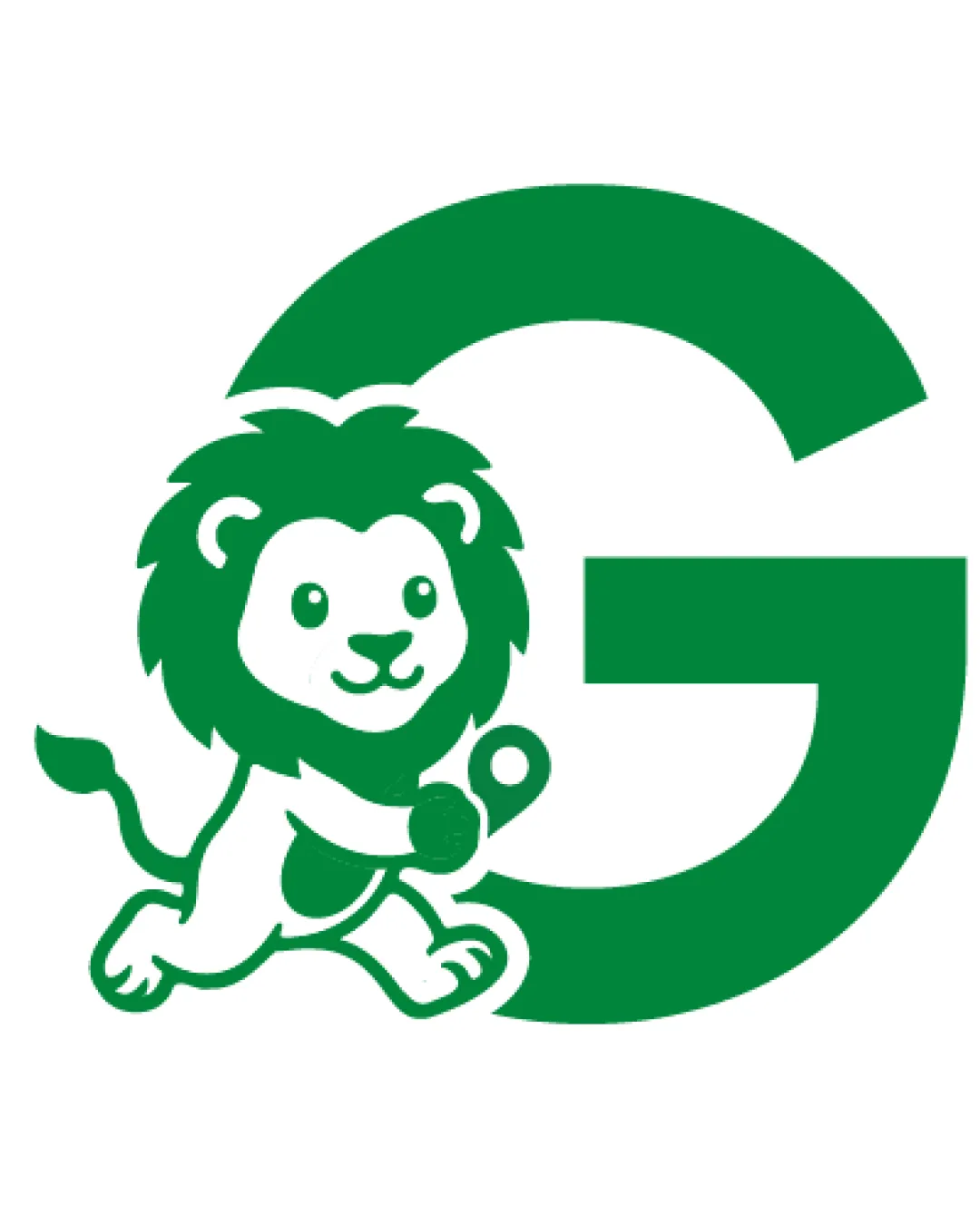
G logo review
4.0 / 5
Logo score
Logo review of

G

Strong, approachable mascot logo with good originality and cohesion. Tightening scalability and balance would further polish it.

Objective AI feedback. Your creative decision.

Combination Mark Cute Illustrative Mascot With Bold Geometric Letter Sports Or Education
5/5
Legibility
4/5
Originality
5/5
Misread
4/5
Balance
4/5
Scale
Action plan

What to fix first

The most important fixes to handle before polishing the full presentation.

1

Refine mascot details for tiny-size reproduction (simplify eye and inner face lines).

Medium priority

Small details could blur or merge when scaled down.

Impact: Improves Small-scale Clarity And Reproduction Quality. · Effort: Medium

2

Consider slight repositioning for perfect balance between mascot and G.

Low priority

Lion feels slightly left-heavy against the G.

Impact: Enhances Visual Equilibrium And Professionalism. · Effort: Low

Detailed review

Logo performance breakdown

5/5

Legibility

Checkmark icon G is instantly recognizable and large for clarity.

4/5

Originality

Checkmark icon Mascot approach with bold initial avoids generic look.

Warning icon Animal mascots with letters are a common concept; could seek deeper uniqueness.

4/5

Color harmony

Checkmark icon Solid, high-contrast green-and-white palette is friendly and clear.

Warning icon Palette is basic, could be enhanced for distinctiveness.

Green
#0A9441

White
#FFFFFF

Your palette is close. Refine the color roles and combinations before updating the logo.

Build brand colors
4/5

Balance alignment

Checkmark icon Lion well integrated with "G".
Checkmark icon Dynamic but grounded layout.

Warning icon Slight imbalance as lion is left-heavy; could refine positioning for more centered feel.

logo 200x250 pixels scalability test alignment grid overlay
4/5

Scalability

Checkmark icon Simple bold shapes aid scalability.
Checkmark icon Lion illustration is not overly detailed.

Warning icon Some small details (like the lion's face) may lose clarity at very small sizes.

logo 200x250 pixels scalability test

200x250 px

logo 100x125 pixels scalability test

100×125 px

logo 50x62 pixels scalability test

50×62 px

5/5

Misinterpretations

Checkmark icon No plausible misinterpretations.

Brief match

Checkmark icon Mascot Identity: Strong fit – logo is approachable and memorable for a mascot application.
Checkmark icon Industry Relevance: Appropriate for sports, education, or youth-oriented organizations.

Try your own review

Wondering how your logo performs?

Get a clear logo score, key risks, and priority fix ideas before your client or audience sees it.

Review my logo