Wondering how your logo performs? 🧐
Get professional logo reviews in seconds and catch design issues in time.
Try it Now!Logo review of GALUNA LIBRARY
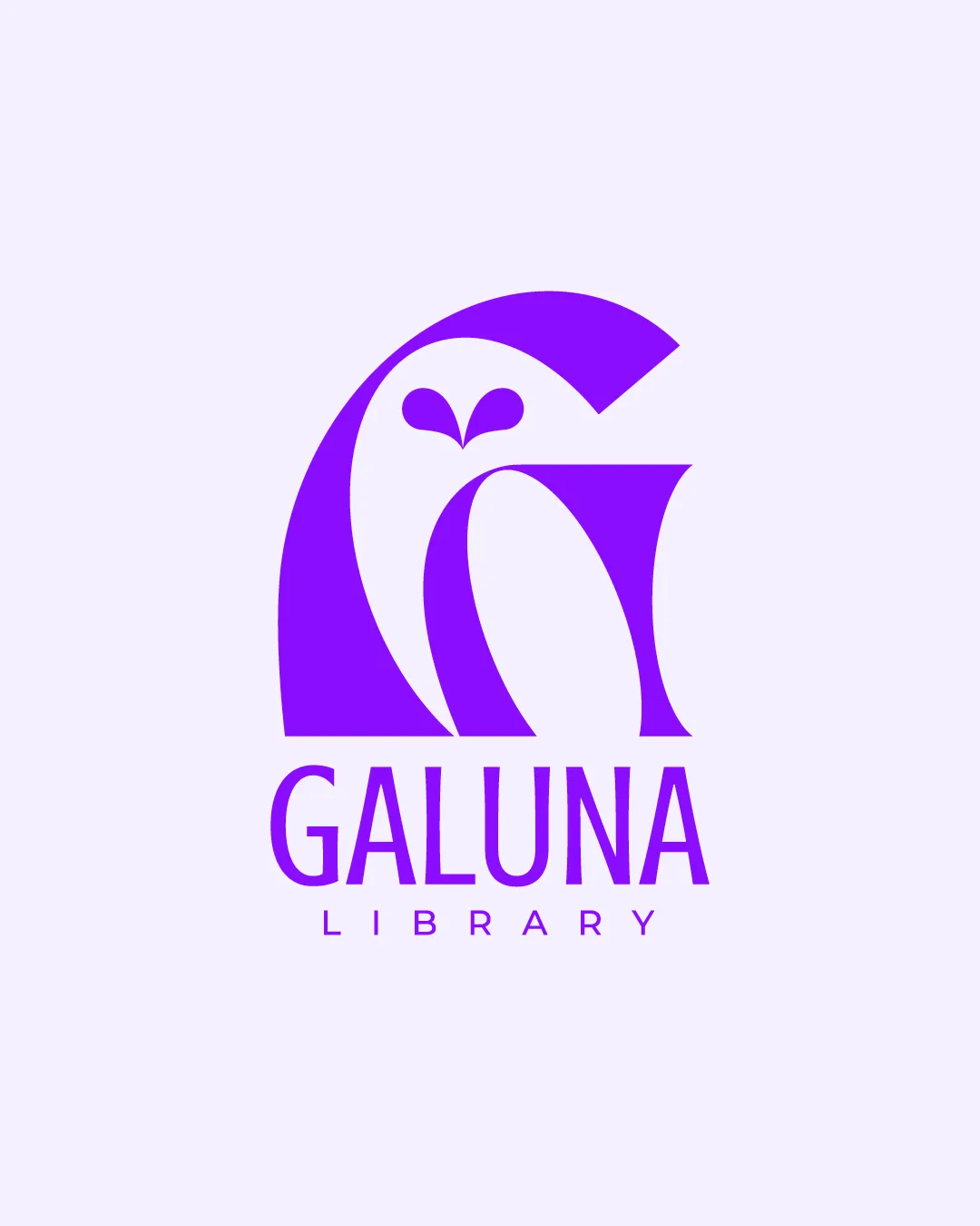
 Logo analysis by AI
Logo type:
Style:
Detected symbol:
Negative space:
Detected text:
Business industry:
Review requested by Graphstorm
**If AI can recognize or misinterpret it, so can people.
Structured logo review
Legibility
Clear and bold typography
High contrast with background
Scalability versatility
Simple shape retains clarity at various sizes
Suitable for business cards, signage, and digital use

200x250 px

100×125 px

50×62 px
Balance alignment
Well-balanced composition between symbol and text
Centrally aligned elements


Originality
Creative use of negative space to form an owl
Unique combination of monogram and animal symbol
Logomark wordmark fit
Cohesive design with both elements matching stylistically
Proportional sizing between text and symbol
Aesthetic look
Minimalistic and modern aesthetic
Eye-catching purple color scheme
Dual meaning and misinterpretations
No inappropriate symbolism detected
Clearly conveys intended message
Color harmony
Harmonious color palette with strong visual impact
Effective use of a single vibrant color
ElectricViolet
#8811FF
GhostWhite
#EDE9F0


