View review
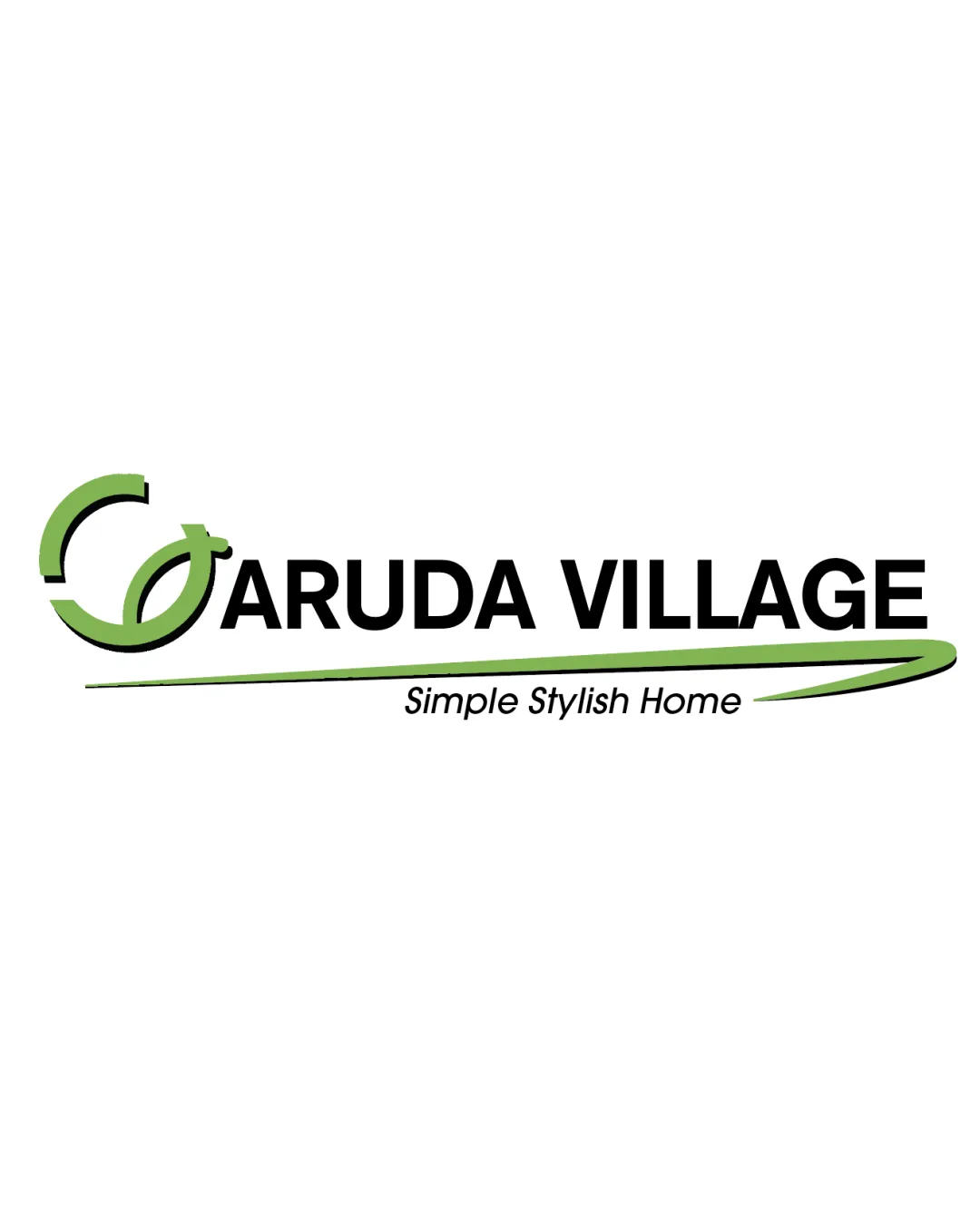
Garuda Village Simple Stylish Home
A solid, clean design for its sector, but would benefit from a more distinctive and specific symbol to elevate brand identity.
What to fix first
The most important fixes to handle before polishing the full presentation.
Refine symbol to create a more unique, property-oriented mark (roofline, window, or stylized 'G'), reducing generic feel.
High priorityCurrent mark resembles common eco/real estate motifs without a strong tie to the brand name or service.
Impact: Helps Brand Stand Out In A Crowded Real Estate Market, Improves Memorability. · Effort: Medium
Increase tagline size or offer simplified logo version for small uses.
Medium priorityTagline risks becoming unreadable at reduced scale.
Impact: Improves Remote Legibility And Preserves Key Messaging Across Platforms. · Effort: Low
Logo performance breakdown
Legibility
Primary wordmark is clear and readable
Tagline is legible at moderate sizes
Tagline may be difficult to read at very small sizes
Originality
Abstract symbol offers mild distinction
Symbol resembles many generic eco or leaf-themed marks in real estate
No highly unique feature
Color harmony
Green and black provide good contrast and a fresh, modern feel
Palette is very common in the sector and lacks individuality
Green
#7FC34A
Black
#000000
Your palette is close. Refine the color roles and combinations before updating the logo.
Build brand colorsBalance alignment
Horizontal alignment is well-structured
Elements are visually connected with the sweeping line
Standalone mark feels slightly disconnected from wordmark vertically
Linear flow of underline could be better integrated
Scalability
Simple forms scale moderately well
Mark and wordmark separate cleanly
Fine detail in swoosh and tagline may get lost at small sizes
200x250 px
100×125 px
50×62 px
Misinterpretations
No obvious unintended shapes or negative space issues
Logo structure & brief match
Mark uses matching color to palette of underline
Symbol's meaning not clearly linked to wordmark or sector
Industry: Styling and color are appropriate for real estate, signaling growth, reliability, and modern living.
Brand Message: 'Simple Stylish Home' tagline is supported by minimalistic, clean forms but doesn't feel highly elevated or memorable.
Wondering how your logo performs?
Get a clear logo score, key risks, and priority fix ideas before your client or audience sees it.