Wondering how your logo performs? 🧐
Get professional logo reviews in seconds and catch design issues in time.
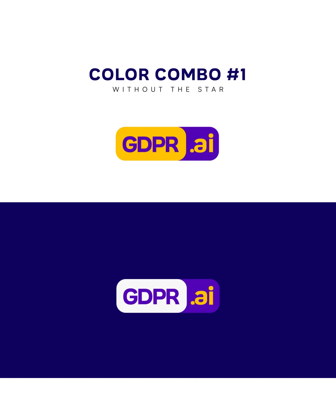
Try it Now!Logo review of GDPR .ai
 Logo analysis by AI
Logo type:
Style:
Detected symbol:
Detected text:
Business industry:
Review requested by Nimmo
**If AI can recognize or misinterpret it, so can people.
Structured logo review
Legibility
![]() Text is highly readable with strong contrast between text and background capsules.
Text is highly readable with strong contrast between text and background capsules.![]() Bold typography increases quick recognition.
Bold typography increases quick recognition.
Scalability versatility
![]() Simple, bold shape will work well on web headers and product packaging.
Simple, bold shape will work well on web headers and product packaging.![]() Minimal detail will transfer clearly to business cards and basic signage.
Minimal detail will transfer clearly to business cards and basic signage.
![]() Very thin spacing between capsules and the text may blur at favicon or small app icon sizes.
Very thin spacing between capsules and the text may blur at favicon or small app icon sizes.![]() Capsule shape might become generic or less memorable at reduced scales.
Capsule shape might become generic or less memorable at reduced scales.
200x250 px
100×125 px
50×62 px
Balance alignment
![]() Text is perfectly centered within its capsules for a clean, balanced appearance.
Text is perfectly centered within its capsules for a clean, balanced appearance.![]() The two-part capsule is visually unified.
The two-part capsule is visually unified.

Originality
![]() Distinct color blocking for the ‘.ai’ extension adds a slight modern twist.
Distinct color blocking for the ‘.ai’ extension adds a slight modern twist.
![]() Capsule-style wordmarks are increasingly common in the tech sector.
Capsule-style wordmarks are increasingly common in the tech sector.![]() Design does not introduce a unique symbol or creative lettering modifications.
Design does not introduce a unique symbol or creative lettering modifications.
Aesthetic look
![]() Clean, approachable, and highly professional appearance.
Clean, approachable, and highly professional appearance.![]() Color blocking elevates hierarchy and draws the eye to the ‘.ai’ ending.
Color blocking elevates hierarchy and draws the eye to the ‘.ai’ ending.
![]() Border between colors is abrupt and lacks smooth visual flow.
Border between colors is abrupt and lacks smooth visual flow.![]() Logo lacks distinctiveness and feels a bit too safe for the tech/AI sector.
Logo lacks distinctiveness and feels a bit too safe for the tech/AI sector.
Dual meaning and misinterpretations
![]() No inappropriate symbols or accidental negative compositions detected.
No inappropriate symbols or accidental negative compositions detected.
Color harmony
![]() Color palette is energetic, modern, and ensures high contrast.
Color palette is energetic, modern, and ensures high contrast.![]() Only two main accent colors used, with white for clarity.
Only two main accent colors used, with white for clarity.
![]() Yellow on white (in the alt version) could present legibility issues in some settings; consider more robust color pairing.
Yellow on white (in the alt version) could present legibility issues in some settings; consider more robust color pairing.
Deep Saffron
#FFD600
Purple
#371D67
White
#FFFFFF


