Refine the flower's geometry and center negative space for better optical harmony and smoother petal transitions.
Current form is basic and slightly stiff; refinement will elevate the brand perception.
Increases polish and sophistication.
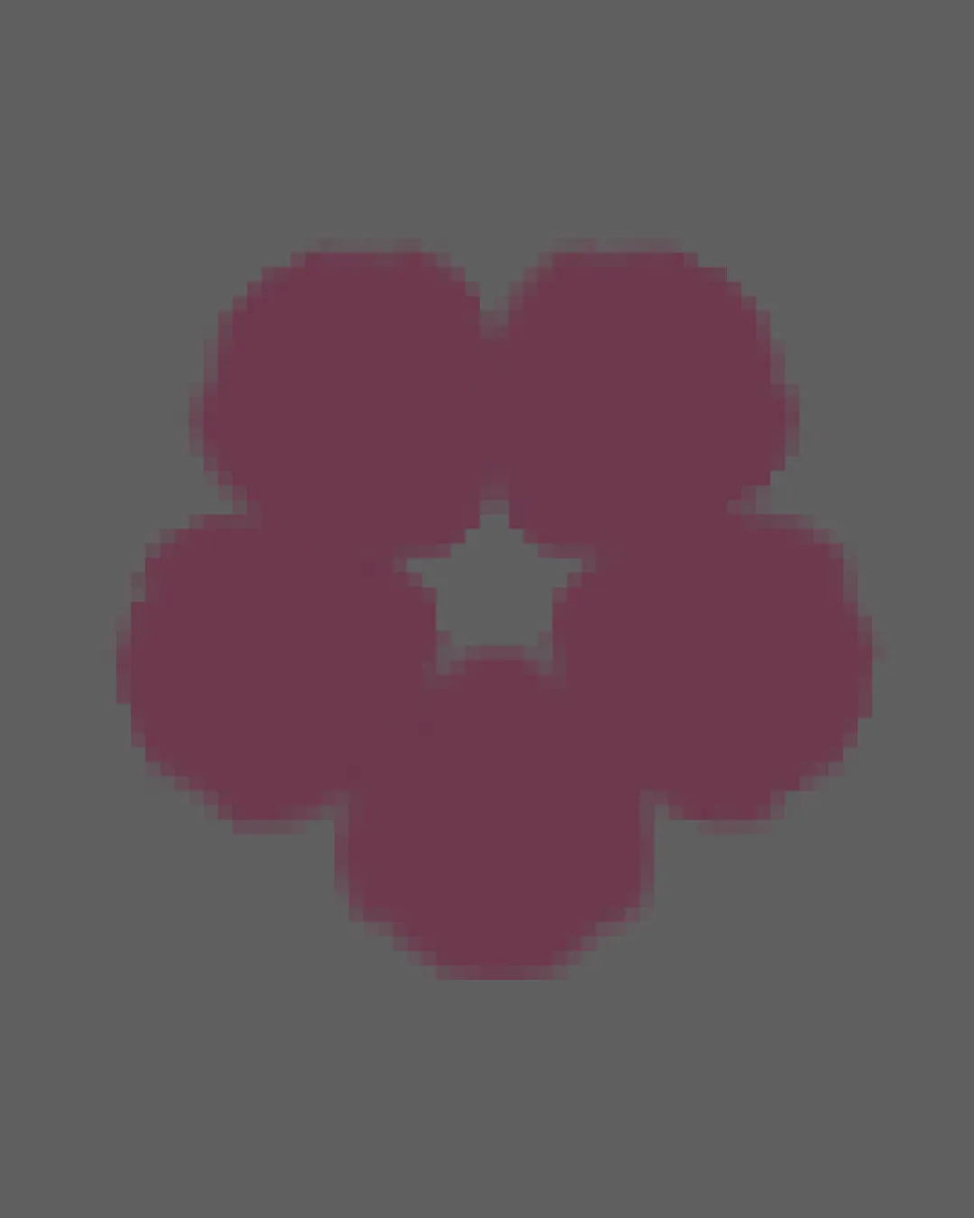
Functional abstract mark, but needs additional creativity and detail to become iconic or distinctively fit for Mauve Cafe.
Focus on the changes that matter. Keep what makes the logo work.
Current form is basic and slightly stiff; refinement will elevate the brand perception.
Increases polish and sophistication.
Currently too generic and misses some brief cues.
Improves identity cohesion and makes the logo more distinctive in the hospitality space.
Clearly contemporary and somewhat playful, but not particularly memorable or whimsical.
Estimated colors. Use the original design file for exact values.
Create a full color palette using these colors
Create new palette
Inspect spacing with the guide. Optical balance may differ from geometric centering.
Does the shape still work without color?
Find the surfaces where your logo stays clear.
A 3px blur softens fine details so you can check whether the overall shape stays recognizable. If key gaps close or elements merge, the logo may rely too heavily on detail.
Get a clear logo score, key risks, and priority fix ideas before your client or audience sees it.
More credits needed
Add credits to continue without losing your work.
Then $7/month. Cancel anytime.