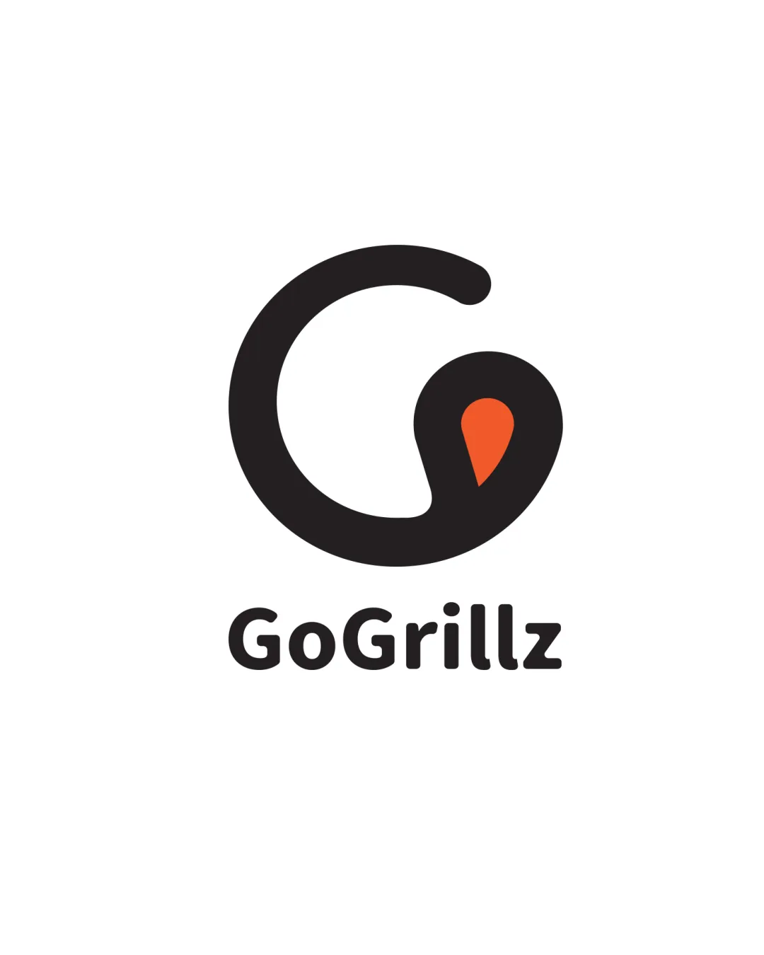
GoGrillz logo review
4/5
Logo score
Logo review of

Gogrillz

Strong, clear logo highly suitable for a modern Ghanaian shawarma or food delivery brand; justifies launch but could be pushed for even more distinctiveness.

Combination Mark Modern, Bold, Minimal Food
4.5/5
Legibility
4/5
Originality
4.5/5
Misread
4/5
Balance
4/5
Scale
Your next steps

What to fix first

Focus on the changes that matter. Keep what makes the logo work.

1

Slightly adjust thickness or spacing for greater legibility at very small sizes

Medium priority Low effort

Ensures scalability without mark detail loss

Improves micro-usage and prevents pin drop-out
2

Explore a minor enhancement or unique touch to the pin to further drive distinctiveness for branding in Ghana

Medium priority Medium effort

Boosts originality and regional relevance

Differentiates from global food-location trends and aids memorability

Detailed review

Logo performance breakdown

Not scored

Brief & logo match

From the original review
  • Food/shawarma Brand Context

    Logo communicates food, heat, and location/delivery—all relevant for shawarma quick-service

4.5/5

Legibility

  • Wordmark is bold, clear, and highly readable
4/5

Originality

  • Pin incorporated into 'G' feels fresh for food context
  • 'G' + pin is a rising trend; risks mild generic feel if not extended in branding
4/5

Color harmony

  • Black/orange palette is strong and food-appropriate; high contrast
  • Palette is not very distinctive, but safe and functional
Black#000000
Orange#FF5C1A

Estimated colors. Use the original design file for exact values.

Create a full color palette using these colors

Create new palette

4/5

Balance alignment

  • Mark and wordmark are well-aligned and balanced
  • Tiny optical weight difference between mark and text
Uploaded logoAlignment guide overlay

Inspect spacing with the guide. Optical balance may differ from geometric centering.

4/5

Scalability

  • Simple forms retain clarity at small sizes
  • Minimal details support scalability
  • Pin detail may lose minor definition at very small sizes
Uploaded logo at 200 pixels wide
200 × 250 px
Uploaded logo at 100 pixels wide
100 × 125 px
Uploaded logo at 50 pixels wide
50 × 63 px

Compare the detail at different sizes. Labels show the full image dimensions.

4.5/5

Misinterpretations

  • No confusing alternate readings, shape is safe
4.5/5

Symbol & text fit

  • Mark and wordmark match stylistically

Black & white

Does the shape still work without color?

These tests are available only for logos uploaded in vector (SVG) format.

Background contrast

Find the surfaces where your logo stays clear.

These tests are available only for logos uploaded in vector (SVG) format.

Blur & silhouette

A 3px blur softens fine details so you can check whether the overall shape stays recognizable. If key gaps close or elements merge, the logo may rely too heavily on detail.

These tests are available only for logos uploaded in vector (SVG) format.

Try your own review

Wondering how your logo performs?

Get a clear logo score, key risks, and priority fix ideas before your client or audience sees it.

Review my logo