Wondering how your logo performs? 🧐
Get professional logo reviews in seconds and catch design issues in time.
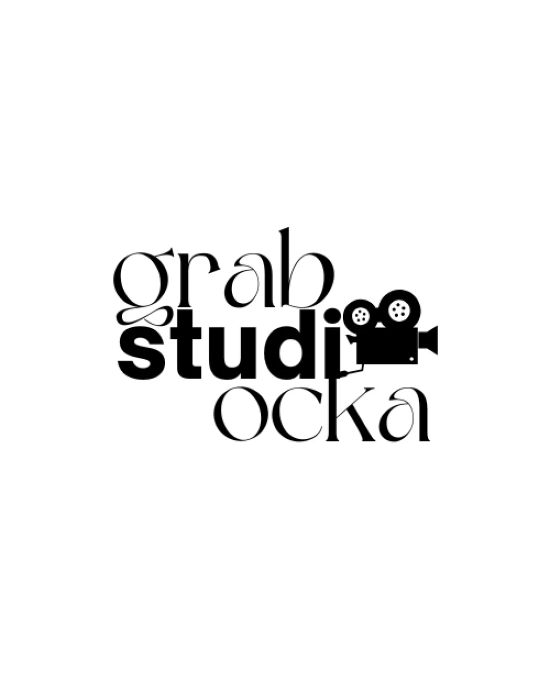
Try it Now!Logo review of grab studio ocka
 Logo analysis by AI
Logo type:
Style:
Detected symbol:
Detected text:
Business industry:
Review requested by Og123456789
**If AI can recognize or misinterpret it, so can people.
Structured logo review
Legibility
![]() Different font styles create distinction.
Different font styles create distinction.
![]() Text is cramped and difficult to read.
Text is cramped and difficult to read.![]() Inconsistent font weights affect clarity.
Inconsistent font weights affect clarity.
Scalability versatility
![]() Would work well on digital media and large prints.
Would work well on digital media and large prints.
![]() Small elements like film camera details might not scale well.
Small elements like film camera details might not scale well.![]() Thin fonts may lose readability in small formats.
Thin fonts may lose readability in small formats.
200x250 px
100×125 px
50×62 px
Balance alignment
![]() Central alignment is visually appealing.
Central alignment is visually appealing.
![]() Uneven spacing between text lines creates imbalance.
Uneven spacing between text lines creates imbalance.![]() Film camera overlaps with text awkwardly.
Film camera overlaps with text awkwardly.

Originality
![]() Creative use of film camera symbol.
Creative use of film camera symbol.![]() Interactive element between text and symbol.
Interactive element between text and symbol.
![]() Text arrangement feels disjointed.
Text arrangement feels disjointed.
Aesthetic look
![]() Modern and trendy aesthetic.
Modern and trendy aesthetic.
![]() Cluttered appearance due to overlapping elements.
Cluttered appearance due to overlapping elements.![]() Varied font styles clash visually.
Varied font styles clash visually.
Possible misinterpretations
![]() No obvious misinterpretations.
No obvious misinterpretations.
Color harmony
![]() Monochromatic color scheme enhances simplicity.
Monochromatic color scheme enhances simplicity.


