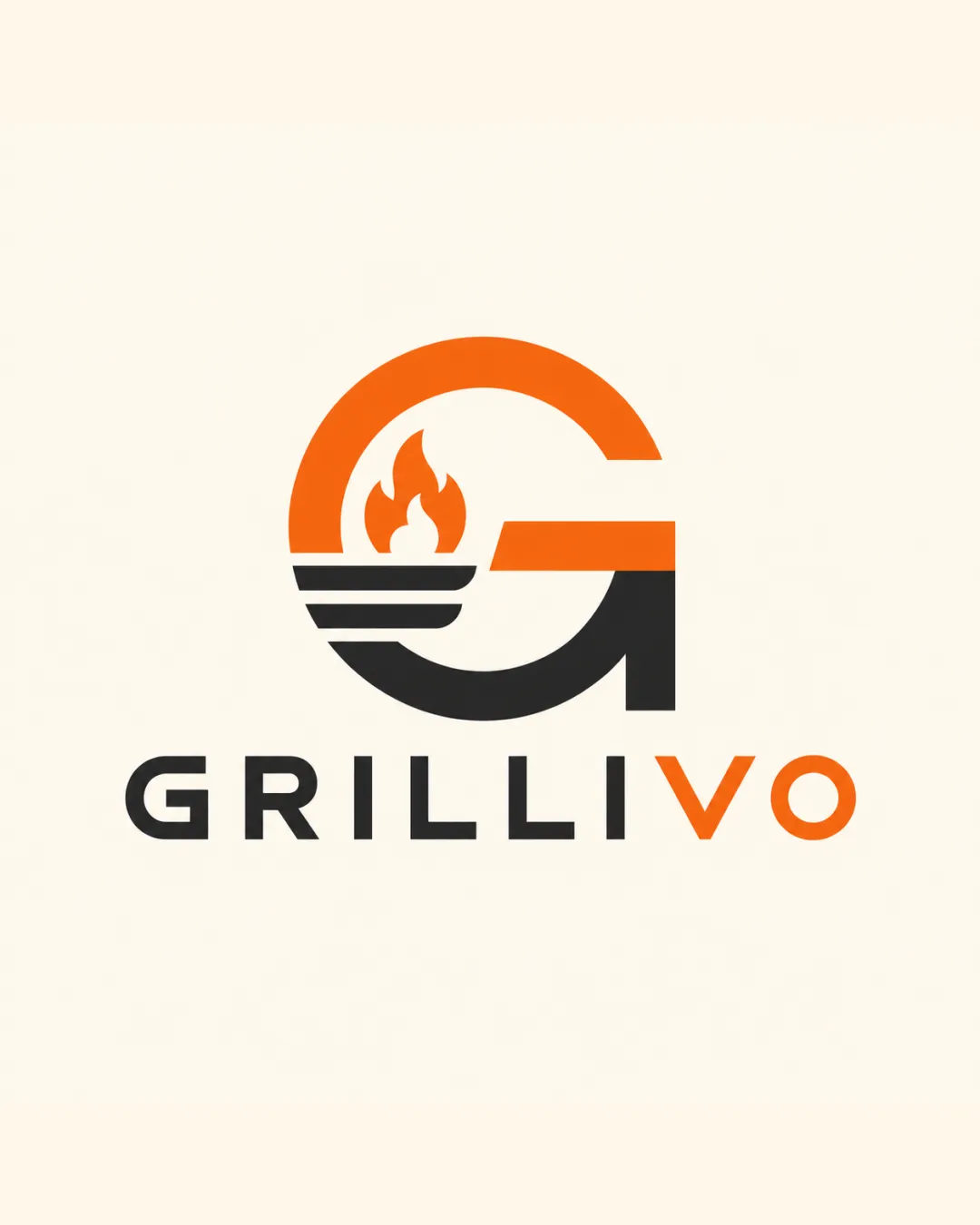
GRILLIVO logo review
4.3 / 5
Logo score
Logo review of

Grillivo

A strong, memorable fast food logo, communicating grilling and energy while maintaining modern professionalism.

Objective AI feedback. Your creative decision.

Combination Mark Modern, Geometric, Minimal Fast Food
4.5/5
Legibility
4/5
Originality
5/5
Misread
4.5/5
Balance
4/5
Scale
Action plan

What to fix first

The most important fixes to handle before polishing the full presentation.

1

Tweak 'VO' color intensity or weight for improved balance

Medium priority

Current treatment draws disproportionate focus to the end rather than the brand as a whole.

Impact: Strengthens Unity And Avoids Segmenting The Name Visually · Effort: Low

Detailed review

Logo performance breakdown

4.5/5

Legibility

Checkmark icon Wordmark is clear and readable
Checkmark icon Font choice provides strong contrast against background

Warning icon Slight weight contrast between 'VO' and the rest may affect small size clarity

4/5

Originality

Checkmark icon Unique integration of flame, grill, and initial
Checkmark icon Modern execution distinguishes it from generic fast food marks

Warning icon Uses common food symbolism (grill/flame)

4.5/5

Color harmony

Checkmark icon Limited palette is appetizing and industry-appropriate
Checkmark icon Orange accent draws eye to the brand ending

Warning icon 'VO' might overpower or feel disconnected in some applications

Orange
#E86720

Black
#232323

Cream
#F8F3EB

Your palette is close. Refine the color roles and combinations before updating the logo.

Build brand colors
4.5/5

Balance alignment

Checkmark icon Strong horizontal alignment
Checkmark icon Clear visual hierarchy between mark and wordmark

Warning icon The color weight of 'VO' creates slight imbalance

logo 200x250 pixels scalability test alignment grid overlay
4/5

Scalability

Checkmark icon Shapes are bold and clean for easy scaling
Checkmark icon Minimal detail for good reproduction

Warning icon Thin elements in the grill bars may be less distinct at micro sizes

logo 200x250 pixels scalability test

200x250 px

logo 100x125 pixels scalability test

100×125 px

logo 50x62 pixels scalability test

50×62 px

5/5

Misinterpretations

Checkmark icon No plausible misinterpretation, clear food/grill cues

4.5 / 5

Logo structure & brief match

Checkmark icon Mark and wordmark share geometric construction and color harmony

Warning icon Minor style difference between angular logomark and rounder 'VO'

Checkmark icon Industry: Highly relevant; visual cues effectively communicate grilling/fast food.
Checkmark icon Memorability: Distinctive design increases recall compared to generic competitors.

Try your own review

Wondering how your logo performs?

Get a clear logo score, key risks, and priority fix ideas before your client or audience sees it.

Review my logo