Wondering how your logo performs? 🧐
Get professional logo reviews in seconds and catch design issues in time.
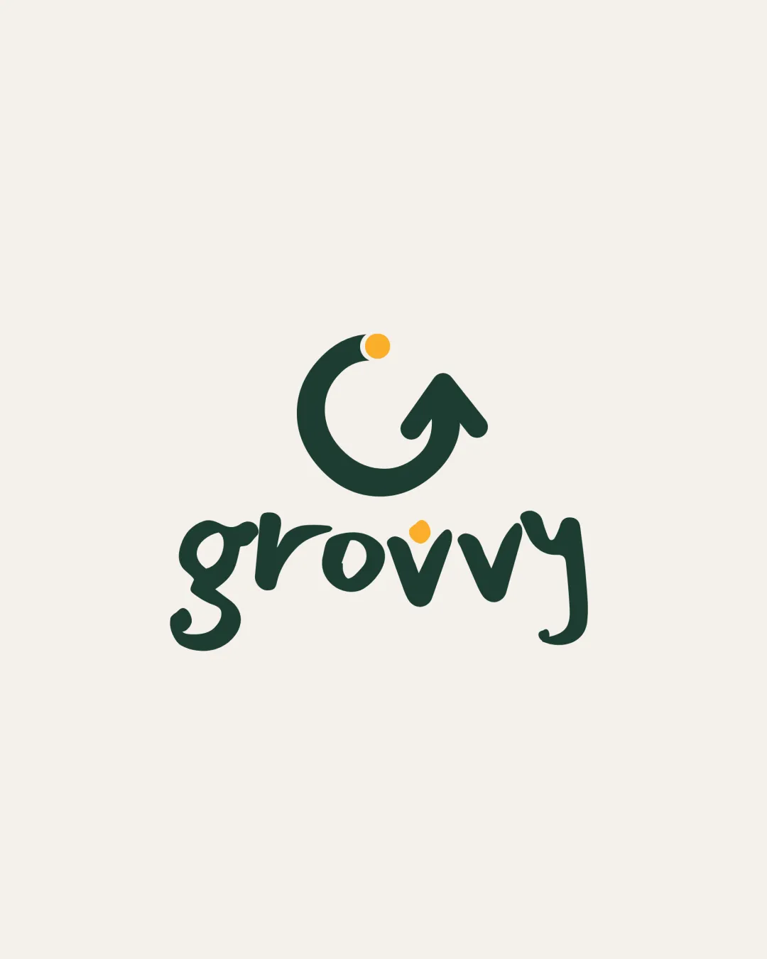
Try it Now!Logo review of grovy
 Logo analysis by AI
Logo type:
Style:
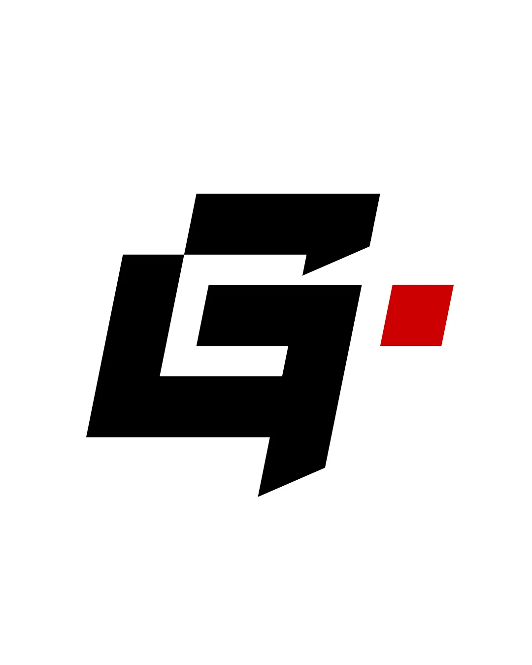
Detected symbol:
Detected text:
Business industry:
Review requested by Earthtosarah
**If AI can recognize or misinterpret it, so can people.
Structured logo review
Legibility
![]() Text is easily distinguishable and clear.
Text is easily distinguishable and clear.![]() Letterforms have ample spacing and stand out against the background.
Letterforms have ample spacing and stand out against the background.
![]() The double 'v' could be briefly misread as a 'w' at small sizes or quick glances.
The double 'v' could be briefly misread as a 'w' at small sizes or quick glances.
Scalability versatility
![]() Logo is relatively simple and could work well on digital applications and merchandise.
Logo is relatively simple and could work well on digital applications and merchandise.![]() Minimal color palette aids reproduction.
Minimal color palette aids reproduction.
![]() Hand-lettered style may lose crispness at tiny scales, especially in embroidery.
Hand-lettered style may lose crispness at tiny scales, especially in embroidery.![]() Small orange dot may disappear in reduced sizes or poor printing.
Small orange dot may disappear in reduced sizes or poor printing.
200x250 px
100×125 px
50×62 px
Balance alignment
![]() The logomark and wordmark are visually centered and well integrated.
The logomark and wordmark are visually centered and well integrated.![]() The upward motion of the mark complements the handwritten style below.
The upward motion of the mark complements the handwritten style below.
![]() The orange dot above both the logomark and the wordmark may create a slightly top-heavy feel.
The orange dot above both the logomark and the wordmark may create a slightly top-heavy feel.

Originality
![]() Unique hand-lettered type paired with a dynamic, stylized 'G' arrow symbol.
Unique hand-lettered type paired with a dynamic, stylized 'G' arrow symbol.![]() Playful dot motif adds individuality.
Playful dot motif adds individuality.
![]() Circular arrow is a somewhat common motif in growth/tech, but execution here is above average.
Circular arrow is a somewhat common motif in growth/tech, but execution here is above average.
Logomark wordmark fit
![]() The handwritten stroke and roundness of the logomark is stylistically cohesive with the wordmark.
The handwritten stroke and roundness of the logomark is stylistically cohesive with the wordmark.![]() Color and shape motifs are mirrored in both areas.
Color and shape motifs are mirrored in both areas.
Aesthetic look
![]() Playful, modern look with organic friendliness.
Playful, modern look with organic friendliness.![]() Consistent strokes, pleasing color balance, contemporary visual tone.
Consistent strokes, pleasing color balance, contemporary visual tone.
Dual meaning and misinterpretations
![]() No inappropriate or confusing secondary imagery detected.
No inappropriate or confusing secondary imagery detected.
Color harmony
![]() Green and orange are complementary and visually appealing.
Green and orange are complementary and visually appealing.![]() Restrained palette maintains modernity and approachability.
Restrained palette maintains modernity and approachability.
Evergreen
#23382D
Saffron
#F7CB43
Alabaster
#F7F7EC