Concept & direction
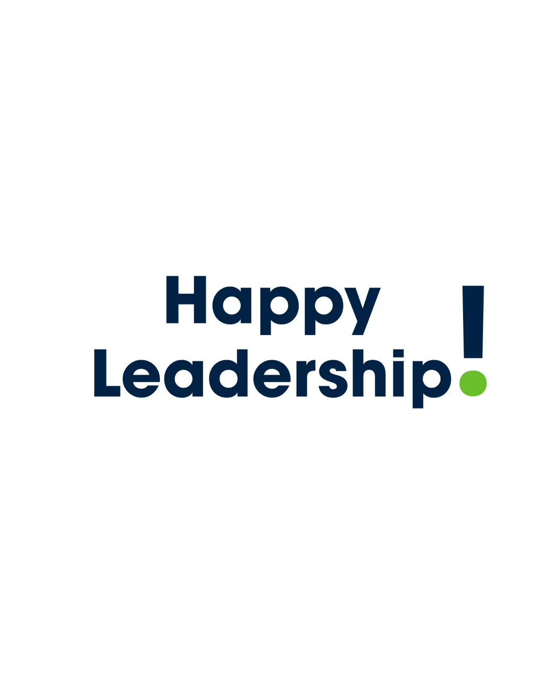
The combination of a bold wordmark with a playful, oversized exclamation mark delivers an energetic and positive message suitable for leadership communications.
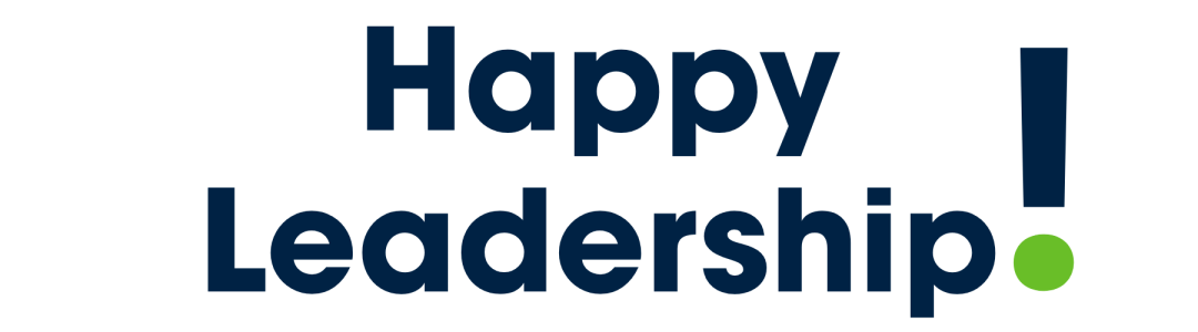
A clear, energetic wordmark with an engaging emphasis mark, slightly needing refinement for visual balance.
This wordmark shows solid execution, supported by text readability and clarity at smaller sizes; improving distinctiveness is the clearest next step.
Focus on the changes that matter. Keep what makes the logo work.
The combination of a bold wordmark with a playful, oversized exclamation mark delivers an energetic and positive message suitable for leadership communications.
overall
The exclamation mark's vertical alignment is shifted to the upper right, causing a slight imbalance in the logo, making the right side visually heavier than the left.
See the category reviewEnergetic typographic approach aligns with leadership movement and HR executive audiences, though the visual exclamation could be more formally balanced for optimal professional appeal.
The green dot at the base of the exclamation introduces a secondary accent that contrasts well but may be visually distracting depending on usage scale and background.
Estimated colors. Use the original design file for exact values.
Create a full color palette using these colors
Create new paletteThe exclamation mark's vertical alignment is shifted to the upper right, causing a slight imbalance in the logo, making the right side visually heavier than the left.
Try: Refine exclamation mark alignment with the wordmark baseline.

Inspect spacing with the guide. Optical balance may differ from geometric centering.
Get a clear logo score, key risks, and priority fix ideas before your client or audience sees it.
More credits needed
Add credits to continue without losing your work.
Then $7/month. Cancel anytime.
Essential logo review with AI
Estimated progress