Wondering how your logo performs? 🧐
Get professional logo reviews in seconds and catch design issues in time.
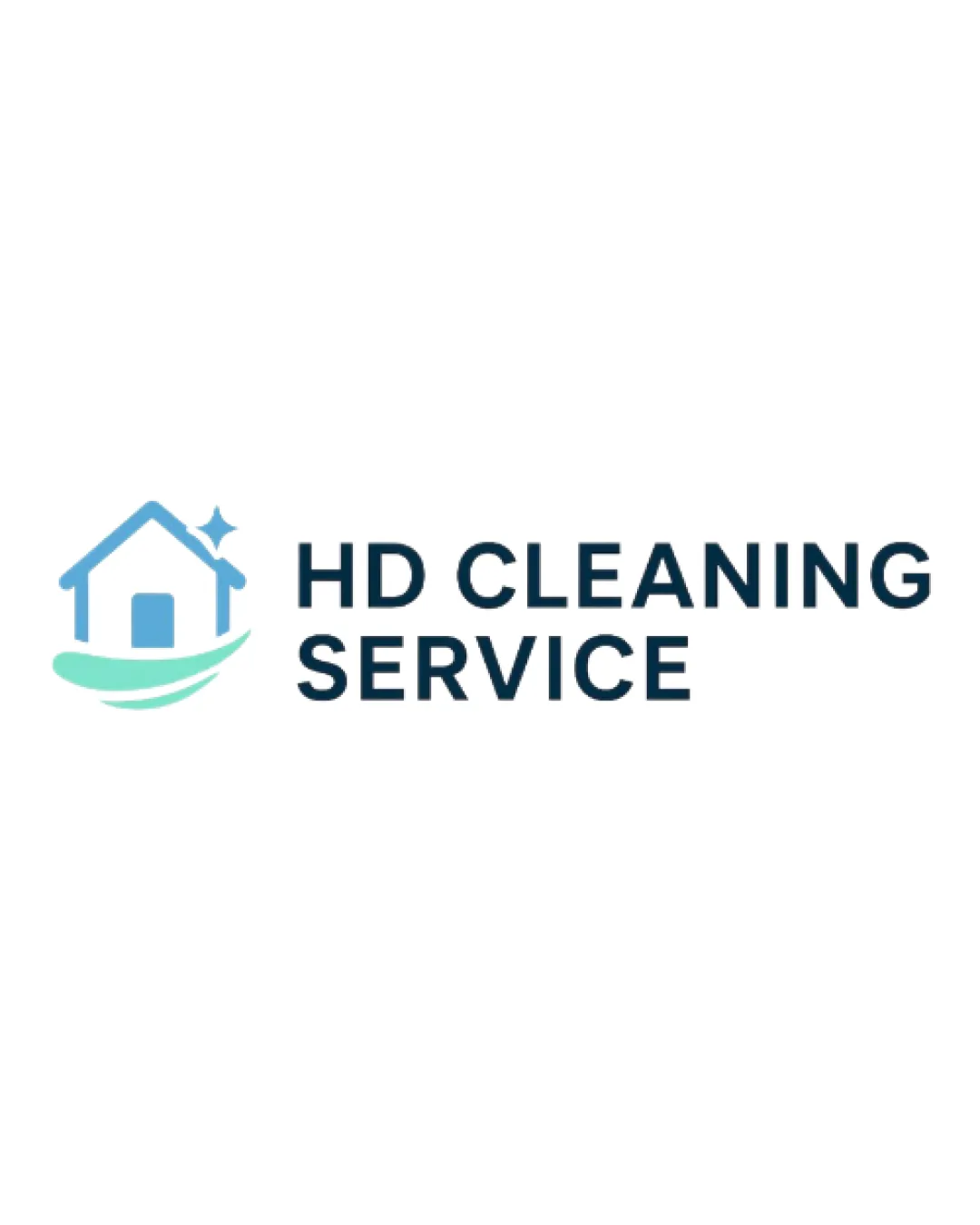
Try it Now!Logo review of HD CLEANING SERVICE
 Logo analysis by AI
Logo type:
Style:
Detected symbol:
Detected text:
Business industry:
Review requested by SAstacio
**If AI can recognize or misinterpret it, so can people.
Structured logo review
Legibility
![]() Text is bold, uppercase, and easy to read.
Text is bold, uppercase, and easy to read.![]() Font selection ensures high visibility and clarity in diverse applications.
Font selection ensures high visibility and clarity in diverse applications.
Scalability versatility
![]() Logo is simple and clean, which supports scalability.
Logo is simple and clean, which supports scalability.![]() Should reproduce well on small formats like business cards.
Should reproduce well on small formats like business cards.
![]() Thin lines in the house symbol and sparkle might be lost at smaller sizes such as app icons or embroidery.
Thin lines in the house symbol and sparkle might be lost at smaller sizes such as app icons or embroidery.![]() Color gradients may lose clarity in black and white or single-color applications.
Color gradients may lose clarity in black and white or single-color applications.
200x250 px
100×125 px
50×62 px
Balance alignment
![]() Overall composition is visually balanced with the symbol and typography proportionally aligned.
Overall composition is visually balanced with the symbol and typography proportionally aligned.![]() Good spacing between the logomark and the wordmark.
Good spacing between the logomark and the wordmark.
![]() The wave below the house feels slightly disconnected and ungrounded compared to the blocky text.
The wave below the house feels slightly disconnected and ungrounded compared to the blocky text.

Originality
![]() The sparkle adds a cleanliness cue.
The sparkle adds a cleanliness cue.
![]() House and sparkling elements are very common in cleaning industry logos.
House and sparkling elements are very common in cleaning industry logos.![]() Wave element is a generic choice for conveying 'clean' or 'fresh'.
Wave element is a generic choice for conveying 'clean' or 'fresh'.
Logomark wordmark fit
![]() Color scheme and simplicity of both elements are well-matched.
Color scheme and simplicity of both elements are well-matched.
![]() Typography is rigid while the symbol is more fluid, creating a minor stylistic mismatch.
Typography is rigid while the symbol is more fluid, creating a minor stylistic mismatch.
Aesthetic look
![]() Color palette is clean and pleasant.
Color palette is clean and pleasant.![]() Minimal style aligns with modern design trends.
Minimal style aligns with modern design trends.
![]() Generic iconography reduces unique brand memorability.
Generic iconography reduces unique brand memorability.
Dual meaning and misinterpretations
![]() Symbolism is clear, straightforward, and appropriate for cleaning services.
Symbolism is clear, straightforward, and appropriate for cleaning services.
Color harmony
![]() Limited to harmonious blues and greens, which are both fresh and professional.
Limited to harmonious blues and greens, which are both fresh and professional.![]() No jarring or clashing color combinations.
No jarring or clashing color combinations.
Tiffany Blue
#6CD4C4
Cornflower Blue
#4E9ADB
Dark Blue
#172A38
White
#FFFFFF


