 View review
Logo score
Logo review of
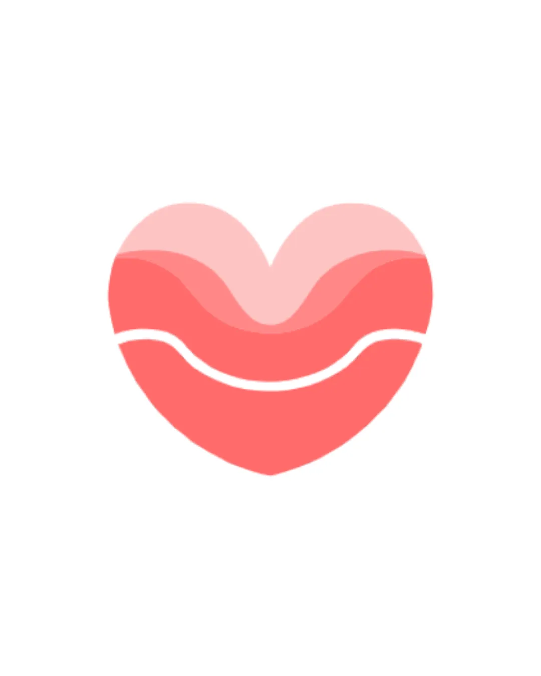
Heart With Wavy Lines And Layered Shading
Review the detailed scores below to see what is working and what should be refined first.
Objective AI feedback. Your creative decision.
Originality
Misread
Balance
Scale
Detailed review
Logo performance breakdown
Originality
 The multi-layered approach gives a slight creative edge and adds dimension to the generic heart symbol.
 Heart symbols are extremely common in the health and wellness industry, so the core concept lacks distinctiveness. No unique or ownable element that sets this apart from standard heart iconography.
Color harmony
Palette is soft and complementary, providing visual comfort. Smooth transitions between gradient shades avoid harsh contrasts.
Using three similar pink/red hues can limit versatility across darker or monochrome backgrounds and restrict brand expansion.
Persian Pink
#FF6F71
Light Pink
#FFA7AA
White
#FFFFFF
Your palette is close. Refine the color roles and combinations before updating the logo.
Build brand colorsBalance alignment
Symmetrical composition provides visual harmony. Layering is well-centered, and internal lines are consistently aligned.

Scalability
The design uses bold shapes and simple layering, which work well for larger and medium-sized applications such as signage, posters, and digital interfaces. Clean shapes maintain their clarity from a distance.
Some thinner internal wavy lines may lose definition or blur on very small-scale applications like favicons or embroidery. Gradients and multiple shades may not reproduce well in single-color or low-resolution formats.
200x250 px
100×125 px
50×62 px
Misinterpretations
No inappropriate or ambiguous dual-meanings detected. The overall shape is clear and positive.
Try your own review
Review my logo
Wondering how your logo performs?
Get a clear logo score, key risks, and priority fix ideas before your client or audience sees it.
Keep exploring


