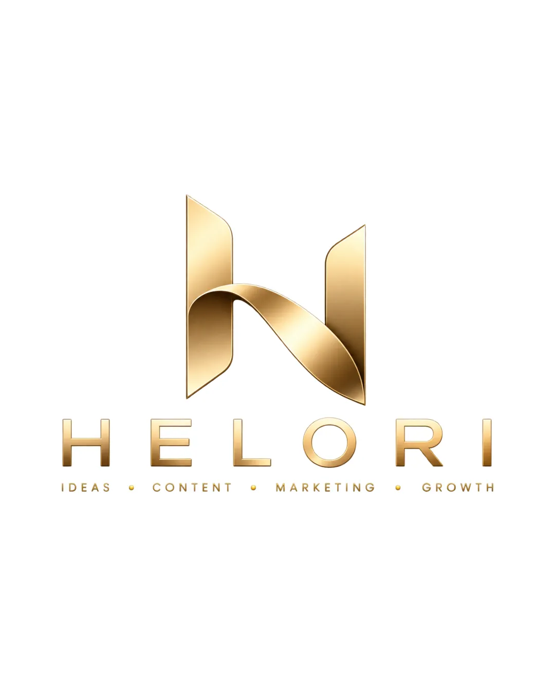
HELORI IDEAS • CONTENT • MARKETING • GROWTH logo review
4.3/5
Logo score
Logo review of

Helori Ideas • Content • Marketing • Growth

A premium, visually cohesive and highly legible logo suited for marketing or consulting, with minor refinements needed for extreme scalability and further distinctiveness.

Combination Mark Modern, Metallic Gradient, Premium Marketing
4.5/5
Legibility
4/5
Originality
5/5
Misread
4.5/5
Balance
4/5
Scale
Action plan

What to fix first

The most important fixes to handle before polishing the full presentation.

1

Develop a single-color or simplified version for small-size or low-fidelity applications.

High priority

Gradient effects will not display well in all print/media situations.

Impact: Ensures Brand Consistency And Readability In All Contexts. · Effort: Medium

2

Further differentiate the monogram for stronger ownability.

Medium priority

Current ribbon effect is elegant but somewhat familiar.

Impact: Improves Memorability And Avoids Industry Clichés. · Effort: Medium

Detailed review

Logo performance breakdown

4.5/5

Legibility

Checkmark icon Wordmark 'HELORI' is clear and highly readable.
Checkmark icon Tagline is well-spaced and legible.

Warning icon Gold gradient requires contrast for maximum clarity on varying backgrounds.

4/5

Originality

Checkmark icon Ribbon effect in the 'H' is visually distinctive.
Checkmark icon Metallic finish feels premium and upscale.

Warning icon Monogram style is on-trend but not entirely unique within luxury/marketing sectors.

4.5/5

Color harmony

Checkmark icon Consistent gold gradient suggests premium value and creativity.

Warning icon Highly dependent on color; may not reproduce well without gradient.

Gold
#CDA45E

White
#FFFFFF

Your palette is close. Refine the color roles and combinations before updating the logo.

Build brand colors
4.5/5

Balance alignment

Checkmark icon Monogram is proportionate above the wordmark.
Checkmark icon Excellent centering and optical balance.

logo 200x250 pixels scalability test alignment grid overlay
4/5

Scalability

Checkmark icon Monogram and wordmark maintain clarity at reduced sizes.
Checkmark icon Details remain distinguishable except at very small scale.

Warning icon Metallic gradient effects may lose impact at very small or single-color sizes.

logo 200x250 pixels scalability test

200x250 px

logo 100x125 pixels scalability test

100×125 px

logo 50x62 pixels scalability test

50×62 px

5/5

Misinterpretations

Checkmark icon No unintended shapes or negative space issues observed.

4.5/5

Logo structure & brief match

Checkmark icon Cohesive integration of ribbon monogram with modern sans-serif type.

Checkmark icon Premium Perception: Metallic gold and stylized monogram create a high-end impression suitable for marketing or consulting.
Checkmark icon Clear Communication: Wordmark and tagline clearly explain core services.

Try your own review

Wondering how your logo performs?

Get a clear logo score, key risks, and priority fix ideas before your client or audience sees it.

Review my logo