HG monogram logo logo review
2.9/5
Logo score Monogram category

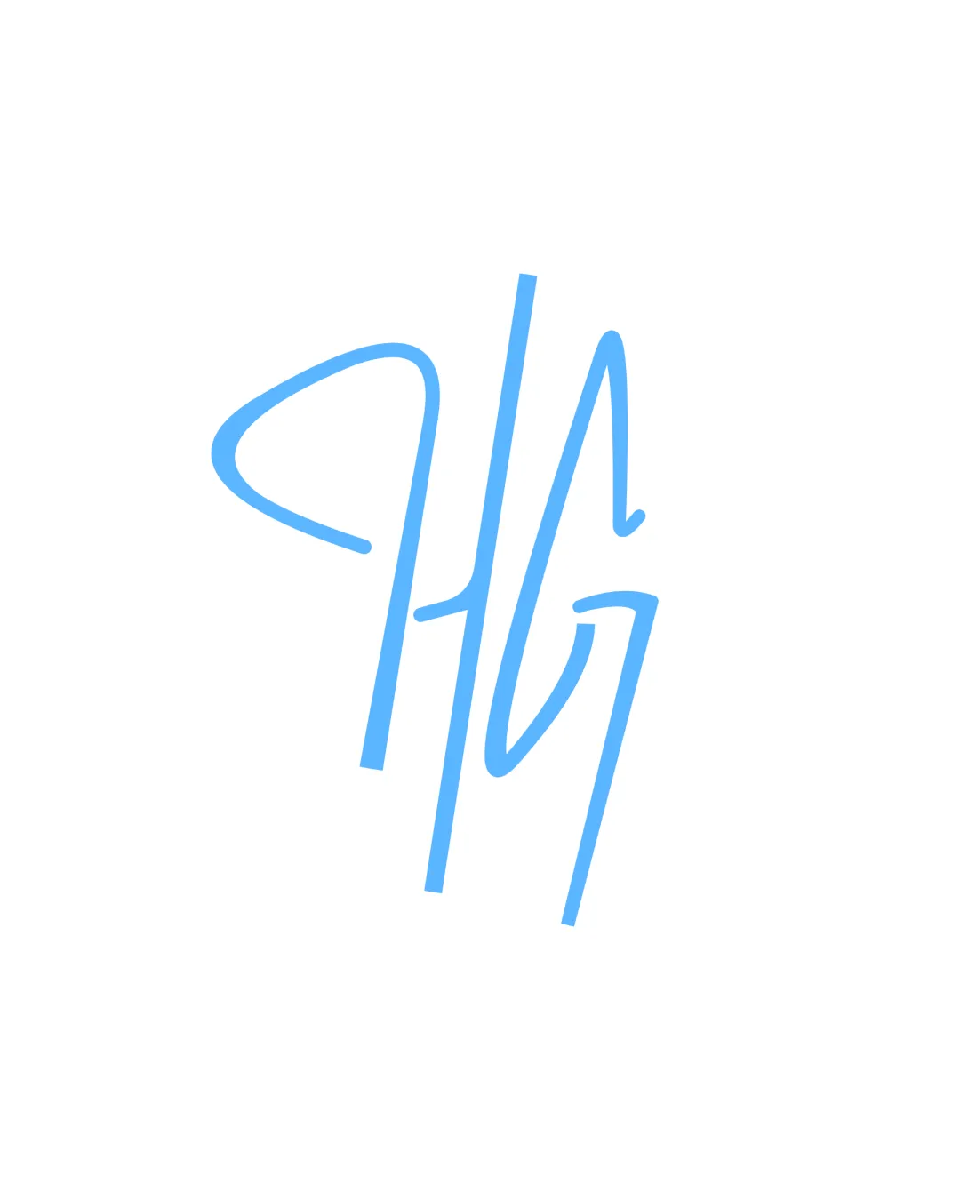
HG monogram logo

creative202391 Essential logo review

Creative and uniquely styled, but requires user testing for monogram readability and thicker strokes for reliable small-scale application.

This monogram has a workable foundation; improving clarity at smaller sizes is the clearest next step.

Monogram Handwritten, Minimalist Photography
3/5
Legibility
3/5
Originality
4/5
Balance
2/5
Scale
Your next steps

What to fix first

Focus on the changes that matter. Keep what makes the logo work.

1

monogram

Test recognizability of 'HG' with target users before production.

High priority Worth testing Low effort

The handwritten style causes the 'H' and 'G' to blend, which could hinder quick recognition, especially at smaller sizes.

See the category review


Detailed review

Logo performance breakdown

3/5

Brief & logo match

The handwritten 'HG' monogram expresses individuality relevant for photography, but risks in legibility and clarity limit professional branding effectiveness without refinement.

5/5

Misinterpretations

  • No visible risk of misinterpretation or unintended meaning.
4/5

Balance alignment

  • Overall monogram is visually balanced despite script-like asymmetry.
Uploaded logoAlignment guide overlay

Inspect spacing with the guide. Optical balance may differ from geometric centering.

3/5

Legibility

  • The handwritten style causes the 'H' and 'G' to blend, which could hinder quick recognition, especially at smaller sizes.

    Worth testing monogram

    Try: Test recognizability of 'HG' with target users before production.

3/5

Originality

Available in Advanced logo reviews
2/5

Scalability

Available in Advanced logo reviews
Try your own review

Wondering how your logo performs?

Get a clear logo score, key risks, and priority fix ideas before your client or audience sees it.

Review my logo