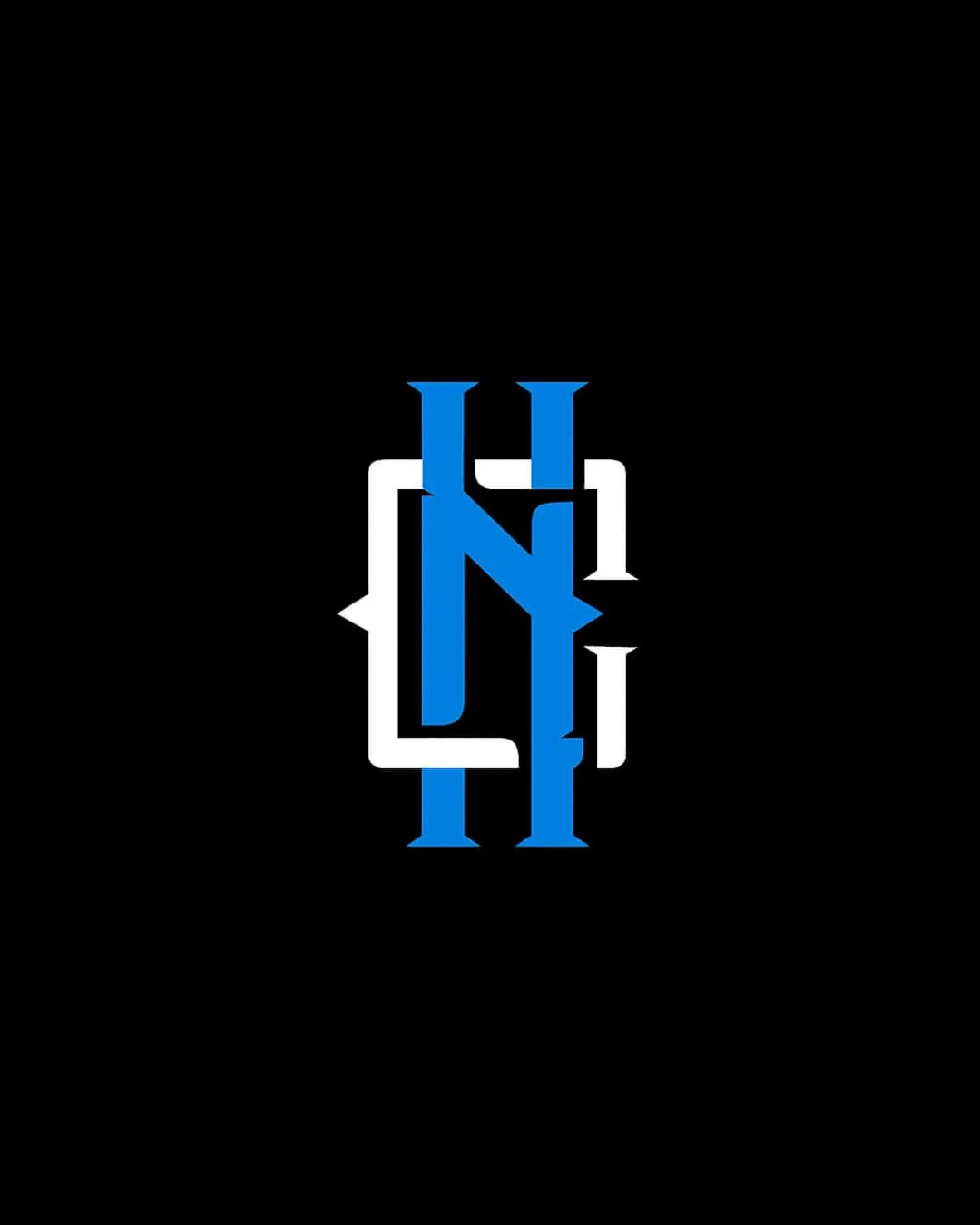
HNL (possible interpretation) logo review
3.4 / 5
Logo score
Logo review of

Hnl (possible Interpretation)

A visually striking monogram with strong visual presence, but legibility issues inhibit broader professional use without further iteration.

Objective AI feedback. Your creative decision.

Monogram Modern Interlocking Letters
2.5/5
Legibility
3.5/5
Originality
4/5
Misread
3.5/5
Balance
4/5
Scale
Action plan

What to fix first

The most important fixes to handle before polishing the full presentation.

1

Refine the individual letterforms or their intersections to improve first-glance legibility while preserving the interlocking effect.

High priority

Currently, quick recognition is hindered by ambiguity at the intersections.

Impact: Improves Recognition And Professional Polish. · Effort: Medium

Detailed review

Logo performance breakdown

2.5/5

Legibility

Checkmark icon Bold and clean stroke weights enhance visibility.

Warning icon Letter interlocking reduces legibility, especially on first glance; letterforms are ambiguous.

3.5/5

Originality

Checkmark icon Interlocking monogram has a custom, unique feel.

Warning icon The general approach is familiar in sports and varsity branding.

4/5

Color harmony

Checkmark icon Blue and white contrast well on black background.

White
#FFFFFF

Blue
#0074D9

Black
#000000

Your palette is close. Refine the color roles and combinations before updating the logo.

Build brand colors
3.5/5

Balance alignment

Checkmark icon Central composition with balanced color distribution.

Warning icon Interlocking forms cause some visual tension and mild imbalance.

logo 200x250 pixels scalability test alignment grid overlay
4/5

Scalability

Checkmark icon Strong, chunky forms remain legible at small sizes.
Checkmark icon Simple palette is reproduction-friendly.

Warning icon Letter overlap creates small gaps that could clog at extreme reductions.

logo 200x250 pixels scalability test

200x250 px

logo 100x125 pixels scalability test

100×125 px

logo 50x62 pixels scalability test

50×62 px

4/5

Misinterpretations

Checkmark icon Abstract form is visually clear with no obvious misinterpretation.

Try your own review

Wondering how your logo performs?

Get a clear logo score, key risks, and priority fix ideas before your client or audience sees it.

Review my logo