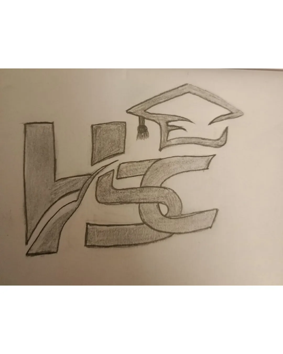
HSC academy logo logo review
2.4/5
Logo score

HSC academy logo

Essential logo review

The academic context is clear due to the graduation cap, but heavy stylization of the monogram hinders legibility and visual balance, limiting immediate effectiveness for an educational brand.

This monogram needs substantial refinement; improving clarity at smaller sizes is the clearest next step.

Monogram Hand-drawn, Outlined Education
2/5
Legibility
3/5
Originality
2/5
Balance
2/5
Scale
@creative505302
Your next steps

What to fix first

Focus on the changes that matter. Keep what makes the logo work.

1

monogram

Refine the letter shapes or spacing for faster recognition.

High priority Visible issue Medium effort

The letterforms are heavily stylized and overlap, making it difficult to confidently and immediately identify each letter; 'HSC' decoding could be ambiguous to new viewers.

See the category review

Detailed review

Logo performance breakdown

3/5

Brief & logo match

The logo references the academic field with a graduation cap but needs greater clarity and refinement to serve offline and social media uses for an educational institute.

5/5

Misinterpretations

  • No visible risk of misinterpretation.
3/5

Originality

  • Standard academic motif (graduation cap) with a customized monogram.
2/5

Legibility

  • The letterforms are heavily stylized and overlap, making it difficult to confidently and immediately identify each letter; 'HSC' decoding could be ambiguous to new viewers.

    Visible issue monogram

    Try: Refine the letter shapes or spacing for faster recognition.

2/5

Balance alignment

Available in Advanced logo reviews
2/5

Scalability

Available in Advanced logo reviews
Try your own review

Wondering how your logo performs?

Get a clear logo score, key risks, and priority fix ideas before your client or audience sees it.

Review my logo