 View review
Logo score
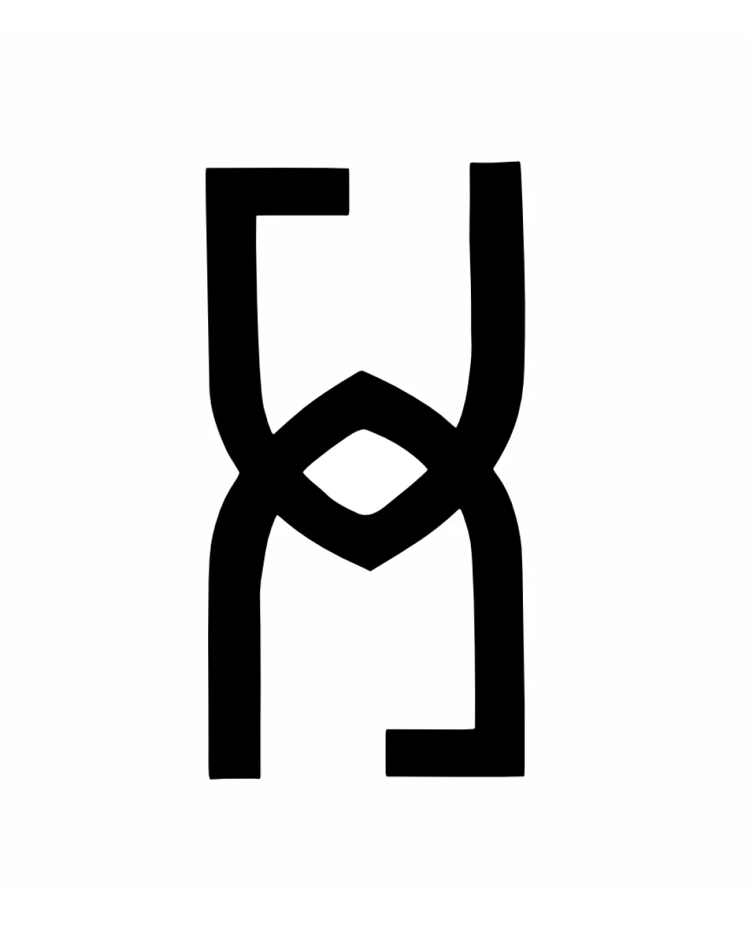
Logo review ofHx
Review the detailed scores below to see what is working and what should be refined first.
Originality
Misread
Balance
Scale
Detailed review
Logo performance breakdown
Originality
![]() Creative interlocking approach to blending the letters H and X in a unique way
Creative interlocking approach to blending the letters H and X in a unique way![]() Use of geometric abstraction adds distinctiveness
Use of geometric abstraction adds distinctiveness
![]() Letter interlock structure is a trend in contemporary monogram design and may not be immediately memorable or ownable
Letter interlock structure is a trend in contemporary monogram design and may not be immediately memorable or ownable
Color harmony
![]() Classic black and white palette offers maximum flexibility and clarity
Classic black and white palette offers maximum flexibility and clarity
Black
#000000
White
#FFFFFF
Balance alignment
![]() Symmetrical structure gives a balanced impression at first glance
Symmetrical structure gives a balanced impression at first glance
![]() Slight unevenness between the thickness and curvature of top and bottom letterforms leads to a mild visual imbalance
Slight unevenness between the thickness and curvature of top and bottom letterforms leads to a mild visual imbalance![]() Diamond-shaped middle area pulls visual attention, causing a minor break in vertical alignment
Diamond-shaped middle area pulls visual attention, causing a minor break in vertical alignment

Scalability
![]() Bold lines and minimal detail make it highly scalable across all sizes
Bold lines and minimal detail make it highly scalable across all sizes![]() Iconic shape works well for digital and physical media, such as app icons, product branding, and embroidery
Iconic shape works well for digital and physical media, such as app icons, product branding, and embroidery
200x250 px
100×125 px
50×62 px
Misinterpretations
![]() No inappropriate or unintentional secondary meanings detected
No inappropriate or unintentional secondary meanings detected
Try your own review
Review my logo
Wondering how your logo performs?
Get a clear logo score, key risks, and priority fix ideas before your client or audience sees it.
Keep exploring


