View review
Logo score
Logo review of
Inka, Bordados Sublimados Dtf
Review the detailed scores below to see what is working and what should be refined first.
Objective AI feedback. Your creative decision.
Legibility
Originality
Misread
Balance
Scale
Detailed review
Logo performance breakdown
Legibility
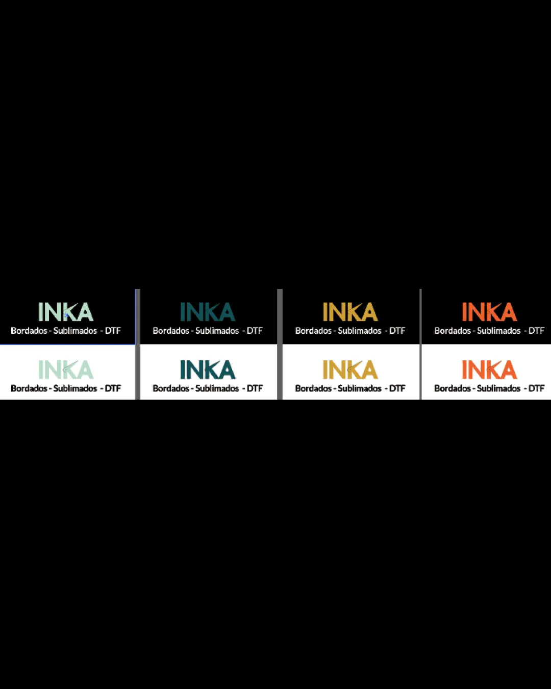
 Clean sans-serif font ensures primary name 'INKA' is clear across all versions. Supporting tagline is readable in high-contrast versions.
 Very light pastel color variation of 'INKA' on white reduces legibility, especially at small sizes. Tagline can be hard to read when the color contrast drops in lighter versions, affecting accessibility.
Originality
Modern sans-serif choice and strong simplicity.
Wordmark only; lacks any distinctive icon or stylized character treatment. Typography and layout are highly generic without unique design features.
Color harmony
Limited palette per version, not visually overwhelming. Color choices are relevant and appropriate for apparel/decoration industry.
Some color variants (like pastel green on white) lack contrast, leading to readability concerns. Palette isn’t particularly distinctive or memorable among competitors.
Powder Ash
#B1D3C7
Eden
#17424A
Olive Gold
#B79937
Flame
#ED5931
Black
#151515
White
#FFFFFF
Color may be holding this logo back. Build a stronger strategic palette before updating the logo.
Build brand colorsBalance alignment
Centered alignment creates a clean, professional, and well-balanced look. Consistent spacing and size between main wordmark and tagline enhance clarity.

Scalability
Simple, bold typography will reproduce well across large-scale and small-scale branding materials. Design adapts well in both light and dark backgrounds, showcasing some versatility.
No logomark or icon reduces quick recognizability when scaled down to favicon size. Very thin tagline may disappear or become illegible on embroidery or smaller packaging labels.
200x250 px
100×125 px
50×62 px
Misinterpretations
Logo avoids any accidental inappropriate or ambiguous symbolism.
Try your own review
Review my logo
Wondering how your logo performs?
Get a clear logo score, key risks, and priority fix ideas before your client or audience sees it.
Keep exploring