Wondering how your logo performs? 🧐
Get professional logo reviews in seconds and catch design issues in time.
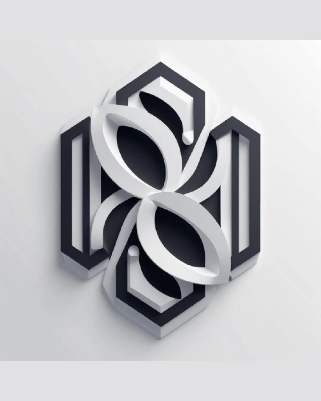
Try it Now!Logo review of interlocking hexagons with abstract floral and pet..
 Logo analysis by AI
Logo type:
Style:
Detected symbol:
Negative space:
Business industry:
Review requested by Aryan008
**If AI can recognize or misinterpret it, so can people.
Structured logo review
Scalability versatility
![]() Bold geometric shapes provide some clarity at medium-to-large sizes.
Bold geometric shapes provide some clarity at medium-to-large sizes.![]() 3D depth effect makes it visually interesting on digital or print collateral.
3D depth effect makes it visually interesting on digital or print collateral.
![]() Complex 3D layering and overlapping forms are likely to lose definition and detail at small scales (e.g., favicon, product tags, embroidery).
Complex 3D layering and overlapping forms are likely to lose definition and detail at small scales (e.g., favicon, product tags, embroidery).![]() Intricate shadow and bevel effects may not translate well to single-color or flat applications.
Intricate shadow and bevel effects may not translate well to single-color or flat applications.
200x250 px
100×125 px
50×62 px
Balance alignment
![]() Overall symmetry creates a stable and harmonious appearance.
Overall symmetry creates a stable and harmonious appearance.![]() Even negative space alignment within the hexagonal shapes.
Even negative space alignment within the hexagonal shapes.
![]() Some overlapping sections feel slightly heavier in the center, leading to minor visual weight imbalance.
Some overlapping sections feel slightly heavier in the center, leading to minor visual weight imbalance.

Originality
![]() The overlapping geometric and organic motifs are not widely seen together in most logos.
The overlapping geometric and organic motifs are not widely seen together in most logos.![]() The combination of hexagons and abstract leaf/petal forms is inventive.
The combination of hexagons and abstract leaf/petal forms is inventive.
![]() Hexagons and petal/leaf shapes have become somewhat common in tech and green branding, making the base elements not entirely unique.
Hexagons and petal/leaf shapes have become somewhat common in tech and green branding, making the base elements not entirely unique.
Aesthetic look
![]() The polished 3D effect and precision geometry add sophistication.
The polished 3D effect and precision geometry add sophistication.![]() Color palette is sleek and professional.
Color palette is sleek and professional.
![]() 3D aesthetic could feel dated if applied in certain industries.
3D aesthetic could feel dated if applied in certain industries.![]() Design may feel slightly busy due to the layering and number of elements.
Design may feel slightly busy due to the layering and number of elements.
Dual meaning and misinterpretations
![]() No explicit or inappropriate shapes detected in the composition.
No explicit or inappropriate shapes detected in the composition.
![]() The interlocking petals might be misread as eyes or other unrelated forms at a glance.
The interlocking petals might be misread as eyes or other unrelated forms at a glance.
Color harmony
![]() Monochromatic palette ensures minimal distraction and visual cohesion.
Monochromatic palette ensures minimal distraction and visual cohesion.![]() Excellent contrast between light and dark shades creates depth without overwhelming.
Excellent contrast between light and dark shades creates depth without overwhelming.
ebony
#22232B
white smoke
#F5F7FA
concrete
#ECECEC


