Concept & direction
A straightforward text-based identity lets the studio name stand out with professional simplicity.
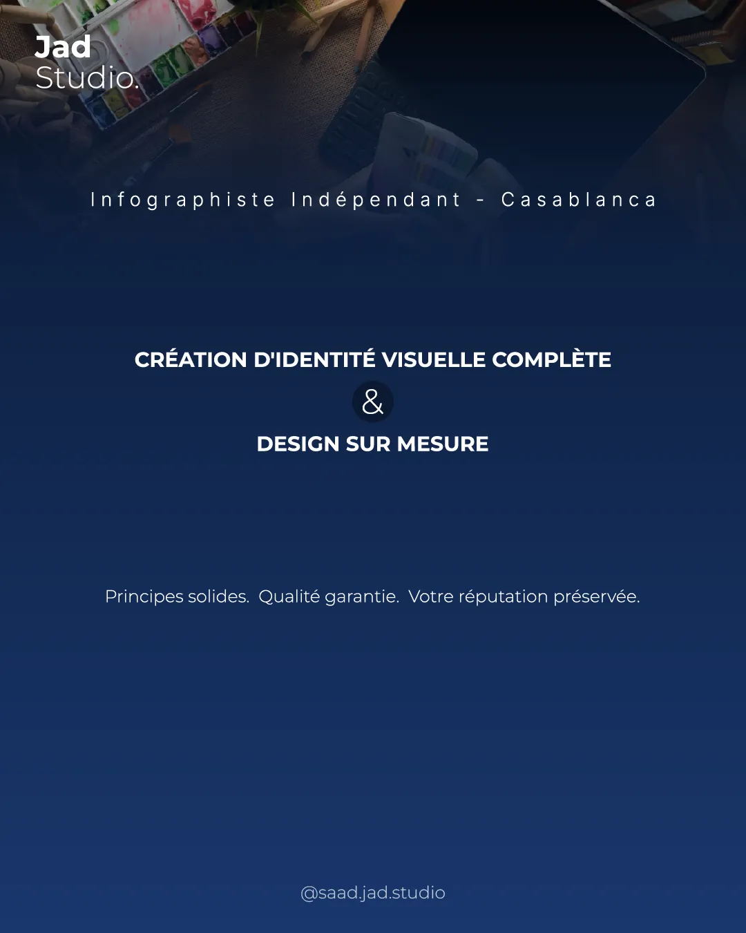
A functional and clear wordmark presenting the studio crisply, but visually generic and at risk of blending in with competitors.
This wordmark needs more distinctive construction to stand out.
Focus on the changes that matter. Keep what makes the logo work.
A straightforward text-based identity lets the studio name stand out with professional simplicity.
wordmark
The wordmark uses a generic sans-serif type treatment with minimal customization, which is common within creative studio branding and lacks visual distinction.
Current style is safe but easily lost among similar competitors.
The clean sans-serif wordmark projects professionalism and is suitable for a graphic design studio, but lacks distinctive flair to uniquely represent a creative brand.
Estimated colors. Use the original design file for exact values.
Create a full color palette using these colors
Create new palette
Inspect spacing with the guide. Optical balance may differ from geometric centering.
The wordmark uses a generic sans-serif type treatment with minimal customization, which is common within creative studio branding and lacks visual distinction.
Try: Explore a custom typographic feature or subtle graphic addition to elevate memorability.
Check: Current style is safe but easily lost among similar competitors.
Get a clear logo score, key risks, and priority fix ideas before your client or audience sees it.
More credits needed
Add credits to continue without losing your work.
Then $7/month. Cancel anytime.
Essential logo review with AI
Estimated progress