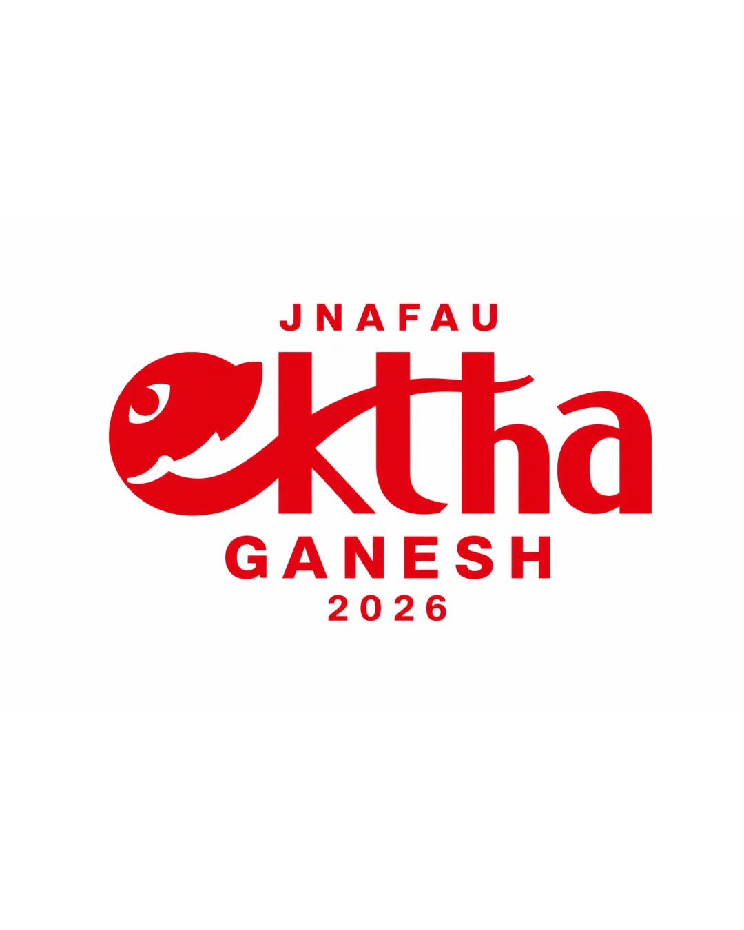
JNAFAU ektha GANESH 2026 logo review
4.3/5
Logo score
Logo review of

Jnafau Ektha Ganesh 2026

Distinctive, relevant, and professionally executed logo highly suited for a college fest identity.

Combination Mark Modern, Typographic, Festival-themed College Fest / Cultural Event
4/5
Legibility
4.5/5
Originality
5/5
Misread
4.5/5
Balance
4/5
Scale
Your next steps

What to fix first

Focus on the changes that matter. Keep what makes the logo work.

1

Increase contrast or spacing within Ganesha symbol for better clarity at small sizes.

Medium priority Low effort

Minor detail loss possible at tiny prints.

Improves small-scale legibility and reproduction.
2

Consider a color accent or festive motif as a responsive version for extra vibrancy.

Low priority Low effort

Secondary tweak; not essential for core function.

May enhance festive appeal, but current scheme is already effective.

Detailed review

Logo performance breakdown

Not scored

Brief & logo match

From the original review
  • College Fest / Cultural Event

    Strong alignment with cultural symbolism (Ganesha) and theme of unity (ektha).

4/5

Legibility

  • Main text 'ektha' is easily readable.
  • Clear supporting text for event details.
  • The 'e' as Ganesha's head may cause a pause in reading flow, but overall clarity is maintained.
4.5/5

Originality

  • Unique integration of symbolic imagery with typography.
  • Distinct concept suited to the context.
  • Slight resemblance to other Ganesha-inspired marks, but implementation is original.
4/5

Color harmony

  • Palette is simple, energetic, and appropriate for a college fest.
  • Limited use of color—could experiment with secondary accent or festive hues, though not required.
Red#D1001B
White#FFFFFF

Estimated colors. Use the original design file for exact values.

Create a full color palette using these colors

Create new palette

4.5/5

Balance alignment

  • Well-centered, balanced composition between mark and text.
  • Strong baseline and even spacing.
  • Minor weight imbalance due to the visually heavy 'e' mark.
Uploaded logoAlignment guide overlay

Inspect spacing with the guide. Optical balance may differ from geometric centering.

4/5

Scalability

  • Simple, bold shapes scale well.
  • No intricate details that would collapse at small sizes.
  • Smallest details in Ganesha's eye/face might blur if printed extremely small.
Uploaded logo at 200 pixels wide
200 × 250 px
Uploaded logo at 100 pixels wide
100 × 125 px
Uploaded logo at 50 pixels wide
50 × 63 px

Compare the detail at different sizes. Labels show the full image dimensions.

5/5

Misinterpretations

  • No unintended or risky secondary interpretations.
4.5/5

Symbol & text fit

  • Mark and wordmark are tightly integrated, enhancing brand recognition.

Black & white

Does the shape still work without color?

These tests are available only for logos uploaded in vector (SVG) format.

Background contrast

Find the surfaces where your logo stays clear.

These tests are available only for logos uploaded in vector (SVG) format.

Blur & silhouette

A 3px blur softens fine details so you can check whether the overall shape stays recognizable. If key gaps close or elements merge, the logo may rely too heavily on detail.

These tests are available only for logos uploaded in vector (SVG) format.

Try your own review

Wondering how your logo performs?

Get a clear logo score, key risks, and priority fix ideas before your client or audience sees it.

Review my logo