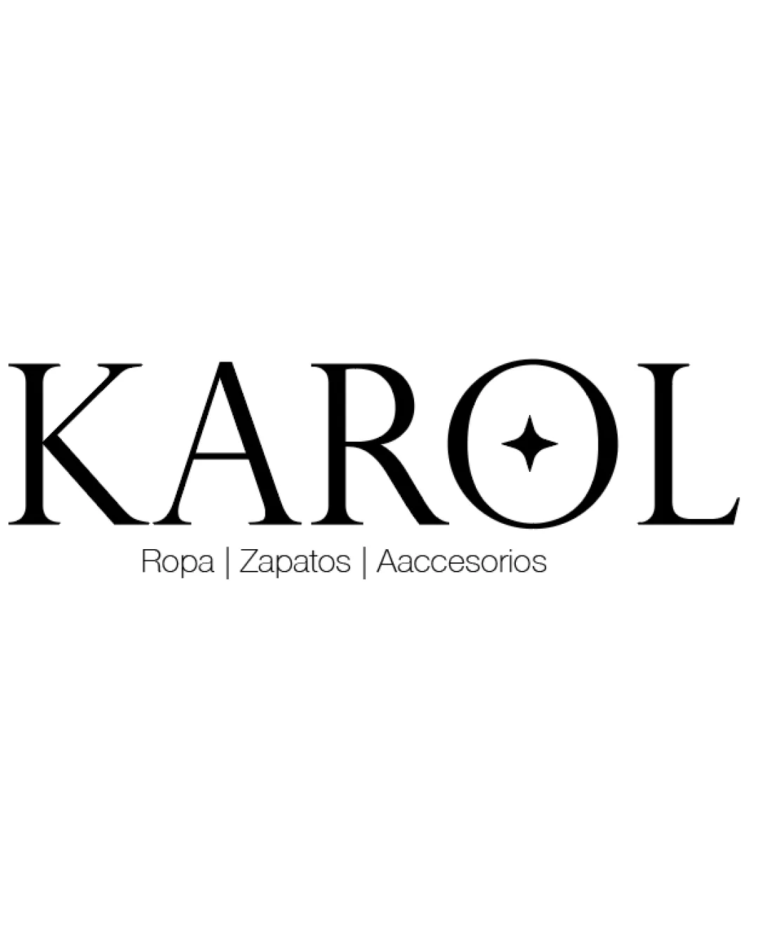
KAROL, Ropa | Zapatos | Aaccesorios logo review
4.1 / 5
Logo score

Logo review ofKarol, Ropa | Zapatos | Aaccesorios

Review the detailed scores below to see what is working and what should be refined first.

Wordmark With Symbol Minimalist, Serif Fashion
4/5
Legibility
3/5
Originality
5/5
Misread
4/5
Balance
3/5
Scale
Review next
Detailed review

Logo performance breakdown

4/5

Legibility

Checkmark icon Primary brand name 'KAROL' is clear and easily readable.
Checkmark icon Elegant, high-contrast serif enhances luxury perception.

Warning icon The descriptor has a typo with 'Aaccesorios', and the thin, light font could be hard to read at small sizes.
Warning icon Descriptor's spacing may cause legibility issues.

3/5

Originality

Checkmark icon Using a star motif within the letter O adds a touch of uniqueness.
Checkmark icon Serif type choice elevates brand from generic sans serif.

Warning icon Serif wordmarks with subtle symbols inside the lettering are common in fashion industry.
Warning icon Star symbol is widely used and not highly distinctive.

5/5

Color harmony

Checkmark icon Classic black and white approach enhances versatility and aligns with industry standards.
Checkmark icon No clashing or excessive color use.

Black
#000000

White
#FFFFFF

4/5

Balance alignment

Checkmark icon Main wordmark is well balanced and evenly spaced.
Checkmark icon Star within the O is horizontally and vertically centered.

Warning icon Descriptor underneath feels more like an afterthought versus being integrated into the composition.

logo 200x250 pixels scalability test alignment grid overlay
3/5

Scalability

Checkmark icon Wordmark remains legible at medium and large scales (signage, shopping bag).
Checkmark icon Star in O is simple enough to scale decently.

Warning icon Fine details in the descriptor will be lost at small sizes (e.g., mobile icons, embroidery).
Warning icon Brand mark loses distinctiveness when scaled to favicon or very small applications.

logo 200x250 pixels scalability test

200x250 px

logo 100x125 pixels scalability test

100×125 px

logo 50x62 pixels scalability test

50×62 px

5/5

Misinterpretations

Checkmark icon No inappropriate or confusing symbolism detected.

5 / 5

Symbol & text fit

Checkmark icon Star glyph style harmonizes very well with the chosen typeface weight and elegance.

Try your own review

Wondering how your logo performs?

Get a clear logo score, key risks, and priority fix ideas before your client or audience sees it.

Review my logo