Wondering how your logo performs? 🧐
Get professional logo reviews in seconds and catch design issues in time.
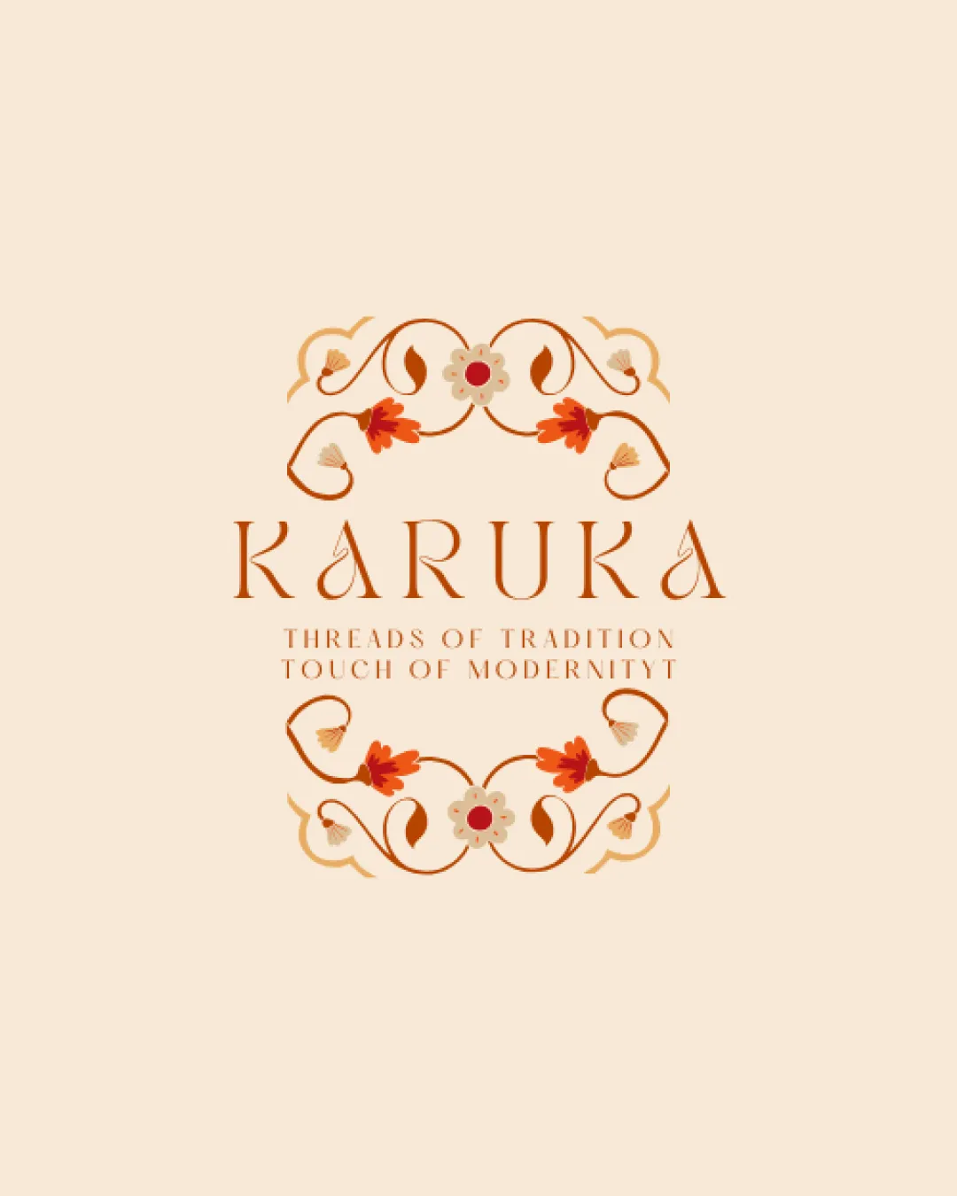
Try it Now!Logo review of KARUKA
 Logo analysis by AI
Logo type:
Style:
Detected symbol:
Detected text:
Business industry:
Review requested by Anannyadesign
**If AI can recognize or misinterpret it, so can people.
Structured logo review
Legibility
![]() Stylish typography matching the traditional theme.
Stylish typography matching the traditional theme.
![]() Small text under the main wordmark may be hard to read.
Small text under the main wordmark may be hard to read.
Scalability versatility
![]() Detailed ornamentation is visually appealing in larger formats.
Detailed ornamentation is visually appealing in larger formats.
![]() May lose details in smaller applications like business cards or embroidery.
May lose details in smaller applications like business cards or embroidery.
200x250 px
100×125 px
50×62 px
Balance alignment
![]() Well-balanced with symmetrical floral elements.
Well-balanced with symmetrical floral elements.

Originality
![]() Distinctive floral design that sets it apart from generic logos.
Distinctive floral design that sets it apart from generic logos.
Aesthetic look
![]() Aesthetically pleasant design with harmonious color use.
Aesthetically pleasant design with harmonious color use.
Dual meaning and misinterpretations
![]() No inappropriate symbols or misinterpretations detected.
No inappropriate symbols or misinterpretations detected.
Color harmony
![]() Warm colors complement the traditional theme.
Warm colors complement the traditional theme.


