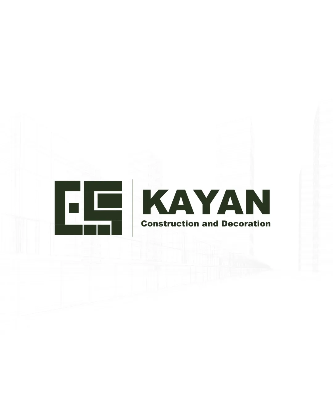
KAYAN Construction and Decoration logo review
3.5 / 5
Logo score
Logo review of

Kayan Construction And Decoration

A solid, legible, sector-appropriate design that is visually reliable but needs stronger distinctiveness for lasting brand impact.

Objective AI feedback. Your creative decision.

Combination Mark Modern Geometric Construction
4/5
Legibility
3/5
Originality
5/5
Misread
4/5
Balance
3.5/5
Scale
Action plan

What to fix first

The most important fixes to handle before polishing the full presentation.

1

Refine symbol-to-wordmark size ratio

Medium priority

Logomark appears slightly oversized and could be balanced to enhance cohesion.

Impact: Improves Mark-word Harmony And Initial Impression · Effort: Low

2

Simplify or thicken fine logomark details for tiny sizes

Medium priority

Small details may merge or blur at reduced scale.

Impact: Boosts Clarity In All Use Cases · Effort: Low

Detailed review

Logo performance breakdown

4/5

Legibility

Checkmark icon 'KAYAN' is clear and bold
Checkmark icon Tagline is readable

Warning icon Tagline is smaller and may become less legible at very small sizes

3/5

Originality

Checkmark icon Owns a recognizable block motif

Warning icon Geometric construction marks are common; symbol lacks a unique twist

4/5

Balance alignment

Checkmark icon Good left-right alignment
Checkmark icon Mark and wordmark are well spaced

Warning icon Logomark feels slightly larger than ideal relative to wordmark

logo 200x250 pixels scalability test alignment grid overlay
3.5/5

Scalability

Checkmark icon Strong block forms scale well
Checkmark icon Wordmark remains clear at most sizes

Warning icon Detail in logomark may fill in or lose clarity at very small sizes

logo 200x250 pixels scalability test

200x250 px

logo 100x125 pixels scalability test

100×125 px

logo 50x62 pixels scalability test

50×62 px

5/5

Misinterpretations

Checkmark icon No obvious negative or confusing secondary meanings

4 / 5

Logo structure & brief match

Checkmark icon Blocky mark style matches bold wordmark
Checkmark icon Unified visual weight

Warning icon Symbol does not clearly echo letters or name

Checkmark icon Industry: Communicates construction well, aligns with sector norms.

Try your own review

Wondering how your logo performs?

Get a clear logo score, key risks, and priority fix ideas before your client or audience sees it.

Review my logo