 View review
Logo score
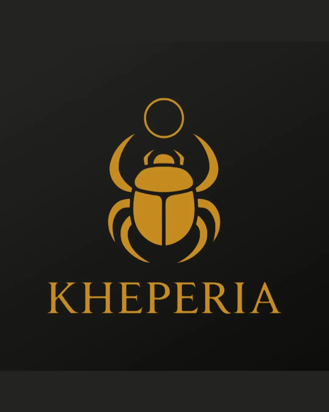
Logo review ofKheperia
Review the detailed scores below to see what is working and what should be refined first.
Legibility
Originality
Misread
Balance
Scale
Detailed review
Logo performance breakdown
Legibility
![]() Highly legible serif typeface with good spacing; all letterforms are clear and readable.
Highly legible serif typeface with good spacing; all letterforms are clear and readable.
Originality
![]() Scarab concept is visually distinctive and relevant, connecting to historical symbolism.
Scarab concept is visually distinctive and relevant, connecting to historical symbolism.![]() Custom abstraction adds uniqueness to the mark.
Custom abstraction adds uniqueness to the mark.
![]() The scarab is a well-known icon and could feel derivative without additional brand context or unique visual twist.
The scarab is a well-known icon and could feel derivative without additional brand context or unique visual twist.
Color harmony
![]() Restrained palette of gold and black radiates refinement and timeless appeal.
Restrained palette of gold and black radiates refinement and timeless appeal.![]() Strong contrast ensures clarity and reinforces the luxury image.
Strong contrast ensures clarity and reinforces the luxury image.
Goldenrod
#B7991E
Raisin Black
#171717
Balance alignment
![]() The logo is well-centered with equal weight distribution between the mark and text.
The logo is well-centered with equal weight distribution between the mark and text.![]() Visual harmony is maintained overall.
Visual harmony is maintained overall.

Scalability
![]() Simplicity of the scarab mark supports scalability.
Simplicity of the scarab mark supports scalability.![]() Strong single-color contrast maximizes recognizability at different sizes.
Strong single-color contrast maximizes recognizability at different sizes.
![]() Some fine lines in the legs and antennae could be lost in very small applications such as favicons or embroidery.
Some fine lines in the legs and antennae could be lost in very small applications such as favicons or embroidery.
200x250 px
100×125 px
50×62 px
Misinterpretations
![]() No inappropriate dual meanings or accidental references detected in the composition.
No inappropriate dual meanings or accidental references detected in the composition.
Symbol & text fit
![]() Wordmark’s classic serif typeface matches the sophisticated tone set by the scarab symbol.
Wordmark’s classic serif typeface matches the sophisticated tone set by the scarab symbol.
![]() Proportions and spacing between logomark and wordmark are harmonious.
Proportions and spacing between logomark and wordmark are harmonious.
Try your own review
Review my logo
Wondering how your logo performs?
Get a clear logo score, key risks, and priority fix ideas before your client or audience sees it.
Keep exploring


