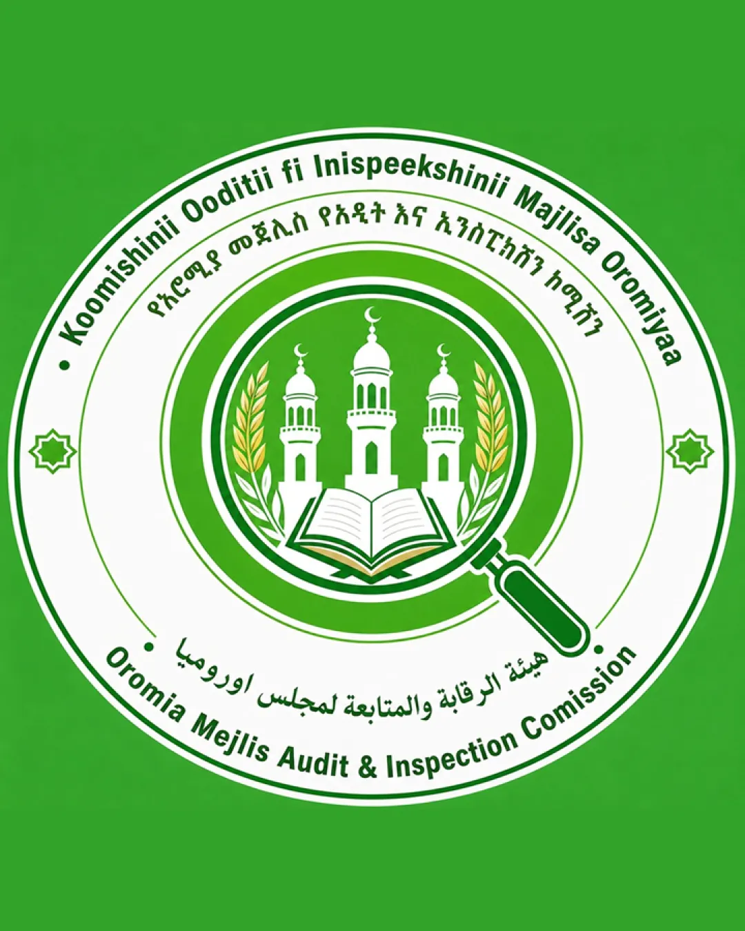
Koomishinii Ooditii fi Inispeekshinii Majlisa Orom.. logo review
3.0 / 5
Logo score
Logo review of

Koomishinii Ooditii Fi Inispeekshinii Majlisa Orom..

Meets formal standards; refinement needed for broader professional application and improved clarity.

Objective AI feedback. Your creative decision.

Emblem Formal Government Seal Government / Public Sector
4/5
Legibility
2.5/5
Originality
4/5
Misread
3/5
Balance
2.5/5
Scale
Action plan

What to fix first

The most important fixes to handle before polishing the full presentation.

1

Simplify the emblem core and reduce the amount of fine detail, especially around text and magnifying glass.

High priority

Small elements collapse at reproduction sizes needed for practical deployment.

Impact: Improves Scalability, Clarity, And Practical Use Across Contexts. · Effort: Medium

2

Explore subtle enhancement to originality (unique symbol shape, more memorable motif).

Medium priority

Current design is competent but visually standard for governmental religious bodies.

Impact: Could Help Stand Out Among Similar Institutional Seals. · Effort: Medium

Detailed review

Logo performance breakdown

4/5

Legibility

Checkmark icon Text in main Latin wordmark is clear and readable

Warning icon Small circular text in secondary languages is harder to read at smaller sizes

2.5/5

Originality

Checkmark icon Magnifying glass overlays religious iconography, tying to inspection

Warning icon Overall seal format and mosque/book/wreath imagery are standard government/Islamic visual tropes

3/5

Color harmony

Checkmark icon Green and white support Islamic identity, feel official

Warning icon Palette is generic for sector; lacks originality

Green
#34A853

White
#FFFFFF

Black
#000000

Color may be holding this logo back. Build a stronger strategic palette before updating the logo.

Build brand colors
3/5

Balance alignment

Checkmark icon Centrally aligned seal format
Checkmark icon Main components distributed evenly

Warning icon Minor crowding due to abundance of elements
Warning icon Legibility and symbol clarity compete in dense core

logo 200x250 pixels scalability test alignment grid overlay
2.5/5

Scalability

Checkmark icon Distinct central icon, strong silhouette

Warning icon Fine details (small text, intricate lines, magnifying glass handle) will lose clarity at small sizes

logo 200x250 pixels scalability test

200x250 px

logo 100x125 pixels scalability test

100×125 px

logo 50x62 pixels scalability test

50×62 px

4/5

Misinterpretations

Checkmark icon No obvious negative or confusing interpretations

3.5 / 5

Logo structure & brief match

Checkmark icon Wordmark and symbol clearly reinforce one another's message

Warning icon Visual density draws focus away from wordmark

Checkmark icon Sector Appropriateness: Fits standard expectations for public sector and religious audit body; communicates seriousness and trust.
Checkmark icon Cultural Relevance: Uses Islamic and educational iconography widely accepted in context.

Try your own review

Wondering how your logo performs?

Get a clear logo score, key risks, and priority fix ideas before your client or audience sees it.

Review my logo