 View review
Logo score
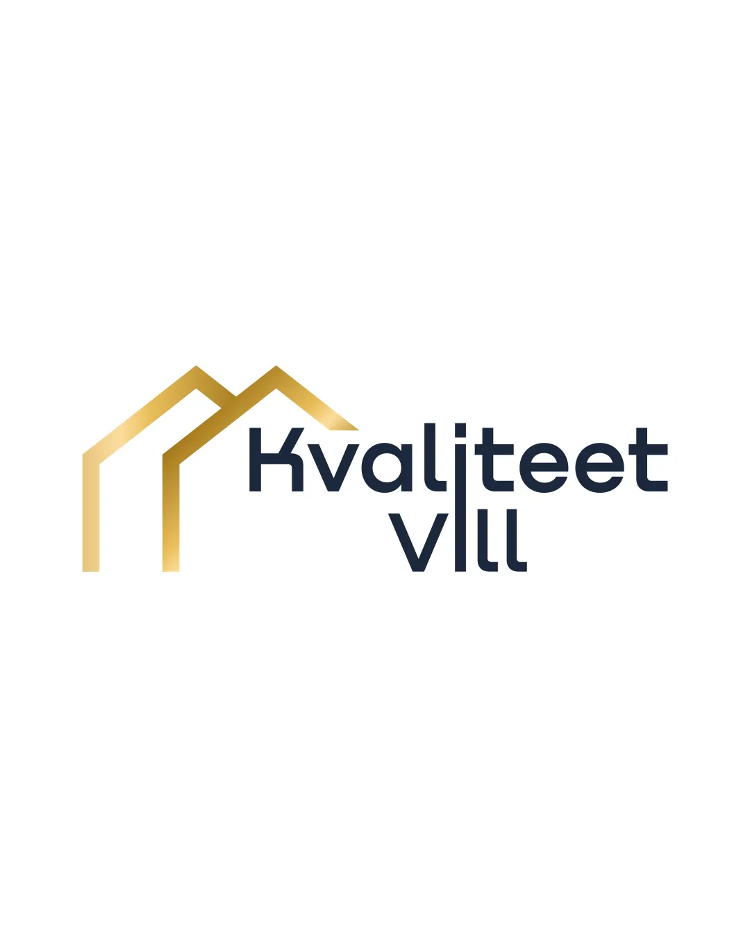
Logo review ofKvaliteet Viii
Review the detailed scores below to see what is working and what should be refined first.
Legibility
Originality
Misread
Balance
Scale
Detailed review
Logo performance breakdown
Legibility
![]() Typography is clear and easy to read.
Typography is clear and easy to read.![]() Good contrast between text and background.
Good contrast between text and background.
Originality
![]() Double roof element provides a hint of uniqueness.
Double roof element provides a hint of uniqueness.![]() Modern typeface complements the geometric icon.
Modern typeface complements the geometric icon.
![]() Roof motif is overused in real estate branding and lacks strong distinctiveness.
Roof motif is overused in real estate branding and lacks strong distinctiveness.![]() No creative twist in combining symbol and text.
No creative twist in combining symbol and text.
Color harmony
![]() Limited, harmonious color palette.
Limited, harmonious color palette.![]() Gold gradient and dark blue create a premium, professional look.
Gold gradient and dark blue create a premium, professional look.
Teak
#B7996E
BigStone
#202735
White
#FFFFFF
Balance alignment
![]() Decent alignment between the symbol and wordmark.
Decent alignment between the symbol and wordmark.![]() Visual weight is generally well distributed.
Visual weight is generally well distributed.
![]() Slight imbalance as the icon feels slightly detached or disconnected from the wordmark due to spacing; text placement could be tighter or more integrated with the symbol.
Slight imbalance as the icon feels slightly detached or disconnected from the wordmark due to spacing; text placement could be tighter or more integrated with the symbol.

Scalability
![]() Simple iconography ensures clarity at smaller sizes.
Simple iconography ensures clarity at smaller sizes.![]() Would work well on business cards, mobile apps, and billboards.
Would work well on business cards, mobile apps, and billboards.
![]() Gradient in the gold roofs may not reproduce well in small or single-color applications, such as embroidery or black-and-white prints.
Gradient in the gold roofs may not reproduce well in small or single-color applications, such as embroidery or black-and-white prints.
200x250 px
100×125 px
50×62 px
Misinterpretations
![]() No inappropriate dual meanings detected.
No inappropriate dual meanings detected.![]() Shapes are easily interpreted as roof structures.
Shapes are easily interpreted as roof structures.
Symbol & text fit
![]() Style harmony between geometric logomark and modern sans-serif wordmark.
Style harmony between geometric logomark and modern sans-serif wordmark.
![]() Both elements share a contemporary visual language.
Both elements share a contemporary visual language.
![]() Spatial separation can make the relationship between mark and text feel less cohesive.
Spatial separation can make the relationship between mark and text feel less cohesive.
Try your own review
Review my logo
Wondering how your logo performs?
Get a clear logo score, key risks, and priority fix ideas before your client or audience sees it.
Keep exploring


