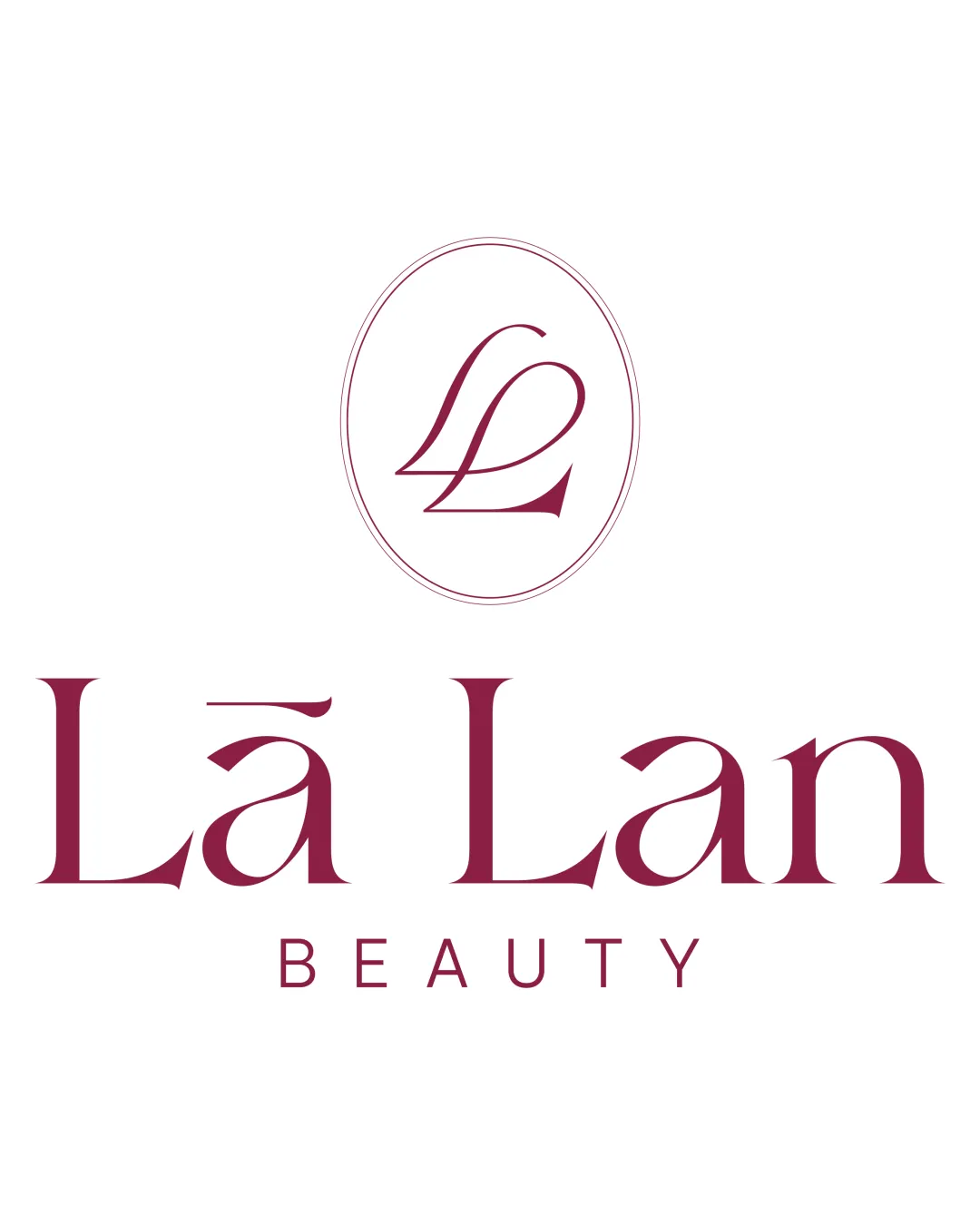
Lā Lan BEAUTY logo review
4.3 / 5
Logo score
Logo review of

Lā Lan Beauty

Polished, elegant logo exudes premium quality and aligns well with the beauty industry. Distinctive enough to stand out among competitors, with only small adjustments to perfect versatility.

Objective AI feedback. Your creative decision.

Combination Mark Elegant Serif With Minimalist Emblem Beauty
4.5/5
Legibility
4/5
Originality
5/5
Misread
4.5/5
Balance
4/5
Scale
Action plan

What to fix first

The most important fixes to handle before polishing the full presentation.

1

Thicken the oval's stroke or adjust line weight in emblem for optimal legibility at small sizes.

Medium priority

Ensures the logo remains upscale yet versatile at all scales.

Impact: Improves Legibility And Reproduction Across Print/digital Uses. · Effort: Low

Detailed review

Logo performance breakdown

4.5/5

Legibility

Checkmark icon Main wordmark and tagline are highly readable
Checkmark icon Accent marks are clear, not intrusive

Warning icon Slight flourish on 'Lā' may cause a momentary pause but does not disrupt recognition

4/5

Originality

Checkmark icon Elegant initial integration in the emblem
Checkmark icon Wordmark has upmarket, non-generic qualities

Warning icon Monogram form not particularly unique within luxury/beauty segment

4.5/5

Color harmony

Checkmark icon Rich burgundy feels premium and matches beauty industry conventions
Checkmark icon Strong visual contrast with white background

Burgundy
#8C2746

White
#FFFFFF

Your palette is close. Refine the color roles and combinations before updating the logo.

Build brand colors
4.5/5

Balance alignment

Checkmark icon Logo is well-centered and elements feel visually balanced
Checkmark icon Tagline sits cleanly beneath the name

Warning icon Minor spacing adjustment could create slightly more harmony between the emblem and wordmark

logo 200x250 pixels scalability test alignment grid overlay
4/5

Scalability

Checkmark icon Distinctive mark and wordmark remain clear at reduced sizes
Checkmark icon Simple forms translate well

Warning icon Fine lines in the emblem's oval border may thin out at very small scale

logo 200x250 pixels scalability test

200x250 px

logo 100x125 pixels scalability test

100×125 px

logo 50x62 pixels scalability test

50×62 px

5/5

Misinterpretations

Checkmark icon No risk of misreading or negative associations

4.5 / 5

Logo structure & brief match

Checkmark icon Both share elegance and typographic style
Checkmark icon Mark clearly relates to initials of brand

Checkmark icon Industry: Sophisticated, elegant, and clean presentation fits beauty sector expectations.

Try your own review

Wondering how your logo performs?

Get a clear logo score, key risks, and priority fix ideas before your client or audience sees it.

Review my logo