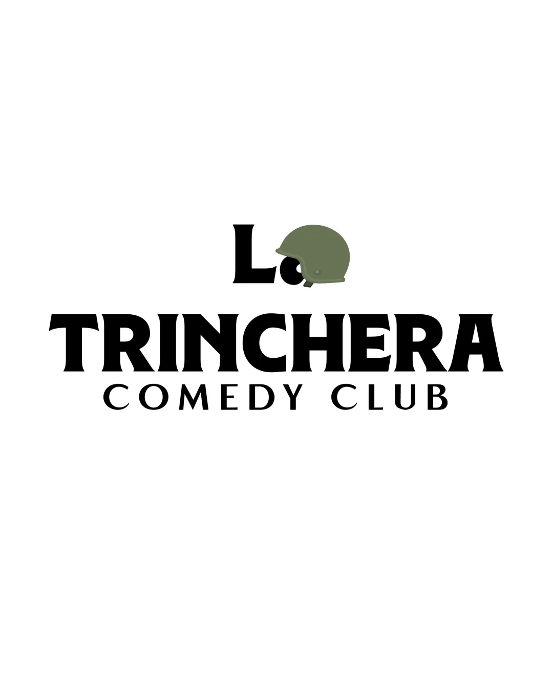
La TRINCHERA COMEDY CLUB logo review
3.8 / 5
Logo score
Logo review of

La Trinchera Comedy Club

Review the detailed scores below to see what is working and what should be refined first.

Combination Mark Bold, Literal, Minimal Color Usage Entertainment
5/5
Legibility
3/5
Originality
5/5
Misread
3/5
Balance
4/5
Scale
Detailed review

Logo performance breakdown

5/5

Legibility

Checkmark icon Text is large, bold, and easy to read.
Checkmark icon High contrast between text and background enhances readability.
3/5

Originality

Checkmark icon Literal pairing of helmet and 'trinchera' (trench) creates a direct thematic link.
Checkmark icon Not a commonly-seen logo pairing in comedy clubs.

Warning icon Literal use of a helmet is not particularly inventive or unique; the concept leans on obvious symbolism rather than clever visual storytelling.
Warning icon Helmets as symbols are broadly used and do not create a unique brand mark.

4/5

Color harmony

Checkmark icon Limited and purposeful color palette.
Checkmark icon Good contrast between olive green and black.

Warning icon Helmet's muted green may look dull or uninspiring compared to the strong black text; color cohesion can be improved.

Black
#222222

Olive green
#757E5B

White
#FFFFFF

Your palette is close. Refine the color roles and combinations before updating the logo.

Build brand colors
3/5

Balance alignment

Checkmark icon Text is horizontally well centered.
Checkmark icon Main name has a strong presence.

Warning icon Helmet above the 'a' and 'L' feels slightly misaligned and detached from the wordmark.
Warning icon Visual weight of the helmet above may create a top-heavy effect, unbalancing the logo.

logo 200x250 pixels scalability test alignment grid overlay
4/5

Scalability

Checkmark icon Bold text ensures clarity when scaled down.
Checkmark icon Design remains mostly legible in small and large formats, such as business cards, social media icons, and billboards.

Warning icon The helmet's detail might be lost at very small sizes, especially the strap and hole.

logo 200x250 pixels scalability test

200x250 px

logo 100x125 pixels scalability test

100×125 px

logo 50x62 pixels scalability test

50×62 px

5/5

Misinterpretations

Checkmark icon No inappropriate or unintended imagery.
Checkmark icon No dual-meaning risks detected.

3 / 5

Symbol & text fit

Checkmark icon Both wordmark and logomark share a bold, straightforward aesthetic.

Warning icon The helmet's style is slightly more realistic, contrasting with the geometric bold typeface.
Warning icon Size and color of the helmet feel a bit disconnected from the wordmark, lacking cohesion.

Try your own review

Wondering how your logo performs?

Get a clear logo score, key risks, and priority fix ideas before your client or audience sees it.

Review my logo