Wondering how your logo performs? 🧐
Get professional logo reviews in seconds and catch design issues in time.
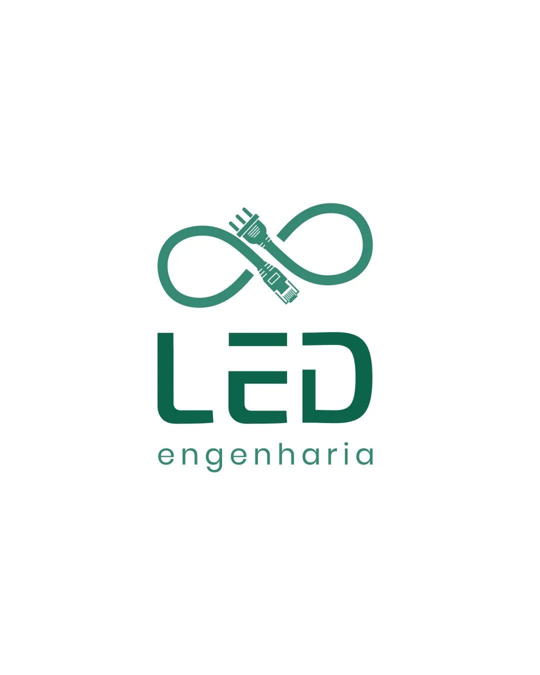
Try it Now!Logo review of LED engenharia
 Logo analysis by AI
Logo type:
Style:
Detected symbol:
Detected text:
Business industry:
Review requested by Silaspitanga
**If AI can recognize or misinterpret it, so can people.
Structured logo review
Legibility
![]() Text 'LED' is highly readable in a modern sans-serif font.
Text 'LED' is highly readable in a modern sans-serif font.![]() 'engenharia' is clearly legible with appropriate spacing and size.
'engenharia' is clearly legible with appropriate spacing and size.
Scalability versatility
![]() Logo remains clear at small sizes due to minimal detail.
Logo remains clear at small sizes due to minimal detail.![]() Works well for web, business cards, and digital profiles.
Works well for web, business cards, and digital profiles.
![]() Cable plug details in the infinity symbol may become illegible when greatly reduced, such as on embroidery or small promotional items.
Cable plug details in the infinity symbol may become illegible when greatly reduced, such as on embroidery or small promotional items.
200x250 px
100×125 px
50×62 px
Balance alignment
![]() Excellent visual hierarchy between symbol and wordmark.
Excellent visual hierarchy between symbol and wordmark.![]() Symmetrical and well-centered composition.
Symmetrical and well-centered composition.

Originality
![]() Use of an infinity symbol as cables cleverly conveys continuity and technology.
Use of an infinity symbol as cables cleverly conveys continuity and technology.![]() Unique combination of symbol and lettering for industry relevance.
Unique combination of symbol and lettering for industry relevance.
![]() The concept of cables forming an infinity shape is creative but not entirely unique within tech and engineering, as infinite loops and cables are fairly common metaphors.
The concept of cables forming an infinity shape is creative but not entirely unique within tech and engineering, as infinite loops and cables are fairly common metaphors.
Logomark wordmark fit
![]() Logomark and wordmark match stylistically and in weight.
Logomark and wordmark match stylistically and in weight.![]() Proportions between symbol and text are harmonious.
Proportions between symbol and text are harmonious.
Aesthetic look
![]() Minimal, modern look aligns with tech and engineering industries.
Minimal, modern look aligns with tech and engineering industries.![]() Color choice is both professional and aesthetically pleasing.
Color choice is both professional and aesthetically pleasing.
Dual meaning and misinterpretations
![]() No inappropriate or ambiguous imagery detected.
No inappropriate or ambiguous imagery detected.![]() Symbol is clear in representing cables and infinity.
Symbol is clear in representing cables and infinity.
Color harmony
![]() Consistent use of a single color tone ensures brand coherence.
Consistent use of a single color tone ensures brand coherence.![]() Contrast against white background is excellent.
Contrast against white background is excellent.
Teal
#328476
White
#FFFFFF


