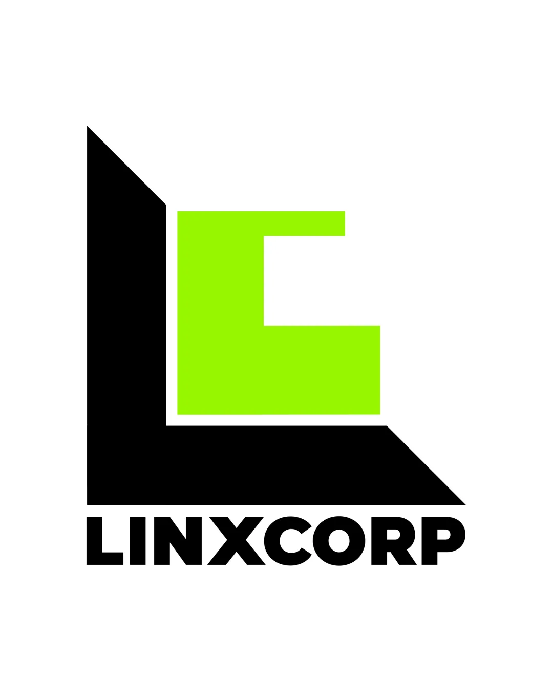
LINXCORP logo review
4/5
Logo score
Logo review of

Linxcorp

A strong, distinctive mark that fulfills industry needs and stands out, though minor refinements to balance and palette versatility are recommended.

Combination Mark Modern Geometric, Bold, High-contrast Outsourcing
4.5/5
Legibility
3.5/5
Originality
5/5
Misread
4/5
Balance
4/5
Scale
Action plan

What to fix first

The most important fixes to handle before polishing the full presentation.

1

Consider refining the green hue or providing a secondary neutral colorway.

Medium priority

Neon green is energetic but may not translate ideally in all contexts.

Impact: Improves Versatility And Reduces Potential Visual Fatigue. · Effort: Low

2

Subtle adjustment to monogram balance for better centering when used standalone.

Low priority

The geometric 'L' may visually outweigh the 'C' on some backgrounds.

Impact: Enhances Perceptual Harmony In Variable Lockups. · Effort: Low

Detailed review

Logo performance breakdown

4.5/5

Legibility

Checkmark icon Wordmark is very clear and easy to read
Checkmark icon Monogram letters are distinguishable

Warning icon Monogram 'C' may momentarily read as an abstract shape, but still resolves quickly

3.5/5

Originality

Checkmark icon Bold color choice is distinctive
Checkmark icon Abstracted letter integration is moderately unique

Warning icon The geometric monogram approach is somewhat conventional in tech/outsourcing

3.5/5

Color harmony

Checkmark icon High-contrast palette grabs attention

Warning icon Vivid green may not fit all brand personalities or backgrounds

Black
#000000

Neon Green
#BFFF00

Your palette is close. Refine the color roles and combinations before updating the logo.

Build brand colors
4/5

Balance alignment

Checkmark icon Strong visual weight with bottom wordmark supporting the monogram
Checkmark icon Geometric forms are optically balanced

Warning icon Monogram’s heavy left bias could feel slightly unbalanced in some lockups

logo 200x250 pixels scalability test alignment grid overlay
4/5

Scalability

Checkmark icon Thick lines and simple geometric forms scale well
Checkmark icon No fine details that would fail at small sizes

Warning icon Color contrast may be harder to distinguish in grayscale applications

logo 200x250 pixels scalability test

200x250 px

logo 100x125 pixels scalability test

100×125 px

logo 50x62 pixels scalability test

50×62 px

5/5

Misinterpretations

Checkmark icon No plausible negative dual readings

4/5

Logo structure & brief match

Checkmark icon Wordmark complements the blocky monogram style

Warning icon None significant

Checkmark icon Industry: Geometric, bold style and high contrast align with outsourcing/tech sector expectations.
Checkmark icon Memorability: Blocky monogram and bright palette help recall.

Try your own review

Wondering how your logo performs?

Get a clear logo score, key risks, and priority fix ideas before your client or audience sees it.

Review my logo