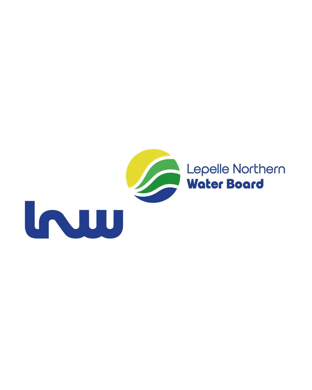
lnw Lepelle Northern Water Board logo review
4.0 / 5
Logo score
Logo review of

Lnw Lepelle Northern Water Board

A clean, professional, well-balanced logo for a public sector utility, with only moderate improvements needed to unify the system and further improve instant recognition.

Combination Mark Contemporary Geometric Public Utilities
4.5/5
Legibility
3.5/5
Originality
4.5/5
Misread
4/5
Balance
4/5
Scale
Action plan

What to fix first

The most important fixes to handle before polishing the full presentation.

1

Explore greater integration between the 'lnw' abbreviation and the round mark for increased cohesion.

Medium priority

Current layout reads as segmented rather than a fully integrated mark.

Impact: Would Enhance Visual Unity And Lessen Initial Separation Of Elements. · Effort: Medium

2

Refine the abbreviation ('lnw') for maximum single-glance recognition, maintaining corporate clarity.

Medium priority

Current stylization is strong but invites initial ambiguity.

Impact: Improves Instant Brand Recall For Formal And Investor Materials, Avoids Misreading At A Glance. · Effort: Medium

Detailed review

Logo performance breakdown

4.5/5

Legibility

Checkmark icon Main wordmark ('Lepelle Northern Water Board') is sharply set and readable.
Checkmark icon 'lnw' abbreviation is distinctive but generally readable.

Warning icon The 'lnw' abbreviation could be quickly misread from a distance as abstract shapes.

3.5/5

Originality

Checkmark icon Natural landscape symbol and broad abbreviation/font pairing are visually ownable.

Warning icon The landscape/sun/waves motif is common among water/utilities sector brands.

4/5

Color harmony

Checkmark icon Blue, green, and yellow palette reads as trustworthy, energetic, and sector-appropriate.

Warning icon Color palette, while appropriate, does not stand out strongly from industry standards.

Blue
#274898

Yellow
#f2d13c

Green
#339966

White
#FFFFFF

Your palette is close. Refine the color roles and combinations before updating the logo.

Build brand colors
4/5

Balance alignment

Checkmark icon Elements have clear hierarchy and spacing.
Checkmark icon Mark, abbreviation, and full name are optically aligned in a stable lockup.

Warning icon Slight visual competition between colorful mark and bold 'lnw' on first glance.

logo 200x250 pixels scalability test alignment grid overlay
4/5

Scalability

Checkmark icon All components are sharp and bold, supporting a range of sizes.
Checkmark icon Symbol reduces neatly to a recognizable mark.

Warning icon Small text (full name) may need size adjustment at very small scales.

logo 200x250 pixels scalability test

200x250 px

logo 100x125 pixels scalability test

100×125 px

logo 50x62 pixels scalability test

50×62 px

4.5/5

Misinterpretations

Checkmark icon No problematic or offensive forms detected in symbol, abbreviations, or negative space.

4 / 5

Logo structure & brief match

Checkmark icon Colorful round mark, full name, and abbreviation are harmonized by color and style.
Checkmark icon Unified corporate tone, with no major clash.

Warning icon 'lnw' and the circular symbol feel somewhat independent rather than tightly integrated.

Checkmark icon Corporate/investor Audiences: Well-suited for formal, professional contexts; communicates clarity and trust.
Checkmark icon Water Utility And Governance: Symbol and palette clearly reference water/landscape, fitting the public utility theme.

Try your own review

Wondering how your logo performs?

Get a clear logo score, key risks, and priority fix ideas before your client or audience sees it.

Review my logo